The WNBA preseason begins today, and the league kicked things off yesterday by unveiling a new set of uniforms for all the teams. The truth: I don’t really give a rat’s hairy little tuchis about the WNBA, and I know most of you don’t either. But the new designs still provide some useful object lessons — most of them, unfortunately, negative.
WNBA teams already face serious visual identity challenges, because many of them are affiliated with, and aesthetically modeled after, NBA teams. So why make things even worse by imposing the same design template on every club in the league? If you’ve got a league that’s struggling for recognition and high-profile coverage, wouldn’t it make sense to allow your teams to develop their own unique looks? But instead each WNBA team now has an elongated design panel running down from the jersey through the shorts; each team now has player names appearing below the uni number (a fun device when used sparingly; pointless overkill when imposed league-wide); each team name will appear on the players’ butts; and so on. In other words, these aren’t really individual teams with their own distinct characters — they’re just interchangeable pieces of Team WNBA. Or at least that’s the message this kind of design program creates.
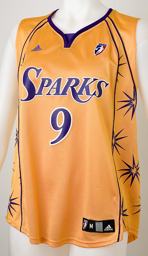
The template might be tolerable if it were a good template — but it’s not. Each team has its own piping pattern (described on the league’s web site as “a dramatic pattern design formed from core elements of each team’s logo”), and some of them are pretty embarrassing. I mean, c’mon, what is this? Or this? I do like this one, but the shape of the jersey panel is still so weird and forced-looking — it all feels like a badly failed experiment. (You can see more images of the new uniforms here.)
This hive-mentality approach is the unfortunate hallmark of small, new-ish leagues these days, because they insist on having the league office coordinate all the uniform designs. Fun logo characters like Pat Patriot and odd uniform quirks like the Steelers wearing their logo on only one side of the helmet could never happen in leagues like the WNBA or the AFL, because the uniforms are all created under the same roof. I understand why they do it — they’re trying to create a league-wide brand identity — but I think it’s a serious miscalculation. If you’re an upstart trying to compete with the major sports, you don’t need a league identity — you need lots of distinct team identities. People don’t say, “Hey, let’s go to the WNBA game tonight!” They say, “Hey, let’s go see the Mystics tonight!” Or at least that’s the idea.
Uni Watch News Ticker: Holders for placekicks usually go bare-handed, so I was surprised to see this photo. Don’t think I’ve ever seen a double-gloved holder before. … There are a lot of odd things in this photo, but the one that interests me most is that the ump is wearing his uni number on his ball bag (with thanks to Jeremy Brahm). … Kudos to Phil Richardson, who’s got his entire Little League team wearing striped stirrups (additional pics here and here). … Yet another case of a municipal icon being draped in a jersey: Check out this photo gallery (with thanks to Aaron Stilley). … Willie Harris is back in the bigs, this time with the Braves. As you may recall, he’s that rarest of creatures: a non-switch-hitter who wears a double-flapped batting helmet. … Good discussion of college softball uniforms here. … Juhem Navarro notes that Tigers closer Todd Jones has some issues with MLB’s uniform regulations (but then he lots of issues, so I don’t take his opinions too seriously). … Interesting rugby news from Caleb Borchers, who writes: “The French have just changed their national rugby jerseys from this to this, and seem to have done it to force New Zealand’s famous ‘All Blacks’ into not wearing all black if the two meet in this year’s World Cup. If all goes as expected such a matchup would be in the Finals of the tournament.” Further details here. … This should be fun. … Nice documentation here of Julio Lugo wearing Jason Varitek’s jersey during pregame warm-ups. … Enough already. … Coming tomorrow: a really interesting story about golf (and believe me, I never thought I’d be typing those words).
I always wondered how to spell tuchis.
The WNBA uniforms aren’t so hot, but at least they don’t have an extra, non-matching color thrown onto them. Didn’t the teams used to have light green included on the uniform, regardless of the rest of the color scheme?
The problem with the positioning of the player surname on those WNBA jerseys isn’t that it’s underneath the number; rather it’s that they’ve got that huge blank spot over the number, with a silly and pointless team logo in it.
Player names under the numbers work in basketball because the jerseys are singlets, and there’s no space to work with around the shoulders. You want to have the number in that space because it fits better — with the name on top, link (though link can help).
Another factor is that some of the WNBA players use double-barrel surnames after getting married. I’ve seen such long names drawn out Jabbar-style, and also spread over two lines. In that latter situation you really want them to be on the bottom where you can add a second line without too much trouble.
In defense of the Marlins untucking their jerseys after games, the Marlins have a lot of young players and I guess that’s the cool thing to do. I mean, after a basketball game, the first thing I do is untuck my jersey.
The Pirates broke out the red vests again last night, this time with the red billed hats……so much for Friday night special unis….
link
I guess Phoenix is trying to save money on their electric bill by dimming the lights at US Airways Arena and wearing these in the dark:
link
Its weird that the Seattle Storm colors were chosen to match the Sonics, but the Sonics have gone back to the green & gold and the Storm has/have kept the old colors and logo design.
[quote comment=”79690″]The Pirates broke out the red vests again last night, this time with the red billed hats……so much for Friday night special unis….
link
If they just exchanged the white pants for black, and wore that only on the road, they’d look good.
I’m trying to find a picture of Phil Hughes’s back from yesterday’s outing, but it seems that the cameramen were too respectful to leave the public with shots of that ugly #65. The Yankees need to hurry up and un-retire some numbers, or we’re just going to see more of this — linebacker numbers on baseball players! I’d rather see a whote team in untucked jerseys, pajama pants, and fake stirrups than see players with numbers like 65.
(While searching for a photo, I spotted a link on Doug Mientkiewicz. He looks Cecil Fielder-like!)
The Doug Jones column was interesting reading. I found it odd that, in complaining about the uniform police, he wrote that “the length of [players’] pants are big deals, too. I realize some players have gotten creative and blurred the line between uniforms and pajamas, but come on.”
Jones seems to be saying that MLB is taking some action against those whose pajama pants are out of control. However, aside from stopping the practice of tying the pants under players’ shoes, have we seen any evidence of the MLB putting a stop to pajama-pants syndrome?
Ump having his number on his ballbag, no biggie. A monkey in a uniform on a beachball. The wonders and mysteries of the Far East never fail to amaze.
Michigan State’s softball team is sporting link for a Breast Cancer Awareness game.
It figures that a bunch of Little Leaguers have to lead the way in how to dress appropriately on the field. Baseball (and uni-wear) at its purest folks, plain and simple. The so-called “pros” should take note; they could learn something important.
When exactly did the whole “team name on the fanny” phenomenon begin in college basketball? And why is the WNBA adopting it? I’ve never been thrilled about it; it reminds me too much of those hoochie-mama pants with various things written on the backside (though to the teams’ credit, the writing hasn’t gotten as big as that on the “fashion” wear . . . yet).
Did anyone see the Red Sox game last night (5/1)and more specifically, Curt Schillings latest shoe message? Haven’t been able to locate an image yet, but his cleat was embroidered with “4 Pete’s Sake” where he had scrawled “K-ALS” back in ’04. I don’t know how long he’s had that written on his cleat, my first impression was that he was commenting on the latest round of bloody sock controversy, but it seems 4 Pete’s Sake is an actual link.
Gotta admire his savvy in that he knew the cameras would be on his ankle at some point last night since it was his first start following Thorne’s comments.
During a stoppage in play last night, the NY Rangers ran a one-minute slide show of all of the NY statuers that were dressed in Ranger jerseys, not just the Ralph Kramden shown above. They included Mayor LaGuardia ay City hall and a bunch of others, however the Junkotron (oops, Jumbotron) was so bad that I can report that there were 10 others, including one directly in front of MSG. Maybe we can do a scavenger hunt to see who can locate the most?
I always thought that in rugby, the home team were the ones who changed kits, not the away side – the theory being that if the ref couldn’t tell the two teams apart then the home team would be more likely to have a change kit? I’ve looked on the irb regulations but i cant find anything pertaining to home/away kits.
“Double-barrel surnames spread out over two lines” . . . reminds me of that brief stint in the late 80s when Isiah Thomas had both his first and last name on his jersey, with the first name in slightly smaller letters placed above his last name. I couldn’t find any pictures, though
[quote comment=”79690″]The Pirates broke out the red vests again last night, this time with the red billed hats……so much for Friday night special unis….
link
Mike,
I was watching the game last night with my dad, who is half blind, elderly and generally not very observant. I swear, in the second inning he said, “I thought they (cubs) were playing the Pirates?”. I told him they were and he said, “Geez those are some ugly red uniforms…why in the hell are they wearing red!” It is the first time I can EVER remember him commenting on uniforms. Of course, he was a senior in High School in 1945 when he cut school to go see the Cubs play a game in the World Series against the Tigers…so he has a pretty traditional idea of what a baseball uniform should look like.
It will be interersting to see if the Pirates don the same jersey’s today when finishing their ‘suspended’ game.
Someone said yesterday that Nebraska has ditched its striped socks, but i dont know what they’re talking link
Hard to knock the WNBA for actually trying to add more uniformity to its uniforms. Seems like a novel idea to me.
Interesting article by Todd Jones.
Shoes have to be 51% the team’s dominant color? So does that mean that white is a dominant color of the A’s scheme? Or is that just for shoes that are neither black nor white?
[quote comment=”79705″]I always thought that in rugby, the home team were the ones who changed kits, not the away side – the theory being that if the ref couldn’t tell the two teams apart then the home team would be more likely to have a change kit? I’ve looked on the irb regulations but i cant find anything pertaining to home/away kits.[/quote]
In big tournaments like World Cups, the tendency is for a coin toss to determine who gets first choice, and the ref deciding if/what the other side needs to change any of their home kit to avoid a clash.
I was watching the tv show the Wonder Years last night, and it was an episode where Kevin Arnold tries out for his high school baseball team. There were lots and lots of players in stirrups!
Forgive me for my Englishness, but who is/was Ralph Kramden?
[quote comment=”79717″]Forgive me for my Englishness, but who is/was Ralph Kramden?[/quote]
link
Two comments
1) The picture of the holder wearing the gloves isn’t all that unusual. Many times in college the team will have a wide reciever/d-back hold rather then the quarterback. Why? I dunno, just becuase. So that why the gloves on the holder
2) Do you think that the WNBA placeing the logo on the buttocks area and putting the name in the lower back area is on purpose to draw the eyes to the butt or do you think that it never crossed their minds becuase it’s a somewhat normal thing in baseketball. A comment made a reference to butt hugger shorts that say stuff on them, and the only reason it’s there is to draw attention to the physcial attributes of the wearer
sorry basketball, my fat fingers did a little extra walking
Re: the ump uni number on ball bag pic.
I was dismayed to see that the monkey has also adopted the pajama pants look…
Say… tomorrow’s story about link wouldn’t have anything to do with link link link, would it?
They’re so obnoxious, the BBC had a trouser design link to design him some new ones.
[quote comment=”79722″]Two comments
1) The picture of the holder wearing the gloves isn’t all that unusual. Many times in college the team will have a wide reciever/d-back hold rather then the quarterback. Why? I dunno, just becuase. So that why the gloves on the holder
2) Do you think that the WNBA placeing the logo on the buttocks area and putting the name in the lower back area is on purpose to draw the eyes to the butt or do you think that it never crossed their minds becuase it’s a somewhat normal thing in baseketball. A comment made a reference to butt hugger shorts that say stuff on them, and the only reason it’s there is to draw attention to the physcial attributes of the wearer[/quote]
Definately no stirrups here…..
link
[quote comment=”79709″]Someone said yesterday that Nebraska has ditched its striped socks, but i dont know what they’re talking link[/quote]
Interesting. They must wear the striped socks with only certain uniforms. They went stripe-free earlier in the same series. This photo is from Saturday against K-State.
link
Fans of the English Premiere League, some new kits that have been revealed:
link
link
link
link
link
ok, so you guys know i actually like the wnba (read, i like sue bird and she plays in this league).
the teams always obeyed templates. i think there were 4 different uni templates used for the last 4 years. no only 1 basic template. i think it all comes down to cost.
when a team goes on a major uni overhaul, (im assuming, but correct me if im wrong) they would hire a company for the sole purpose of color and design. the nba, nfl, and mlb teams individually can all afford this cost. i would assume that the cost to individually overhaul ALL of the teams would be astronomical versus, creating a blank template universal for all teams… but again, im assuming.
There are a lot of odd things in this photo, but the one that interests me most is that the ump is wearing his uni number on his ball bag.
god did i laugh at that sentence!
EPL kits link (didn’t post it earlier)
link
[quote comment=”79712″]Hard to knock the WNBA for actually trying to add more uniformity to its uniforms. Seems like a novel idea to me.[/quote]
Beau, uniformity within a team is very different from the idea of uniformity across teams, which is what you seem to be proposing. I’d much rather see the players have loyalty for their own teams than for a larger entity that includes their rivals. Should the US military design their uniforms with the same template as, say, France?
In defense of the Marlins untucking their jerseys after games, the Marlins have a lot of young players and I guess that’s the cool thing to do. I mean, after a basketball game, the first thing I do is untuck my jersey.
I don’t particularly like the practice of untucking jerseys, but it seems that the criticism is akin to Buck Showalter complaining about Ken Griffey Jr. wearing his cap backwards. Or the complaints about hot dogging during home run trots (which seemed to be more common when there were more black ballplayers). If people want one explanation for why the number of blacks in baseball is declining, it could be because they are coming under constant criticism for the way they approach the game and their fashion sense (haven’t Dontrelle Willis and CC Sabatahia both been blasted for the way they wear their caps?)
[quote comment=”79728″]Say… tomorrow’s story about link wouldn’t have anything to do with link link link, would it?[/quote]
No.
[quote comment=”79684″]Another factor is that some of the WNBA players use double-barrel surnames after getting married. I’ve seen such long names drawn out Jabbar-style, and also spread over two lines. In that latter situation you really want them to be on the bottom where you can add a second line without too much trouble.[/quote]
That is a really smart analysis, and I wish it had occurred to me. Thanks, Mark!
I hate the wnba. It would have folded a long time ago if it was not heavily subsidized by the NBA. And I love how most arenas put black drapes covering the second decks of the arenas, and only show certain camera angles to make you think the place is packed, when in reality there are 4-5K there. Come to think of it, the NCAA does the same thing with the women’s b-ball tournament, except for the final four.
1. If each WNBA team’s color/theme is modeled after the NBA team in the same city, what happens when an NBA team jumps ship and moves to another city? Does the WNBA team follow?
2. If I were a WNBA fan in San Antonio or Hoston, I’d be showing up at the league office with a torch. Horrible. Laughable. They look like fake “girly” jerseys they made up to appeal to women at NBA games. Sorta like all those pink hats for all the teams.
3. For the record, WNBA games are fun to go to. I occasionaly catch a Mystics game here in DC. The crowd is a delightful mix of lesbians, African American families, and school kids. It has a good vibe. The game is, at least, mildly entertaining. Seriously, you should check it out, especially if you have kids. That being said, I couldn’t name a single Mystics player.
I went to the TCU-Baylor baseball game last night and noticed a few uni issues. First, on the cover of the program, TCU’s away jerseys are gray with purple pinstripes and “Frogs” written in the same font/style as Toronto’s “Jays” uniforms.
Second, Baylor’s away uniforms are overly trendy. I noticed 3 MLB uni trends, all in one game’s uniform. 1) They didn’t have gray pants, they have sand-colored pants, like the Padres. 2) Full color alt-jersey top. 3) BLACK alt jersey top when black is not a color you think of when Baylor Bears comes to mind.
And I hate to be that “sorry no pics” guy but I have to be. I walked down to the Baylor dugout and my digital camera, on its last legs, finally decided to not work. So call me “that guy”…
[quote comment=”79747″]I hate the wnba. It would have folded a long time ago if it was not heavily subsidized by the NBA. And I love how most arenas put black drapes covering the second decks of the arenas, and only show certain camera angles to make you think the place is packed, when in reality there are 4-5K there. Come to think of it, the NCAA does the same thing with the women’s b-ball tournament, except for the final four.[/quote]
Yeah, and men’s college baseball, and men’s pro lacrosse, and . . . any “men’s” sport other than the big four.
[quote comment=”79746″][quote comment=”79684″]Another factor is that some of the WNBA players use double-barrel surnames after getting married. I’ve seen such long names drawn out Jabbar-style, and also spread over two lines. In that latter situation you really want them to be on the bottom where you can add a second line without too much trouble.[/quote]
That is a really smart analysis, and I wish it had occurred to me. Thanks, Mark![/quote]
I also think the name-under-the-number policy might be due to the increasing popularity of women’s jerseys that are racerback style; just no room above the number for the name. Racerback jerseys are popular in college right now, but it can’t be long before you see them in the WNBA.
That link is cool, but any idea why it cost $1.63 million to build? Is tennis clay embedded with tiny gold nuggets or something?
[quote comment=”79746″][quote comment=”79684″]Another factor is that some of the WNBA players use double-barrel surnames after getting married. I’ve seen such long names drawn out Jabbar-style, and also spread over two lines. In that latter situation you really want them to be on the bottom where you can add a second line without too much trouble.[/quote]
That is a really smart analysis, and I wish it had occurred to me. Thanks, Mark![/quote]
like taj mcwilliams-franklin
link
link
link
link
[quote comment=”79749″]I went to the TCU-Baylor baseball game last night and noticed a few uni issues. First, on the cover of the program, TCU’s away jerseys are gray with purple pinstripes and “Frogs” written in the same font/style as Toronto’s “Jays” uniforms.
Second, Baylor’s away uniforms are overly trendy. I noticed 3 MLB uni trends, all in one game’s uniform. 1) They didn’t have gray pants, they have sand-colored pants, like the Padres. 2) Full color alt-jersey top. 3) BLACK alt jersey top when black is not a color you think of when Baylor Bears comes to mind.
And I hate to be that “sorry no pics” guy but I have to be. I walked down to the Baylor dugout and my digital camera, on its last legs, finally decided to not work. So call me “that guy”…[/quote]
Checking out the Baylor website, I see the “gold” alts. link If it wasn’t for the armpit stripes and out-of-place piping, I would like them.
At first glance, I did not see any photos of the black-and-sand atrocities that you mentioned. Boo to Baylor for incorporating both of those colors, though. Maybe it is for the best that you were not able to get any photos, Ian.
I mean, c’mon, what is this? Or this?
The first one is the Sacramento Monarchs, which seems to be using something from the monarch butterfly that is in their logo. The second is the LA Sparks, which is using the top of the palm tree that is in their logo.
[quote comment=”79745″][quote comment=”79728″]Say… tomorrow’s story about link wouldn’t have anything to do with link link link, would it?[/quote]
No.[/quote]
How about Natalie Gulbis?
link
[quote comment=”79747″]I hate the wnba. It would have folded a long time ago if it was not heavily subsidized by the NBA. And I love how most arenas put black drapes covering the second decks of the arenas, and only show certain camera angles to make you think the place is packed, when in reality there are 4-5K there. Come to think of it, the NCAA does the same thing with the women’s b-ball tournament, except for the final four.[/quote]
Obviously you have never attended a game at a top-notch women’s basketball school. Until the past few years it was the women’s teams at schools like Tennessee, Texas and Texas Tech that sold out the arenas. Not the men’s programs.
[quote comment=”79737″]ok, so you guys know i actually like the wnba (read, i like sue bird and she plays in this league).
the teams always obeyed templates. i think there were 4 different uni templates used for the last 4 years. no only 1 basic template. i think it all comes down to cost.
when a team goes on a major uni overhaul, (im assuming, but correct me if im wrong) they would hire a company for the sole purpose of color and design. the nba, nfl, and mlb teams individually can all afford this cost. i would assume that the cost to individually overhaul ALL of the teams would be astronomical versus, creating a blank template universal for all teams… but again, im assuming.
There are a lot of odd things in this photo, but the one that interests me most is that the ump is wearing his uni number on his ball bag.
god did i laugh at that sentence![/quote]
Love to the link link!
And the WNBA Uniforms I think could work, because they’ve always followed templates. Plus, the league promotes its players to their target audience, and if you haven’t noticed, there are probably more young women picking up a basketball in your neighborhoods.
Your comment about non-switch-hitters wearing double-ear-flapped batting helmets reminds me that Reds pitcher Bronson Arroyo wears a double-flapped helmet when he hits. It’s an odd sight, to say the least.
[quote comment=”79771″][quote comment=”79737″]ok, so you guys know i actually like the wnba (read, i like sue bird and she plays in this league).
the teams always obeyed templates. i think there were 4 different uni templates used for the last 4 years. no only 1 basic template. i think it all comes down to cost.
when a team goes on a major uni overhaul, (im assuming, but correct me if im wrong) they would hire a company for the sole purpose of color and design. the nba, nfl, and mlb teams individually can all afford this cost. i would assume that the cost to individually overhaul ALL of the teams would be astronomical versus, creating a blank template universal for all teams… but again, im assuming.
There are a lot of odd things in this photo, but the one that interests me most is that the ump is wearing his uni number on his ball bag.
god did i laugh at that sentence![/quote]
Love to the link link!
And the WNBA Uniforms I think could work, because they’ve always followed templates. Plus, the league promotes its players to their target audience, and if you haven’t noticed, there are probably more young women picking up a basketball in your neighborhoods.[/quote]
Sue Bird is ok. (She is, however, great looking – for a WNBA player) I’d much rather look at the women of the LPGA, WTA, or women’s beach volleyball tour.
I think the link look pretty sharp, kind of inspired by the old Bullets design but in the updated Wizards/Mystics colors. Speaking of which, which DC teams are going back to red and blue? Is that only the Caps?
[quote comment=”79777″][quote comment=”79771″][quote comment=”79737″]ok, so you guys know i actually like the wnba (read, i like sue bird and she plays in this league).
the teams always obeyed templates. i think there were 4 different uni templates used for the last 4 years. no only 1 basic template. i think it all comes down to cost.
when a team goes on a major uni overhaul, (im assuming, but correct me if im wrong) they would hire a company for the sole purpose of color and design. the nba, nfl, and mlb teams individually can all afford this cost. i would assume that the cost to individually overhaul ALL of the teams would be astronomical versus, creating a blank template universal for all teams… but again, im assuming.
There are a lot of odd things in this photo, but the one that interests me most is that the ump is wearing his uni number on his ball bag.
god did i laugh at that sentence![/quote]
Love to the link link!
And the WNBA Uniforms I think could work, because they’ve always followed templates. Plus, the league promotes its players to their target audience, and if you haven’t noticed, there are probably more young women picking up a basketball in your neighborhoods.[/quote]
Sue Bird is ok.
(She is, however, great looking – for a WNBA player)
I’d much rather look at the women of the LPGA, WTA, or women’s beach volleyball tour.[/quote]
Sue is also a hell of a player. Multiple All-Star games, at or near the top of the APG every year, USA Basketball team member, Olympic Gold Medalist, and the list goes on…
[quote comment=”79767″][quote comment=”79747″]I hate the wnba. It would have folded a long time ago if it was not heavily subsidized by the NBA. And I love how most arenas put black drapes covering the second decks of the arenas, and only show certain camera angles to make you think the place is packed, when in reality there are 4-5K there. Come to think of it, the NCAA does the same thing with the women’s b-ball tournament, except for the final four.[/quote]
Obviously you have never attended a game at a top-notch women’s basketball school. Until the past few years it was the women’s teams at schools like Tennessee, Texas and Texas Tech that sold out the arenas. Not the men’s programs.[/quote]
Case in point. I’m a die hard Louisville men’s basketball fan and went to watch them play at Tennessee a few years back (pre-Bruce Pearl). Our seats were at the top of the arena right in front of a big, black curtain. I peeled it back a little to reveal another 10 rows of seats. I asked the person next to me what that was all about and they said they only open up those seats for women’s games.
[quote comment=”79692″]Its weird that the Seattle Storm colors were chosen to match the Sonics, but the Sonics have gone back to the green & gold and the Storm has/have kept the old colors and logo design.[/quote]
At the risk of asking a dumb question, but if the Sonics move (to Vegas, or Oklahoma, or wherever) do the Storm move too?
[quote comment=”79737″]
Sue Bird is ok.
(She is, however, great looking – for a WNBA player)
I’d much rather look at the women of the LPGA, WTA, or women’s beach volleyball tour.[/quote]
Just because I don’t find Steve Nash attractive, doesn’t mean I can’t enjoy a Sun’s game. I’m not a fan of the double standard that female athletes need to be hot (and athletic) in order for a sport to be popular.
I would think the WNBA would consciously try to avoid maternity wear, but what do I know?
Meanwhile, Mason Crosby’s double-gloved holder is Nick Holz, a senior wide receiver. Thus the gloves, although he only had three catches all year on a 2-10 team, so there was probably some wishful thinking involved.
At the risk of asking a dumb question, but if the Sonics move (to Vegas, or Oklahoma, or wherever) do the Storm move too?
The link stuck it out there between the Hornets departure and Bobcats arrival. Also the Connecticut Sun does not share an arena with an NBA team.
[quote comment=”79785″][quote comment=”79692″]Its weird that the Seattle Storm colors were chosen to match the Sonics, but the Sonics have gone back to the green & gold and the Storm has/have kept the old colors and logo design.[/quote]
At the risk of asking a dumb question, but if the Sonics move (to Vegas, or Oklahoma, or wherever) do the Storm move too?[/quote]
yes. the ownership group owns both teams. this is the case for most of the teams.
[quote comment=”79690″]The Pirates broke out the red vests again last night, this time with the red billed hats……so much for Friday night special unis….
link
you know.
those uniforms almost kinda look good… except when the Pittsburgh Pirates are wearing them. the Pirates should not have any red in their uniform at all; Their colors are black and yellow, therefore all they should be using is black, yellow and white.
that’s a really good pic though.
according to the lions website, it looks like calvin johnson will be wearing 81. I think it would have been cool to wear 12 since he can’t wear 21 in the NFL.
link
and even though its not official yet it looks like numbers have been determined for other guys like ginn, brown, lynch, okoye and some more. i’d guess that these will be thier numbers b/c wouldn’t they just have #1 jerseys otherwise. especially for jerseys with a number change like ginn’s 7 to 11
link
[quote comment=”79778″]I think the link look pretty sharp, kind of inspired by the old Bullets design but in the updated Wizards/Mystics colors. Speaking of which, which DC teams are going back to red and blue? Is that only the Caps?[/quote]
God I hope they’re all going back to red/blue. If any team deserves to wear red/white/blue (which, patriotism aside, is awesome color combo) its the teams in the nations capital. Now, if I could just the get the Skins to switch colors. . . Seriously though, EVERYONE wears a Nats cap in this town and no one (except on game day) wears Skins, Wiz, or Caps stuff. Thats b/c those three teams have horrible color scheme/logo. Who over the age of 12 wants to something based on link. Get real. Or seriously, how many people have a non-Skins shirt in their closet with a maroon and gold color scheme? Theres a reason for that. I’ve rooted for years for one of those native american copyright suits to succeed, just so we could get a decent theme.
[quote comment=”79694″][quote comment=”79690″]The Pirates broke out the red vests again last night, this time with the red billed hats……so much for Friday night special unis….
link
If they just exchanged the white pants for black, and wore that only on the road, they’d look good.
I’m sorry, did you just suggest that a Major League baseball team wear black pants?
need you be reminded of link idiocy?
[quote comment=”79794″][quote comment=”79690″]The Pirates broke out the red vests again last night, this time with the red billed hats……so much for Friday night special unis….
link
you know.
those uniforms almost kinda look good… except when the Pittsburgh Pirates are wearing them. the Pirates should not have any red in their uniform at all; Their colors are black and yellow, therefore all they should be using is black, yellow and white.
that’s a really good pic though.[/quote]
I can’t understand why the rest of the Pirates organization can’t see that. If they bring those back next year I would be surprised. I have mixed emotions on the pinstripes as well……
until those Arsenal jerseys appear on their site, I am not believing they are real.
I don’t mind if they go to a white kit as an alt or 2nd even if that is Tottenham’s color. If only to make Tottenham wear an alt when we play them.
Honestly, I’d like to see them go to an away/ alt kit like the original SEGA yellow kit. The red JVC kit will always be my favorite though. (old crest included)
Not the main point of discussion, but isn’t it interesting how officials distance themselves from comments like those made by Todd Jones in 2003 about the prospect of a gay ballplayer? The Colorado Rockies, Jones’s team that year, said that they totally disagreed with his opinions. Of course, everyone in a position of power in this diverse country would say the same thing in the 21st century. But actions speak louder than words, and Jones’s bigotry bears this out. His most insightful comment (though I don’t think he intended it to be so insightful) was that a gay player had better hit 50 HR or win 20 games, or management will run him out of town for being a distraction. The fact of the matter is, conservative estimates put the homosexual population at about 10%. That means that there are, without a doubt, gay ballplayers, RIGHT THIS VERY MINUTE! But can you name me one? Exactly.
Thus, Jones was right. No one comes out while active, because to do so would be to voluntarily bear a cross (and have to listen to the screeds of ‘men’ like Jones). Jackie Robinson didn’t have much choice in the issue; his difference was written on his skin. Gay players have the option of hiding their identities, of choosing to avoid the burden of being a “first.” And so it remains that, in the public consciousness at least, there are no gay professional team-sport athletes (except John Amaechi, of course). And since no athlete would be masochistic enough to don the burden of breaking the sexuality barrier, front offices can continue issuing platitudes while men like Jones (of whom I was a big fan until reading this article) are free to spew hatred towards individuals who have done nothing to earn it.
So thanks for saying the truth, Todd Jones, John Rocker, Tim Hardaway, all you honestly bigoted souls. And shame on executives mumbling about diversity while avoiding the fact that their locker rooms are built on homophobia, misogyny, and racism. Perhaps one day, another Branch Rickey will come along and realize the shame that is this secret. Perhaps Mark Cuban will be that guy; he’s already said it would be a million-dollar move for a pro athlete to come out. Remember, Rickey didn’t select Jackie Robinson out of some moral duty to break down the color barrier; he did it because he thought Jackie Robinson could sell tickets.
not quite sure what happened with the italics in comment #63.
my response was:
I’m sorry, did you just suggest that a Major League baseball team wear black pants?
need you be reminded of link idiocy?
[quote comment=”79803″]not quite sure what happened with the italics in comment #63.
my response was:
I’m sorry, did you just suggest that a Major League baseball team wear black pants?
need you be reminded of link idiocy?[/quote]
I think it was two years ago the Pirates brought back the yellow jersey, black pants combo for a “turn back the clock” night….sweet
[quote comment=”79803″]not quite sure what happened with the italics in comment #63.
my response was:
I’m sorry, did you just suggest that a Major League baseball team wear black pants?
need you be reminded of link idiocy?[/quote]
Vanderbilt is wearing black pants now, and they’re the #1 college baseball team in the country.
Just as long as nobody ever decides to wear the gold-on-gold baseball unis Florida State wore in the mid-80s. I’m still looking for pictures of those, by the way . . .
I was dismayed to see that the monkey has also adopted the pajama pants look…
Me too.
re: holders wearing gloves
I’m 99% sure Jeff Samardzija wore gloves as the holder for Notre Dame last season. I can see the reasoning: why have your punter or 2nd QB hold when you can use your All-American WR?
I’d look for a pic, but I’ve got 3 finals today…
[quote comment=”79809″][quote comment=”79803″]not quite sure what happened with the italics in comment #63.
my response was:
I’m sorry, did you just suggest that a Major League baseball team wear black pants?
need you be reminded of link idiocy?[/quote]
I think it was two years ago the Pirates brought back the yellow jersey, black pants combo for a “turn back the clock” night….sweet[/quote]
This turn back the clock uni, not so sweet…terrible pinstripes…
link
[quote comment=”79797″][quote comment=”79778″]I think the link look pretty sharp, kind of inspired by the old Bullets design but in the updated Wizards/Mystics colors. Speaking of which, which DC teams are going back to red and blue? Is that only the Caps?[/quote]
God I hope they’re all going back to red/blue. If any team deserves to wear red/white/blue (which, patriotism aside, is awesome color combo) its the teams in the nations capital. Now, if I could just the get the Skins to switch colors. . . Seriously though, EVERYONE wears a Nats cap in this town and no one (except on game day) wears Skins, Wiz, or Caps stuff. Thats b/c those three teams have horrible color scheme/logo. Who over the age of 12 wants to something based on link. Get real. Or seriously, how many people have a non-Skins shirt in their closet with a maroon and gold color scheme? Theres a reason for that. I’ve rooted for years for one of those native american copyright suits to succeed, just so we could get a decent theme.[/quote]
I totally agree. I find it interesting that the NCAA has been so adamantly abolishing the Indian inspired teams (Seminoles, Illini – many of which are ‘approved’ by the respective tribes), yet the most offensive teams are all in professional sports – Redskins, Indians (Cleveland’s red faced cartoon mascot), Braves tomahawk chop, etc. The fact that the Redskins reside in our nations capital is beyond me!
[quote comment=”79744″]In defense of the Marlins untucking their jerseys after games, the Marlins have a lot of young players and I guess that’s the cool thing to do. I mean, after a basketball game, the first thing I do is untuck my jersey.
I don’t particularly like the practice of untucking jerseys, but it seems that the criticism is akin to Buck Showalter complaining about Ken Griffey Jr. wearing his cap backwards. Or the complaints about hot dogging during home run trots (which seemed to be more common when there were more black ballplayers). If people want one explanation for why the number of blacks in baseball is declining, it could be because they are coming under constant criticism for the way they approach the game and their fashion sense (haven’t Dontrelle Willis and CC Sabatahia both been blasted for the way they wear their caps?)[/quote]
I don’t think the numbers of black ballplayers are declining because some people don’t like it when they untuck their shirts after a game, or wear their caps crooked. I’ve always assumed the number of African-Americans, as well as caucasians(although I have no idea if those numbers have changed or not) is due to the increase in players of Latin and Asian descent.
Black players aren’t the only ones who untuck their jerseys, or wear their hats crooked, or wear pajama pants. And just yesterday in the comments section, someone put Juan Pierre’s name forward as the Uni-Watch poster boy for the way he wears his uniform (particularly his pants).
[quote comment=”79800″][quote comment=”79694″][quote comment=”79690″]The Pirates broke out the red vests again last night, this time with the red billed hats……so much for Friday night special unis….
link
If they just exchanged the white pants for black, and wore that only on the road, they’d look good.
I’m sorry, did you just suggest that a Major League baseball team wear black pants?
need you be reminded of link idiocy?[/quote]
The late 70s Pirates had the SWEETEST uniforms EVER!!!!!!!
I dont’ know if all you “Ditch the Black” backers noticed, but the Mets lost again in the blue hats. I believe they are now 0 – 3 wearing blue.
Time to start a “Ditch the Blue” website????
[quote comment=”79814″][quote comment=”79797″][quote comment=”79778″]I think the link look pretty sharp, kind of inspired by the old Bullets design but in the updated Wizards/Mystics colors. Speaking of which, which DC teams are going back to red and blue? Is that only the Caps?[/quote]
God I hope they’re all going back to red/blue. If any team deserves to wear red/white/blue (which, patriotism aside, is awesome color combo) its the teams in the nations capital. Now, if I could just the get the Skins to switch colors. . . Seriously though, EVERYONE wears a Nats cap in this town and no one (except on game day) wears Skins, Wiz, or Caps stuff. Thats b/c those three teams have horrible color scheme/logo. Who over the age of 12 wants to something based on link. Get real. Or seriously, how many people have a non-Skins shirt in their closet with a maroon and gold color scheme? Theres a reason for that. I’ve rooted for years for one of those native american copyright suits to succeed, just so we could get a decent theme.[/quote]
I totally agree. I find it interesting that the NCAA has been so adamantly abolishing the Indian inspired teams (Seminoles, Illini – many of which are ‘approved’ by the respective tribes), yet the most offensive teams are all in professional sports – Redskins, Indians (Cleveland’s red faced cartoon mascot), Braves tomahawk chop, etc. The fact that the Redskins reside in our nations capital is beyond me![/quote]
At one point there was supposed to be an Arena Football team playing at the Verizon Center. They were supposed to be the Washington Warriors and their uni’s were going to match the old Redskins “arrow helmet” design. Nothing ever came of that…….
perhaps the golf post has something to do with the fact that NIKE guys tiger woods and michael jordan were paired together this morning in their first organized round ever.
Two things:
WNBA – The Cleveland Rockers went defunct a second after the Cavs “won” the lottery in 2003. The Gunds had no use for the team anymore, couldn’t find a buyer, and the WNBA did a dispersal draft.
I got an email from nflshop.com about the jerseys, if it works, here’s the graphic that was used in it. Interesting that Brady Quinn is the featured jersey of the 4, unless that was send that way since I’m probably registered on that list as a Browns fan:
link
[quote comment=”79802″]Remember, Rickey didn’t select Jackie Robinson out of some moral duty to break down the color barrier; he did it because he thought Jackie Robinson could sell tickets.[/quote]
True, and he didn’t even try to make it look different, knowing it would help convince the league, who was already selling thousands of tickets to black people but still kept them off the field. Then a few decades later, general hypocrisy made the society rewrite the history as it’s known today.
[quote comment=”79815″][quote comment=”79744″]In defense of the Marlins untucking their jerseys after games, the Marlins have a lot of young players and I guess that’s the cool thing to do. I mean, after a basketball game, the first thing I do is untuck my jersey.
I don’t particularly like the practice of untucking jerseys, but it seems that the criticism is akin to Buck Showalter complaining about Ken Griffey Jr. wearing his cap backwards. Or the complaints about hot dogging during home run trots (which seemed to be more common when there were more black ballplayers). If people want one explanation for why the number of blacks in baseball is declining, it could be because they are coming under constant criticism for the way they approach the game and their fashion sense (haven’t Dontrelle Willis and CC Sabatahia both been blasted for the way they wear their caps?)[/quote]
I don’t think the numbers of black ballplayers are declining because some people don’t like it when they untuck their shirts after a game, or wear their caps crooked. I’ve always assumed the number of African-Americans, as well as caucasians(although I have no idea if those numbers have changed or not) is due to the increase in players of Latin and Asian descent.
Black players aren’t the only ones who untuck their jerseys, or wear their hats crooked, or wear pajama pants. And just yesterday in the comments section, someone put Juan Pierre’s name forward as the Uni-Watch poster boy for the way he wears his uniform (particularly his pants).[/quote]
The ones who can’t wear their hats straight are left handed pitchers…..anyone else ever notice this? Doesn’t matter what color skin they have, the hat is always crooked……weird….
I saw this old link today and I noticed the guy from the Bullets is wearing a totally different jersey than Elvin Hayes. Blue shorts and there is no logo or number on the front. Weird…
Liverpool’s away kit for next year:
link
SI.com has this picture from a cover from the 1978 Eastern Conference Finals and Elvin Hayes is wearing a completely different jersey than his teammate in the background.
link
[quote comment=”79687″]In defense of the Marlins untucking their jerseys after games, the Marlins have a lot of young players and I guess that’s the cool thing to do. I mean, after a basketball game, the first thing I do is untuck my jersey.[/quote]
Paul’s just mad because they beat the Mets at Shea last night. The “untucking” incident is Paul’s personal equivalent of the “T.O. Dallas Star” episode.
[quote comment=”79830″][quote comment=”79687″]In defense of the Marlins untucking their jerseys after games, the Marlins have a lot of young players and I guess that’s the cool thing to do. I mean, after a basketball game, the first thing I do is untuck my jersey.[/quote]
Paul’s just mad because they beat the Mets at Shea last night. The “untucking” incident is Paul’s personal equivalent of the “T.O. Dallas Star” episode.[/quote]
“so thats 1 tuck, and 1 no tuck.”
“There are a lot of odd things in this photo, but the one that interests me most is that the ump is wearing his uni number on his ball bag (with thanks to Jeremy Brahm).”
Yeah, am I the only one uncomfortable with clicking on a picture of an umpire’s ball bag?
[quote comment=”79830″][quote comment=”79687″]In defense of the Marlins untucking their jerseys after games, the Marlins have a lot of young players and I guess that’s the cool thing to do. I mean, after a basketball game, the first thing I do is untuck my jersey.[/quote]
Paul’s just mad because they beat the Mets at Shea last night. The “untucking” incident is Paul’s personal equivalent of the “T.O. Dallas Star” episode.[/quote]
As a Mets fan I look at this more as an age thing. Last year, after every game, Jose Reyes and Cliff Floyd would both do the “untuck” but for some reason it bothered me more to see Floyd do it than Reyes.
[quote comment=”79836″][quote comment=”79830″][quote comment=”79687″]In defense of the Marlins untucking their jerseys after games, the Marlins have a lot of young players and I guess that’s the cool thing to do. I mean, after a basketball game, the first thing I do is untuck my jersey.[/quote]
Paul’s just mad because they beat the Mets at Shea last night. The “untucking” incident is Paul’s personal equivalent of the “T.O. Dallas Star” episode.[/quote]
“so thats 1 tuck, and 1 no tuck.”[/quote]
Yes, George.
[quote comment=”79740″]EPL kits link (didn’t post it earlier)
link
Note that the site says in one way or another that most of these are unofficial and may or may not be real. He specifically cautions as much about the Arsenal white away shirt.
[quote comment=”79697″]the one that interests me most is that the ump is wearing his uni number on his ball bag.[/quote]
Hey! Let’s keep the language clean in this blog!
The appropriate term is “testicles”.
Actually, I think that the Kings road jersey is based on the Monarchs road jersey, not vice versa.
[quote comment=”79809″][quote comment=”79803″]not quite sure what happened with the italics in comment #63.
my response was:
I’m sorry, did you just suggest that a Major League baseball team wear black pants?
need you be reminded of link idiocy?[/quote]
I think it was two years ago the Pirates brought back the yellow jersey, black pants combo for a “turn back the clock” night….sweet[/quote]
As you’ll recall, the Pirates (in particular, link) wore their all yellow throwbacks on the night that rocked the baseball world… link.
Couple of things….
#1, Eddie Thompson is a wide receiver at Idaho State, and he will wear his gloves to hold, as he is doing
#2 The Washington Bullets cover…if I remember right, that player lost his jersey and played for the other team, so he wore a Bullets jersey inside out with the road shorts. I’m almost positive that’s it. (NOTE: Got the proof from the Washington Wizard’s website: “First Spurs guard Mike Gale lost his uniform in a bag mix-up with the airline and was forced to wear a Washington road uniform turned inside-out.”
#3 I love the Marlins (might be their only fan in Idaho, but I hate the untucking stuff as well. The Marlins, while I love the black uniform (it’s not an alternate, they use it half the time…) the team tends to be an asthetic (SP?) mess, topped off by link, who tucks his pajamas over his cleats (no pic, sorry).
Couple of things….
#1, Eddie Thompson is a wide receiver at Idaho State, and he will wear his gloves to hold, as he is doing link
#2 The Washington Bullets cover…if I remember right, that player lost his jersey and played for the other team, so he wore a Bullets jersey inside out with the road shorts. I’m almost positive that’s it. (NOTE: Got the proof from the Washington Wizard’s website: “First Spurs guard Mike Gale lost his uniform in a bag mix-up with the airline and was forced to wear a Washington road uniform turned inside-out.”
#3 I love the Marlins (might be their only fan in Idaho, but I hate the untucking stuff as well. The Marlins, while I love the black uniform (it’s not an alternate, they use it half the time…) the team tends to be an asthetic (SP?) mess, topped off by link, who tucks his pajamas over his cleats (no pic, sorry).
[quote comment=”79819″]I dont’ know if all you “Ditch the Black” backers noticed, but the Mets lost again in the blue hats. I believe they are now 0 – 3 wearing blue.
Time to start a “Ditch the Blue” website????[/quote]
I blame Aaron Heilman. Seriously everytime the guy comes in to pitch he gives up multiple runs and takes all the gas out of the team.
Sorry about post #94….
Frank
[quote comment=”79824″]
The ones who can’t wear their hats straight are left handed pitchers…..anyone else ever notice this? Doesn’t matter what color skin they have, the hat is always crooked……weird….[/quote]
To us lefties, it’s the right-handers who wear their hats “crooked” and “weird”. Surely anything other than putting your hat on with both hands, directly in front of your face, will create a tiny bit of crookedness in one direction.
Just because there are more of you doesn’t mean that whatever you do is more aesthetically pleasing!
[quote comment=”79845″][quote comment=”79809″][quote comment=”79803″]not quite sure what happened with the italics in comment #63.
my response was:
I’m sorry, did you just suggest that a Major League baseball team wear black pants?
need you be reminded of link idiocy?[/quote]
I think it was two years ago the Pirates brought back the yellow jersey, black pants combo for a “turn back the clock” night….sweet[/quote]
As you’ll recall, the Pirates (in particular, link) wore their all yellow throwbacks on the night that rocked the baseball world… link.[/quote]
Randall Simon. . . phuture Phillie. . . his face was in the first programs printed this year, but he’s not with the team.
[quote comment=”79801″]until those Arsenal jerseys appear on their site, I am not believing they are real.
I don’t mind if they go to a white kit as an alt or 2nd even if that is Tottenham’s color. If only to make Tottenham wear an alt when we play them.
Honestly, I’d like to see them go to an away/ alt kit like the original SEGA yellow kit. The red JVC kit will always be my favorite though. (old crest included)[/quote]
Arsenal will wear red and white against my Spurs, no matter what. I do like that the spurs shirt doesn’t have Puma’s template pit accents! Come on you Spurs!
[quote comment=”79728″]Say… tomorrow’s story about link wouldn’t have anything to do with link link link, would it?
They’re so obnoxious, the BBC had a trouser design link to design him some new ones.[/quote]
Does that dude have a vegetable in his trousers or is he just really happy to be playing golf?
[quote comment=”79850″]To us lefties, it’s the right-handers who wear their hats “crooked” and “weird”. Surely anything other than putting your hat on with both hands, directly in front of your face, will create a tiny bit of crookedness in one direction.
Just because there are more of you doesn’t mean that whatever you do is more aesthetically pleasing![/quote]
Amen, fellow lefty. And I MUST ask you about being a lefty in Japan. I’ve worked with Japanese scientists on a patent case (not a part of my solo practice, obviously). They really were baffled at my left-handedness.
[quote comment=”79822″]Two things:
WNBA – The Cleveland Rockers went defunct a second after the Cavs “won” the lottery in 2003. The Gunds had no use for the team anymore, couldn’t find a buyer, and the WNBA did a dispersal draft.
I got an email from nflshop.com about the jerseys, if it works, here’s the graphic that was used in it. Interesting that Brady Quinn is the featured jersey of the 4, unless that was send that way since I’m probably registered on that list as a Browns fan:
link
I got the same email, and I’m a NY Giants fan.
He’s one of the top 4 most popular players drafted in the first round, that’s my guess as to why he’s in the “top 4”.
I was on the Bills website yesterday, and 2nd round pick Paul Posluzny’s (#51) jersey is the #1 top seller, meanwhile 1st round pick Marshawn Lynch’s (#23) jersey is the #9 top seller. Go figure.
[quote comment=”79694″][quote comment=”79690″]The Pirates broke out the red vests again last night, this time with the red billed hats……so much for Friday night special unis….
link
If they just exchanged the white pants for black, and wore that only on the road, they’d look good.
I’m trying to find a picture of Phil Hughes’s back from yesterday’s outing, but it seems that the cameramen were too respectful to leave the public with shots of that ugly #65. The Yankees need to hurry up and un-retire some numbers, or we’re just going to see more of this — linebacker numbers on baseball players! I’d rather see a whote team in untucked jerseys, pajama pants, and fake stirrups than see players with numbers like 65.
(While searching for a photo, I spotted a link on Doug Mientkiewicz. He looks Cecil Fielder-like!)[/quote]
I don’t think that’s link, because he doesn’t wear batting gloves and usually goes with high pants.
Phil Richardson (or any Little League guru), can I ask why this link is wearing a batting helmet and a fielder’s glove?
test (I’ve gotten 3 posts eaten) test.
hmm…link not working. first picture
Couple of things. Re: WNBA – templates are never good, doesn’t matter the sport but the first thing that comes to mind were the shoulder stripes on a lot of the Nike schools last year, the Nike bibs are another example of bad templates. One thing I think they need to do, and they kind of do with the Conn franchise, is have teams in places that ALREADY like women’s college b’ball. Knoxville should have a team, probably NJ, etc. Re: Natalie Gulbis, I actually think she looks more attractive in her golf gear with the long braid and cap. Her calendar’s are just ho-hum. (BTW, I’m pretty sure she’s NOT tomrrow’s golf article but as an avid golfer I definitely look forward to it). Re: untucking, PL had a nice rant about this last year specifically Jose Reyes not being able to pinch run? b/c he was SO untucked. I don’t think it’s too much to ask to stay tucked until you get into the clubhouse.
[quote comment=”79862″][quote comment=”79694″][quote comment=”79690″]The Pirates broke out the red vests again last night, this time with the red billed hats……so much for Friday night special unis….
link
If they just exchanged the white pants for black, and wore that only on the road, they’d look good.
I’m trying to find a picture of Phil Hughes’s back from yesterday’s outing, but it seems that the cameramen were too respectful to leave the public with shots of that ugly #65. The Yankees need to hurry up and un-retire some numbers, or we’re just going to see more of this — linebacker numbers on baseball players! I’d rather see a whote team in untucked jerseys, pajama pants, and fake stirrups than see players with numbers like 65.
(While searching for a photo, I spotted a link on Doug Mientkiewicz. He looks Cecil Fielder-like!)[/quote]
I don’t think that’s link, because he doesn’t wear batting gloves and usually goes with high pants.[/quote]
and that he wears #11… i think its “leche”
[quote comment=”79862″][quote comment=”79694″][quote comment=”79690″]The Pirates broke out the red vests again last night, this time with the red billed hats……so much for Friday night special unis….
link
If they just exchanged the white pants for black, and wore that only on the road, they’d look good.
I’m trying to find a picture of Phil Hughes’s back from yesterday’s outing, but it seems that the cameramen were too respectful to leave the public with shots of that ugly #65. The Yankees need to hurry up and un-retire some numbers, or we’re just going to see more of this — linebacker numbers on baseball players! I’d rather see a whote team in untucked jerseys, pajama pants, and fake stirrups than see players with numbers like 65.
(While searching for a photo, I spotted a link on Doug Mientkiewicz. He looks Cecil Fielder-like!)[/quote]
I don’t think that’s link, because he doesn’t wear batting gloves and usually goes with high pants.[/quote]
I believe you’re right, that’s not Mientkiewicz, but it looks like Mark might have picked up on the caption for that pic which is link… it’s says Mientkiewicz, but I believe it’s really Giambi.
[quote comment=”79857″][quote comment=”79850″]To us lefties, it’s the right-handers who wear their hats “crooked” and “weird”. Surely anything other than putting your hat on with both hands, directly in front of your face, will create a tiny bit of crookedness in one direction.
Just because there are more of you doesn’t mean that whatever you do is more aesthetically pleasing![/quote]
Amen, fellow lefty. And I MUST ask you about being a lefty in Japan. I’ve worked with Japanese scientists on a patent case (not a part of my solo practice, obviously). They really were baffled at my left-handedness.[/quote]
AMEN!
And by putting a hat on with both hands, your brim will be in front of your face. And if the brim lines up correctly stitched on to the rest of the hat, it will look correctly. If the brim is not stitched on evenly, then you’ll have an off-center hat.
LEFTY’S RULE!
…because he wears 2k5’s
[quote comment=”79864″]Phil Richardson (or any Little League guru), can I ask why this link is wearing a batting helmet and a fielder’s glove?[/quote]
Experienced this phenomenon myself with my son’s first year of t-ball. He loves all helmets and cries (he’s 3 so lay off the no crying in b’ball ;P) when he had to take it off. so he went Olerud for our team. He also has a penchant for diving at my kneecaps with his helmet on.
[quote comment=”79843″][quote comment=”79697″]the one that interests me most is that the ump is wearing his uni number on his ball bag.[/quote]
link
[quote comment=”79712″]Hard to knock the WNBA for actually trying to add more uniformity to its uniforms. Seems like a novel idea to me.[/quote]
Actually it is…the uniformity should be between teams not league wide. What if the NFL teams all had the same sleeve patterns and helmet stripage? Same piping on the pants and sock style…everyone would be pissed and then there would be no uniwatch cuz everyone would look the same pretty much…would you knock it then if you put this blog out of commission?
Anyone else look at link and infer causality, like the photo illustrates the reason behind the headline?
Is the “Rangers” lettering on Ralph Kramden’s jersey oversized for a particular reason? To me it just looks like some ind of ridiculous replica disaster.
they have the freakin NL batting champion now, and there are a ton of top players around the leagues who were once pirates.
I don’t think I saw a mention of this on here, but Cesar Izturis, in at least one at bat last night, was wearing only one batting glove for the Cubs.
hey,
have any of the readers here ever tried out for “stump the schwab”?
[quote comment=”79852″][quote comment=”79801″]until those Arsenal jerseys appear on their site, I am not believing they are real.
I don’t mind if they go to a white kit as an alt or 2nd even if that is Tottenham’s color. If only to make Tottenham wear an alt when we play them.
Honestly, I’d like to see them go to an away/ alt kit like the original SEGA yellow kit. The red JVC kit will always be my favorite though. (old crest included)[/quote]
Arsenal will wear red and white against my Spurs, no matter what. I do like that the spurs shirt doesn’t have Puma’s template pit accents! Come on you Spurs![/quote]
First off- why would you want arsenal to make spurs wear their alternate kit at emerates? you want arsenal to come out wearing spurs colors? really? you want your team to basically be wearing your biggest rivals kits for the north london derby? wow. some people dont get rivalries.
secondly- the spurs new kit is basically a replica of the 60-61 kit.
link
the year we won the double. all of the kits for this year are supposedly inspired by kits from the past, since its the 125th year. the kit will be officially released on may 12th. 12-5 get it 125,
According to the St. Paul Pioneer Press, the Gopher football team is/will be making some changes thanks to Tim Brewster (the new coach). He’s switching the team’s shoes from black to white beginning with the ’07 season. Also he’s going to add “Minnesota” to the front of the jersey, but apparently has to wait a couple of years until Nike allows the change to happen. Didn’t know Nike had that much power over a team’s uniform that they can dictate how long to wait until a school wants to make changes.
Here’s the link for the aforementioned Gopher story:
link
[quote comment=”79887″]hey,
have any of the readers here ever tried out for “stump the schwab”?[/quote]
Is that still in production?
I couldn’t find any evidence of Phil Hughes’ #65, but I did take note that link (foreground) and Kameron Loe sport the high socks. The Rangers’ radio play-by-play man, Eric Nadel, always makes mention of that.
[quote comment=”79773″]Your comment about non-switch-hitters wearing double-ear-flapped batting helmets reminds me that Reds pitcher Bronson Arroyo wears a double-flapped helmet when he hits. It’s an odd sight, to say the least.[/quote]
See my post late in the day yesterday. The Astros announcers mocked Arroyo’s double-flap.
[quote comment=”79867″]One thing I think they need to do, and they kind of do with the Conn franchise, is have teams in places that ALREADY like women’s college b’ball. Knoxville should have a team, probably NJ, etc.[/quote]
You’ve hit on the most significant flaw in the WNBA’s business model. They need to go where the fans are, rather than force-feed it to, say, Chicago fans where women’s basketball is hardly established. As you pointed out, Knoxville would support a WNBA franchise. Other hotspots include Durham, N.C.; South Bend, Ind.; Columbus, Ohio; Lubbock, Texas; etc.
[quote comment=”79812″]re: holders wearing gloves
I’m 99% sure Jeff Samardzija wore gloves as the holder for Notre Dame last season. I can see the reasoning: why have your punter or 2nd QB hold when you can use your All-American WR?
I’d look for a pic, but I’ve got 3 finals today…[/quote]
We used a WR as a holder @ Valpo…except he took his gloves off when holding and just threw them to the side on the field…i’m assuming it was to spin the ball better
AMEN!
And by putting a hat on with both hands, your brim will be in front of your face. And if the brim lines up correctly stitched on to the rest of the hat, it will look correctly. If the brim is not stitched on evenly, then you’ll have an off-center hat.
LEFTY’S RULE!
Lefties Rule?
Could it be that a lefty’s noggin (and maybe entire body) is seriously asymmetrical, thus causing any cap he wears to seem crooked?
[quote comment=”79713″]Interesting article by Todd Jones.
Shoes have to be 51% the team’s dominant color? So does that mean that white is a dominant color of the A’s scheme? Or is that just for shoes that are neither black nor white?[/quote]
Kinda, yes. The A’s official colors are green, gold and white. Not just green and gold.
[quote comment=”79883″]Is the “Rangers” lettering on Ralph Kramden’s jersey oversized for a particular reason? To me it just looks like some ind of ridiculous replica disaster.[/quote]
Not really uni-related, but I don’t really care for the pop culture statues like Ralph Kramden. Great character – not statue worthy.
No knock on NY, because unfortunately, we have our share of it here in the Twin Cities as well. In Minneapolis, we have link, and in my hometown, St. Paul, it’s link link.
[quote comment=”79812″]re: holders wearing gloves
I’m 99% sure Jeff Samardzija wore gloves as the holder for Notre Dame last season. I can see the reasoning: why have your punter or 2nd QB hold when you can use your All-American WR?
I’d look for a pic, but I’ve got 3 finals today…[/quote]
I found 2 small pics, but you can sorta tell that Jeff has on gloves in both pics.
link
link
The ND kicked last year was Carl Gioia, if that helps anyone find more pics.
[quote comment=”79864″]Phil Richardson (or any Little League guru), can I ask why this link is wearing a batting helmet and a fielder’s glove?[/quote
I know when I was in little league the first baseman always wore a helmet. Safety thing I guess.
Per SI (from St. Paul Pioneer Press), Minnesota is doing small uni changes and ditchin’ the black:
link
Another reason for the name below the number in the WNBA is there is more players with long hair, which obscures a name above the number.
[quote comment=”79828″]Liverpool’s away kit for next year:
link
That is definitely not Liverpool’s away or even 3rd next year. Rumor has it that that was the runner up to be this year 3rds. And why would Liverpool use an adidas template that was for 06/07 when the 07/08 are coming out, and some of them already out.
[quote comment=”79887″]hey,
have any of the readers here ever tried out for “stump the schwab”?[/quote]
No, but they had a uniforms category in the showdown the other night, and I got all three of them correct! The 3 pointer was “what two NFL teams have helmets depicted on their helmets?” So I think most people on here would’ve aced it too.
Regarding the new NFL draft jerseys, I was glad to see the fine print on that email notice about jerseys being shipped with the correct nameplates and numbers. Personally, I don’t know why anybody would order a jersey when the only thing to go on is a link.
[quote comment=”79869″][quote comment=”79862″][quote comment=”79694″][quote comment=”79690″]The Pirates broke out the red vests again last night, this time with the red billed hats……so much for Friday night special unis….
link
If they just exchanged the white pants for black, and wore that only on the road, they’d look good.
I’m trying to find a picture of Phil Hughes’s back from yesterday’s outing, but it seems that the cameramen were too respectful to leave the public with shots of that ugly #65. The Yankees need to hurry up and un-retire some numbers, or we’re just going to see more of this — linebacker numbers on baseball players! I’d rather see a whote team in untucked jerseys, pajama pants, and fake stirrups than see players with numbers like 65.
(While searching for a photo, I spotted a link on Doug Mientkiewicz. He looks Cecil Fielder-like!)[/quote]
I don’t think that’s link, because he doesn’t wear batting gloves and usually goes with high pants.[/quote]
I believe you’re right, that’s not Mientkiewicz, but it looks like Mark might have picked up on the caption for that pic which is link… it’s says Mientkiewicz, but I believe it’s really Giambi.[/quote]
I don’t think it’s Giambi. The player has sorta dark skin. I’m gonna go with Melky Cabrera.
link
Went home for lunch and caught some MLB hilites from last night.
1) the Mets actually looked like a professional ball team, what with not wearing 95% black
2) Delgado can’t run the bases, got thrown out at home by like 27 strides
3) Shea Stadium is looking better than ever
4) Mets lost-hahaha. go Yankees.
[quote comment=”79869″][quote comment=”79862″][quote comment=”79694″][quote comment=”79690″]The Pirates broke out the red vests again last night, this time with the red billed hats……so much for Friday night special unis….
link
If they just exchanged the white pants for black, and wore that only on the road, they’d look good.
I’m trying to find a picture of Phil Hughes’s back from yesterday’s outing, but it seems that the cameramen were too respectful to leave the public with shots of that ugly #65. The Yankees need to hurry up and un-retire some numbers, or we’re just going to see more of this — linebacker numbers on baseball players! I’d rather see a whote team in untucked jerseys, pajama pants, and fake stirrups than see players with numbers like 65.
(While searching for a photo, I spotted a link on Doug Mientkiewicz. He looks Cecil Fielder-like!)[/quote]
I don’t think that’s link, because he doesn’t wear batting gloves and usually goes with high pants.[/quote]
I believe you’re right, that’s not Mientkiewicz, but it looks like Mark might have picked up on the caption for that pic which is link… it’s says Mientkiewicz, but I believe it’s really Giambi.[/quote]
That’s actually Melky Cabrera.
[quote comment=”79869″][quote comment=”79862″][quote comment=”79694″][quote comment=”79690″]The Pirates broke out the red vests again last night, this time with the red billed hats……so much for Friday night special unis….
link
If they just exchanged the white pants for black, and wore that only on the road, they’d look good.
I’m trying to find a picture of Phil Hughes’s back from yesterday’s outing, but it seems that the cameramen were too respectful to leave the public with shots of that ugly #65. The Yankees need to hurry up and un-retire some numbers, or we’re just going to see more of this — linebacker numbers on baseball players! I’d rather see a whote team in untucked jerseys, pajama pants, and fake stirrups than see players with numbers like 65.
(While searching for a photo, I spotted a link on Doug Mientkiewicz. He looks Cecil Fielder-like!)[/quote]
I don’t think that’s link, because he doesn’t wear batting gloves and usually goes with high pants.[/quote]
I believe you’re right, that’s not Mientkiewicz, but it looks like Mark might have picked up on the caption for that pic which is link… it’s says Mientkiewicz, but I believe it’s really Giambi.[/quote]
If you believe the caption that it was the second inning you’ll see that it couldn’t be Giambi as he walked in the first. It more than likely is Melky Cabrera who grounded out to second.
[quote comment=”79922″][quote comment=”79869″][quote comment=”79862″][quote comment=”79694″][quote comment=”79690″]The Pirates broke out the red vests again last night, this time with the red billed hats……so much for Friday night special unis….
link
If they just exchanged the white pants for black, and wore that only on the road, they’d look good.
I’m trying to find a picture of Phil Hughes’s back from yesterday’s outing, but it seems that the cameramen were too respectful to leave the public with shots of that ugly #65. The Yankees need to hurry up and un-retire some numbers, or we’re just going to see more of this — linebacker numbers on baseball players! I’d rather see a whote team in untucked jerseys, pajama pants, and fake stirrups than see players with numbers like 65.
(While searching for a photo, I spotted a link on Doug Mientkiewicz. He looks Cecil Fielder-like!)[/quote]
I don’t think that’s link, because he doesn’t wear batting gloves and usually goes with high pants.[/quote]
I believe you’re right, that’s not Mientkiewicz, but it looks like Mark might have picked up on the caption for that pic which is link… it’s says Mientkiewicz, but I believe it’s really Giambi.[/quote]
That’s actually Melky Cabrera.[/quote]
Probably… With so many Yankees getting jammed and grounding out, it’s tough to tell them apart!
Anyone want to know the real reason why Phillip Hughes was hurt in the Yankees game last night. Probably from lugging around his link
Looks like Jeff Francoeur is wearing a hoodie under his jersey in the picture on the ESPN link page.
[quote comment=”79916″][quote comment=”79887″]hey,
have any of the readers here ever tried out for “stump the schwab”?[/quote]
No, but they had a uniforms category in the showdown the other night, and I got all three of them correct! The 3 pointer was “what two NFL teams have helmets depicted on their helmets?” So I think most people on here would’ve aced it too.
Regarding the new NFL draft jerseys, I was glad to see the fine print on that email notice about jerseys being shipped with the correct nameplates and numbers. Personally, I don’t know why anybody would order a jersey when the only thing to go on is a link.[/quote]
Yeah, the Photoshop jobs are bad.
Look at the Bills, for example.
link
(Non-Photoshop)
link
Mets in white jerseys and blue caps today.
I guess that means another loss…….
wow, Mets are wearing blue caps again today, but with snow whites (weird, especially since they lost in them yesterday). But they are leaving for a road trip right after the game today so that would strengthen the theory that the other caps are already packed. I just wish they were wearing the pins. They seem to only wear the pinstripes on some weekends.
like i said in #109, its leche…
because of the back number, and his 2k5’s
[quote comment=”79897″][quote comment=”79887″]hey,
have any of the readers here ever tried out for “stump the schwab”?[/quote]
Is that still in production?
I couldn’t find any evidence of Phil Hughes’ #65, but I did take note that link (foreground) and Kameron Loe sport the high socks. The Rangers’ radio play-by-play man, Eric Nadel, always makes mention of that.[/quote]
I saw a billboard for a Rangers promotion for kids to wear their pants high like Ian Kinsler and receive something. Seems very minor league-ish for a promo, but it might be a good game to attend for high sock purposes. Maybe the club should give something to the other players so the whole team looks clean.
Those Marlins look like slobs. Respect the game.
[quote comment=”79694″]
I’m trying to find a picture of Phil Hughes’s back from yesterday’s outing, but it seems that the cameramen were too respectful to leave the public with shots of that ugly #65. The Yankees need to hurry up and un-retire some numbers, or we’re just going to see more of this — linebacker numbers on baseball players! I’d rather see a whote team in untucked jerseys, pajama pants, and fake stirrups than see players with numbers like 65.[/quote]
They offered Hughes #19 but he chose to stick with 65 because he likes numbers that end in 5 and that was the lowest such number available.
[quote comment=”79933″]like i said in #109, its leche…
because of the back number, and his 2k5’s[/quote]
You’re right Todd. It’s Melky…..
Despite my generally conservative nature when it comes to all things Uni, I love black baseball pants. The Pirates in the ’70s were cool, but the best of all were these:
link
Looks like my post thanking you guys for picking up the true identity of the bedsheet-jersey player got eaten!
And I’m with Robert; what’s so intolerable about black pants? They look fine with the Pirates’ matching black sleeves; the only other way you could go would be red pants, and that would look a little goofy.
[quote comment=”79936″]Those Marlins look like slobs. Respect the game.[/quote]
*sign*
*sigh*
[quote comment=”79931″]wow, Mets are wearing blue caps again today, but with snow whites (weird, especially since they lost in them yesterday). But they are leaving for a road trip right after the game today so that would strengthen the theory that the other caps are already packed. I just wish they were wearing the pins. They seem to only wear the pinstripes on some weekends.[/quote]
I actually like the white uniform-blue caps combo; not quite as much as the pinstripes, but it’s a very acceptable, very Mets look.
I’ve noticed for some time that the black drop-shadow on both the white and pinstriped uniforms is much less noticeable when they wear blue caps, socks and undersleeves with them. They look so good every time they appear, both variations, that it’s painful to see them not worn more often.
Wow. So many things to say…
Let’s start with the WNBA unis. I do watch the WNBA, and thank you, dpnation, for pointing out that pulchritude is not a prerequisite for playing ability. I like watching women’s sports when I can (no cable).
Back to the WNBA. The tops are nighties, plain and simple. They are ugly and shiny and sparkly and did I mention ugly? I do like the San Antonio unis, but that’s only because they’re black.
scott in #35, culture is not a be-all end-all. I could say as an Asian-American, it is in my culture to toe the line, obey the rules and to save face. Conformity and not ruffling any feathers are of paramount importance. Therefore, all the showboating is an affront to MY culture, so who gets the last word on the cultural front? I also come from a culture that thought foot-binding was a perfectly dandy thing to do to women. My point is, just because it’s cultural, doesn’t mean it’s a good thing.
I still like the Pirates’ vests, but I agree with Mark in Shiga that they would look better with black pants.
The All-Blacks: Not in all-black? Say it ain’t so! Silver is my favorite accent color, however, so I guess I am ok with that.
U of M with no black? Boo the Brewster. By the way, I guess the U had been contemplating shirts that said “Brew Crew” in honor of Brewster but canceled the idea due to the booze connotations. I thought it should have been canceled due to the fact that “Brew Crew” is the Milwaukee Brewers!
Finally, (for now), Natron! I agree with you about MTM and espcially the Peanuts gang. If St. Paul wanted to have a statue of Schultz instead, I would be fine with that. By the way, he hated the name ‘Peanuts’ and never refered to the comic by that name when he didn’t have to.
[quote comment=”79953″][quote comment=”79931″]wow, Mets are wearing blue caps again today, but with snow whites (weird, especially since they lost in them yesterday). But they are leaving for a road trip right after the game today so that would strengthen the theory that the other caps are already packed. I just wish they were wearing the pins. They seem to only wear the pinstripes on some weekends.[/quote]
I actually like the white uniform-blue caps combo; not quite as much as the pinstripes, but it’s a very acceptable, very Mets look.
I’ve noticed for some time that the black drop-shadow on both the white and pinstriped uniforms is much less noticeable when they wear blue caps, socks and undersleeves with them. They look so good every time they appear, both variations, that it’s painful to see them not worn more often.[/quote]
Amen.
[quote comment=”79936″]Those Marlins look like slobs. Respect the game.[/quote]
I don’t think they look THAT bad, but then again, my opinion on unis probably doesn’t hold much weight with most people here since I happen to not mind Pyjamma bottoms. To me, the order of nice-looking uniform bottoms are Striped Socks -> Pyjamma bottoms -> Stirrups.
I’ve always had an odd fascination with WNBA logos/uniforms since the league debuted. It’s like some alternate universe where the NBA is populated by women, and where names an fashions take on a twisted bizarro reality. (Does anyone remember that the San Antonio Silver Stars used to be the Utah Starzz? Seriously, who thought that name was a good idea?)
About the question over what would happen to the Storm if the Sonics moved: I think there’s a fairly good chance they’d stay. Look at the Charlotte Sting. They stayed put when their brother team, the Hornets, moved to New Orleans (and then to OKC), then changed colors when the Bobcats moved in.
I’m all for pushing a distinct identity to the women’s teams. I always thought that the Shock should retain the Piston’s 90’s Teal-and-Gold look. Sure, it looked hideous on the Pistons, but doesn’t Teal-and-Gold sorta fit a team called the “Shock”? (In the same way powder-blue and yellow suits the San Diego Chargers?)
In the end, I’ve always found WNBA jerseys to be terrible, but likable … sorta how I also enjoy terrible monster movies. So these new WNBA logos are pretty much par for the course for me. I actually think the new Shock outfits are ugly … lightning running down the sides, eh? … but the old outfits looked like someone took a baggy men’s undershirt then ironed-on the Shock logo. Which … is probably what it was in the first place.
(Besides, if they get more merchandise sales because young girls are into this sort of thing … well, don’t they sorta make a sizable chunk of the current WNBA audience anyway?)
Some players (actually ALL, IMO) shoud never wear their hat link.
(While searching for a photo, I spotted a billowing jersey on Doug Mientkiewicz. He looks Cecil Fielder-like!)
I saw this in the Star Tribune this morning…and the caption said Mientkiewicz, but it cant be him. I think it is Jason Giambi. Mientkiewicz always wears high-socks when he starts, and doesnt swing/look like that.
From Post #66
[quote comment=”79802″]…And so it remains that, in the public consciousness at least, there are no gay professional team-sport athletes (except John Amaechi, of course)…[/quote]
Unless you include women’s team sports. Everyone knows that most women team-sport athletes are gay. That’s the public perception anyway.
[quote comment=”79966″](While searching for a photo, I spotted a billowing jersey on Doug Mientkiewicz. He looks Cecil Fielder-like!)
I saw this in the Star Tribune this morning…and the caption said Mientkiewicz, but it cant be him. I think it is Jason Giambi. Mientkiewicz always wears high-socks when he starts, and doesnt swing/look like that.[/quote]
Man your a little late on that one. I think everyone agrees it’s Melky Cabrera. Can’t be Giambi, he wears Reebok cleats
[quote comment=”79902″][quote comment=”79867″]One thing I think they need to do, and they kind of do with the Conn franchise, is have teams in places that ALREADY like women’s college b’ball. Knoxville should have a team, probably NJ, etc.[/quote]
You’ve hit on the most significant flaw in the WNBA’s business model. They need to go where the fans are, rather than force-feed it to, say, Chicago fans where women’s basketball is hardly established. As you pointed out, Knoxville would support a WNBA franchise. Other hotspots include Durham, N.C.; South Bend, Ind.; Columbus, Ohio; Lubbock, Texas; etc.[/quote]
I’ve attended a couple of Detroit Shock games with a friend and his daughters and the business model seems to work rather well. There were plenty of suburban moms and dads with their kids and, yup, a lot of lesbian couples. Both of those demographics have at least one thing in common: Lotsa disposable income.
The WNBA may never sell out arenas, but it caters to a loyal fan base. Heaven knows, if I had daughters I’d rather they aspire to play the game than be a cheerleader.
I thought it was link-Baker?
[quote comment=”79965″]Some players (actually ALL, IMO) shoud never wear their hat link.[/quote]
I gotta disagree here. I like the straight, flat-brimmed look.
I was thinking about receivers that wore odd numbers before the rule change a couple years ago allowing them to do so.
How did these guys get away with it? Did the AFL not have a numbering scheme?
Don Maynard #13
Gene Washington #18
Harold Carmichael #17
Cliff Branch #21
Fred Biletnikoff #25
Not to mention QB John Hadl wearing #21
[quote comment=”79975″][quote comment=”79902″][quote comment=”79867″]One thing I think they need to do, and they kind of do with the Conn franchise, is have teams in places that ALREADY like women’s college b’ball. Knoxville should have a team, probably NJ, etc.[/quote]
You’ve hit on the most significant flaw in the WNBA’s business model. They need to go where the fans are, rather than force-feed it to, say, Chicago fans where women’s basketball is hardly established. As you pointed out, Knoxville would support a WNBA franchise. Other hotspots include Durham, N.C.; South Bend, Ind.; Columbus, Ohio; Lubbock, Texas; etc.[/quote]
I’ve attended a couple of Detroit Shock games with a friend and his daughters and the business model seems to work rather well. There were plenty of suburban moms and dads with their kids and, yup, a lot of lesbian couples. Both of those demographics have at least one thing in common: Lotsa disposable income.
The WNBA may never sell out arenas, but it caters to a loyal fan base. Heaven knows, if I had daughters I’d rather they aspire to play the game than be a cheerleader.[/quote]
I think the point was, instead of building a fan base go where there’s a pre-existing fan base. Some of the franchises do quite well. But why ignore places that appreciate and would genuinely support a franchise?
some pics from “the battle of the surfaces”
(which i think was a huge waste of money)
link
[quote comment=”79916″][quote comment=”79887″]hey,
have any of the readers here ever tried out for “stump the schwab”?[/quote]
No, but they had a uniforms category in the showdown the other night, and I got all three of them correct! The 3 pointer was “what two NFL teams have helmets depicted on their helmets?” So I think most people on here would’ve aced it too.
Regarding the new NFL draft jerseys, I was glad to see the fine print on that email notice about jerseys being shipped with the correct nameplates and numbers. Personally, I don’t know why anybody would order a jersey when the only thing to go on is a link.[/quote]
Actually, I think a lot of people would. Think about it, they already know what the jersey looks like. It just has a different name and number on it. I don’t see it really being something that would prevent people from buying the jerseys…if it was, the teams would take more time to make it look better.
[quote comment=”79893″][quote comment=”79852″][quote comment=”79801″]until those Arsenal jerseys appear on their site, I am not believing they are real.
I don’t mind if they go to a white kit as an alt or 2nd even if that is Tottenham’s color. If only to make Tottenham wear an alt when we play them.
Honestly, I’d like to see them go to an away/ alt kit like the original SEGA yellow kit. The red JVC kit will always be my favorite though. (old crest included)[/quote]
Arsenal will wear red and white against my Spurs, no matter what. I do like that the spurs shirt doesn’t have Puma’s template pit accents! Come on you Spurs![/quote]
First off- why would you want arsenal to make spurs wear their alternate kit at emerates? you want arsenal to come out wearing spurs colors? really? you want your team to basically be wearing your biggest rivals kits for the north london derby? wow. some people dont get rivalries.
secondly- the spurs new kit is basically a replica of the 60-61 kit.
link
the year we won the double. all of the kits for this year are supposedly inspired by kits from the past, since its the 125th year. the kit will be officially released on may 12th. 12-5 get it 125,[/quote]
No, I think I do understand rivalries. I doubt they would ever not wear red at home against Spurs, but I like the idea of doing it as spite or to eff with them. The mindset that they would wear white and there is nothing Spurs could do about it-make them wear their turd brown gear.
just like I think the first home game BAMA has against LSU, Saban should wear white, making LSU wear their purple jerseys.
btw, I sorta like the idea of a WNBA team in Raleigh-Durham. Then you can get a legitimate sports rivalry: Raleigh-Durham vs. Charlotte. That’s a sports rivary I wouldn’t mind watching. Speaking of which … why isn’t there a Boston team? I’m sure some fans would jump aboard just to experience another front of the NY-Boston rivalry.
[quote comment=”80000″][quote comment=”79916″][quote comment=”79887″]hey,
have any of the readers here ever tried out for “stump the schwab”?[/quote]
No, but they had a uniforms category in the showdown the other night, and I got all three of them correct! The 3 pointer was “what two NFL teams have helmets depicted on their helmets?” So I think most people on here would’ve aced it too.
Regarding the new NFL draft jerseys, I was glad to see the fine print on that email notice about jerseys being shipped with the correct nameplates and numbers. Personally, I don’t know why anybody would order a jersey when the only thing to go on is a link.[/quote]
Actually, I think a lot of people would. Think about it, they already know what the jersey looks like. It just has a different name and number on it. I don’t see it really being something that would prevent people from buying the jerseys…if it was, the teams would take more time to make it look better.[/quote]
Great. Another receiver wearing #11.
link
link
link
I’m as sick of this as I am of Quarterbacks named ‘Drew’ and team owners named ‘Jerry’.
[quote comment=”79986″]I was thinking about receivers that wore odd numbers before the rule change a couple years ago allowing them to do so.
How did these guys get away with it? Did the AFL not have a numbering scheme?
Don Maynard #13
Gene Washington #18
Harold Carmichael #17
Cliff Branch #21
Fred Biletnikoff #25
Not to mention QB John Hadl wearing #21[/quote]
They had the same general scheme back then, but neither the NFL nor the AFL were as strict as they are now, there seemed to be lots of exceptions. In addition to those you mentioned, Center Jim Otto wore 00, WRs Lance Allworth and Paul Warfield wore 19 and 42, and WR Tommy McDonald wore #8 (and was the last player to play without a mask, clear until 1970 IIRC). Personally I think other than having certain numbers reserved for interior linemen (i.e.,eligible receivers), people should wear what they want.
[quote comment=”79986″]I was thinking about receivers that wore odd numbers before the rule change a couple years ago allowing them to do so.
How did these guys get away with it? Did the AFL not have a numbering scheme?
Don Maynard #13
Gene Washington #18
Harold Carmichael #17
Cliff Branch #21
Fred Biletnikoff #25
Not to mention QB John Hadl wearing #21[/quote]
Prior to 1973 (or ’72), there was no numbering system, though I think offensive lineman had to wear 50-79 (that’s the rule in college right now).
Breaking News
The Atlanta Braves have called up Jarrod Saltalamacchia (saw this on a well respected Braves fan site on scout.com)thus he now will have the longest surname to go on a jersey in baseball history.Here’s a link to the board.
[quote comment=”80012″][quote comment=”79986″]I was thinking about receivers that wore odd numbers before the rule change a couple years ago allowing them to do so.
How did these guys get away with it? Did the AFL not have a numbering scheme?
Don Maynard #13
Gene Washington #18
Harold Carmichael #17
Cliff Branch #21
Fred Biletnikoff #25
Not to mention QB John Hadl wearing #21[/quote]
Prior to 1973 (or ’72), there was no numbering system, though I think offensive lineman had to wear 50-79 (that’s the rule in college right now).[/quote]
So all those dudes were grandfathered in, I guess.
Sorry………..here’s the link…
link
[quote comment=”80015″]Breaking News
The Atlanta Braves have called up Jarrod Saltalamacchia (saw this on a well respected Braves fan site on scout.com)thus he now will have the longest surname to go on a jersey in baseball history.Here’s a link to the board. [/quote]
Looks like tomorrow’s golf article might get bumped. haha Nice catch Doug. Awaiting the link…..
[quote comment=”79751″][quote comment=”79747″]I hate the wnba. It would have folded a long time ago if it was not heavily subsidized by the NBA. And I love how most arenas put black drapes covering the second decks of the arenas, and only show certain camera angles to make you think the place is packed, when in reality there are 4-5K there. Come to think of it, the NCAA does the same thing with the women’s b-ball tournament, except for the final four.[/quote]
Yeah, and men’s college baseball, and men’s pro lacrosse, and . . . any “men’s” sport other than the big four.[/quote]
Um, men’s college baseball is a non revenue sport just like all women’s sports at most colleges (There are a few college baseball teams that should be considered revenue producing and probably a handful of women’s bball teams that are).
Men’s pro lacrosse has existed for 7 years while the WNBA has been around for 10. The MLL averages around 4,500 a game, WNBA about 7,500. Oh and the MLL has done it without the financial support that the WNBA gets from the NBA. Pro lacrosse isn’t going anywhere, whereas if the NBA cut the WNBA off, it would go by the way of the 2 soccer leagues and another basketball leagues that went belly up in the 90’s. The American public does not seem to have an interest (or a similar interest) in watching women’s team sports. Sure the WTA (women dressed in skirts, running and grunting?) thrives and the LPGA is successful, but these are somewhat fringe sports (as compared to baseball, football and basketball).
My opinion has always been, “Let them play” but don’t try to feed me the company line that women’s sports leagues are as good or comparable to men’s leagues in the same sport.
Okay…”Salty” is in ATL but has not been activated yet. Apparently,Cox wants to see how McCann and Pena do in BP before making a decision. Salty is only there in case one of these two can’t go.
[quote comment=”79968″]From Post #66
[quote comment=”79802″]…And so it remains that, in the public consciousness at least, there are no gay professional team-sport athletes (except John Amaechi, of course)…[/quote]
Unless you include women’s team sports. Everyone knows that most women team-sport athletes are gay. That’s the public perception anyway.[/quote]
.
Wow…and just yesterday, Andy, someone described Paul’s blog readers as intelligent. They obviously weren’t talking about you.
In the words of Jim Rome…link
[quote comment=”79751″][quote comment=”79747″]I hate the wnba. It would have folded a long time ago if it was not heavily subsidized by the NBA. And I love how most arenas put black drapes covering the second decks of the arenas, and only show certain camera angles to make you think the place is packed, when in reality there are 4-5K there. Come to think of it, the NCAA does the same thing with the women’s b-ball tournament, except for the final four.[/quote]
Brings back memories of a Men Lacross Final four a few years back. Fan were only allowed to sit on one side of M&T bank stadium, because the cameras were on the other side.
Thats not a problem anymore
Yeah, and men’s college baseball, and men’s pro lacrosse, and . . . any “men’s” sport other than the big four.[/quote]
Speaking of attendance numbers my brother who is in Canada called me up just to say that the Junior World Cup of Soccer is being held up there and 600,000 tickets have been sold. This figure is higher than any sporting event including the Olympics to take place in Canada, unbelievable. He just called to rub it in cause we always have good discussions during family dinners/holidays about the best sport. His fav is Soccer, and he played pro in Italia between 1990-2000.
[quote comment=”79905″][quote comment=”79713″]Interesting article by Todd Jones.
Shoes have to be 51% the team’s dominant color? So does that mean that white is a dominant color of the A’s scheme? Or is that just for shoes that are neither black nor white?[/quote]
Kinda, yes. The A’s official colors are green, gold and white. Not just green and gold.[/quote]
I think you mean forest green, Fort Knox gold, and wedding gown white.
As for the WNBA, I never watch (nor the NBA), but as long as it has the NBA as its superior, the league will be fine. And having adidas as a sponsor on your uni won’t hurt either.
Saltalamacchia has officially been called up. Mark Redman went on the DL, Bryan Pena(back up C) was DL’ed, and Tanyon Sturtze was moved to the 60 Day DL to clear a spot on the 40 man for Salty..
[quote comment=”79929″][quote comment=”79916″][quote comment=”79887″]hey,
have any of the readers here ever tried out for “stump the schwab”?[/quote]
No, but they had a uniforms category in the showdown the other night, and I got all three of them correct! The 3 pointer was “what two NFL teams have helmets depicted on their helmets?” So I think most people on here would’ve aced it too.
Regarding the new NFL draft jerseys, I was glad to see the fine print on that email notice about jerseys being shipped with the correct nameplates and numbers. Personally, I don’t know why anybody would order a jersey when the only thing to go on is a link.[/quote]
Yeah, the Photoshop jobs are bad.
Look at the Bills, for example.
link
(Non-Photoshop)
link
Both of those are photoshopped. The lettering is perfectly straight while the jersey isn’t flat. I can also tell by some of the pixels and by having seen lots of ‘shops in my time.
[quote comment=”80043″]Saltalamacchia has officially been called up. Mark Redman went on the DL, Bryan Pena(back up C) was DL’ed, and Tanyon Sturtze was moved to the 60 Day DL to clear a spot on the 40 man for Salty..[/quote]
This may end up being the cover story on Uni Watch tomorrow!
No, but they had a uniforms category in the showdown the other night, and I got all three of them correct! The 3 pointer was “what two NFL teams have helmets depicted on their helmets?†So I think most people on here would’ve aced it too.
Dolphins and Vikings?
[quote comment=”80043″]Saltalamacchia has officially been called up. Mark Redman went on the DL, Bryan Pena(back up C) was DL’ed, and Tanyon Sturtze was moved to the 60 Day DL to clear a spot on the 40 man for Salty..[/quote]
You mean 25-man roster right? Cause 40 man doesn’t mean anything till september.
[quote comment=”80049″]No, but they had a uniforms category in the showdown the other night, and I got all three of them correct! The 3 pointer was “what two NFL teams have helmets depicted on their helmets?†So I think most people on here would’ve aced it too.
Dolphins and Vikings?[/quote]
dolphins and raiders
[quote comment=”80051″][quote comment=”80049″]No, but they had a uniforms category in the showdown the other night, and I got all three of them correct! The 3 pointer was “what two NFL teams have helmets depicted on their helmets?†So I think most people on here would’ve aced it too.
Dolphins and Vikings?[/quote]
dolphins and raiders[/quote]
Yeah, I came up with Dolphins and Raiders, too. The vikings have a helmet in their logo, but their helmet is the link
[quote comment=”80051″][quote comment=”80049″]No, but they had a uniforms category in the showdown the other night, and I got all three of them correct! The 3 pointer was “what two NFL teams have helmets depicted on their helmets?†So I think most people on here would’ve aced it too.
Dolphins and Vikings?[/quote]
dolphins and raiders[/quote]
You are correct sir!
[quote comment=”80050″][quote comment=”80043″]Saltalamacchia has officially been called up. Mark Redman went on the DL, Bryan Pena(back up C) was DL’ed, and Tanyon Sturtze was moved to the 60 Day DL to clear a spot on the 40 man for Salty..[/quote]
You mean 25-man roster right? Cause 40 man doesn’t mean anything till september.[/quote]
He had to be placed on the 40 man before he could be “called up” to ATL thus the Sturtze move. Salty then took Pena’s spot on the 25.
[quote comment=”80054″][quote comment=”80051″][quote comment=”80049″]No, but they had a uniforms category in the showdown the other night, and I got all three of them correct! The 3 pointer was “what two NFL teams have helmets depicted on their helmets?†So I think most people on here would’ve aced it too.
Dolphins and Vikings?[/quote]
dolphins and raiders[/quote]
You are correct sir![/quote]
Ah….forgot about the raiders. Technically the Vikings helmet is a helmet. I remember back in 1997 when they almost moved to Birmingham,AL. Woulda been nice to have an NFL team 45 minutes away from me in Tuscaloosa.
[quote comment=”80056″][quote comment=”80054″][quote comment=”80051″][quote comment=”80049″]No, but they had a uniforms category in the showdown the other night, and I got all three of them correct! The 3 pointer was “what two NFL teams have helmets depicted on their helmets?†So I think most people on here would’ve aced it too.
Dolphins and Vikings?[/quote]
dolphins and raiders[/quote]
You are correct sir![/quote]
Ah….forgot about the raiders. Technically the Vikings helmet is a helmet. I remember back in 1997 when they almost moved to Birmingham,AL. Woulda been nice to have an NFL team 45 minutes away from me in Tuscaloosa.[/quote]
People, the question was for a “depiction” of a helmet on the helmet. The vikings helmet is a helmet, not a depiction.
Brings back memories of a Men Lacross Final four a few years back. Fan were only allowed to sit on one side of M&T bank stadium, because the cameras were on the other side.
Thats not a problem anymore
Must have been more than a few years back. I’ve been to 8 of the last 10 college lax final fours (including all the ones at M&T) and I don’t ever remember fans sitting only on one side because of the cameras. In fact twice I sat on the side behind the cameras. I won’t say that all the games were a sell out but, the lower bowl (in a football stadium) is always packed and many of the seats in the upper deck are sold as well. See attendance here. I’m sure any women’s sport (and the NHL would kill for these numbers)
link
Here’s an article about link
Long name alert for tonight’s Braves game….Jarrod Saltalamacchia was called up today and will start, batting 7th.
haha, I love this site….I’m a diehard Braves fan and was following the story all morning about Salty arriving at Turner Stadium, but his start tonight wasnt official yet so I didnt post. Of course I go to lunch and it becomes official, so of course I come here to report and low and behold there are already 50 posts on Salty’s appearance ……love it….
maybe they’ll just circle his number with his last name….one full loop of letters
[quote comment=”80004″][quote comment=”79893″][quote comment=”79852″][quote comment=”79801″]until those Arsenal jerseys appear on their site, I am not believing they are real.
I don’t mind if they go to a white kit as an alt or 2nd even if that is Tottenham’s color. If only to make Tottenham wear an alt when we play them.
Honestly, I’d like to see them go to an away/ alt kit like the original SEGA yellow kit. The red JVC kit will always be my favorite though. (old crest included)[/quote]
Arsenal will wear red and white against my Spurs, no matter what. I do like that the spurs shirt doesn’t have Puma’s template pit accents! Come on you Spurs![/quote]
First off- why would you want arsenal to make spurs wear their alternate kit at emerates? you want arsenal to come out wearing spurs colors? really? you want your team to basically be wearing your biggest rivals kits for the north london derby? wow. some people dont get rivalries.
secondly- the spurs new kit is basically a replica of the 60-61 kit.
link
the year we won the double. all of the kits for this year are supposedly inspired by kits from the past, since its the 125th year. the kit will be officially released on may 12th. 12-5 get it 125,[/quote]
No, I think I do understand rivalries. I doubt they would ever not wear red at home against Spurs, but I like the idea of doing it as spite or to eff with them. The mindset that they would wear white and there is nothing Spurs could do about it-make them wear their turd brown gear.
just like I think the first home game BAMA has against LSU, Saban should wear white, making LSU wear their purple jerseys.[/quote]
college football is different than european football.
rarely do you see color v color in college football. in europe its not just possible, but likely. why would you want to wear your rivals colors to fuck with them? its not like theyre not used to wearing their alternate (which is blue not chocolate). its not like it would screw with them too much. besides, there are enough arsenal fans that are pissed that their alternate is white. you would never see a spurs team come out with a red kit. but arsenal have a long history of copying spurs. i mean, why do you think you guys are even in north london?
[quote comment=”80010″][quote comment=”79986″]I was thinking about receivers that wore odd numbers before the rule change a couple years ago allowing them to do so.
How did these guys get away with it? Did the AFL not have a numbering scheme?
Don Maynard #13
Gene Washington #18
Harold Carmichael #17
Cliff Branch #21
Fred Biletnikoff #25
Not to mention QB John Hadl wearing #21[/quote]
They had the same general scheme back then, but neither the NFL nor the AFL were as strict as they are now, there seemed to be lots of exceptions. In addition to those you mentioned, Center Jim Otto wore 00, WRs Lance Allworth and Paul Warfield wore 19 and 42, and WR Tommy McDonald wore #8 (and was the last player to play without a mask, clear until 1970 IIRC). Personally I think other than having certain numbers reserved for interior linemen (i.e.,eligible receivers), people should wear what they want.[/quote]
Some other interesting exceptions:
– Giants LB Brad van Pelt wore #10. WR Homer Jones wore #45.
– Cardinals safety Larry Wilson wore #8.
– Dolphins safety Jake Scott (Super Bowl VII MVP) wore #13.
– Raiders LB Phil Villapiano wore #41.
– Rams LB Jack Youngblood wore #85.
– Jets WRs Eddie Bell, Bake Turner and Bill Rademacher wore #7, #28 and #23, respectively. Defensive linemen Gerry Philbin, Verlon Biggs and John Elliott wore #81, #86 and #80, respectively.
– Colts/Raiders LB Ted Hendricks wore #83.
– Oilers WR Ken Burrough wore #00 (last NFL player to do so, I think).
– Chiefs RB Warren McVea wore #6.
– Cowboys WR Lance Rentzel wore #19 (before Alworth went to Dallas).
[quote comment=”79731″][quote comment=”79709″]Someone said yesterday that Nebraska has ditched its striped socks, but i dont know what they’re talking link[/quote]
Interesting. They must wear the striped socks with only certain uniforms. They went stripe-free earlier in the same series. This photo is from Saturday against K-State.
link
They must wear plain red socks with the link jerseys, and the striped socks with the link ones.
[quote comment=”80068″][quote comment=”80010″][quote comment=”79986″]I was thinking about receivers that wore odd numbers before the rule change a couple years ago allowing them to do so.
How did these guys get away with it? Did the AFL not have a numbering scheme?
Don Maynard #13
Gene Washington #18
Harold Carmichael #17
Cliff Branch #21
Fred Biletnikoff #25
Not to mention QB John Hadl wearing #21[/quote]
They had the same general scheme back then, but neither the NFL nor the AFL were as strict as they are now, there seemed to be lots of exceptions. In addition to those you mentioned, Center Jim Otto wore 00, WRs Lance Allworth and Paul Warfield wore 19 and 42, and WR Tommy McDonald wore #8 (and was the last player to play without a mask, clear until 1970 IIRC). Personally I think other than having certain numbers reserved for interior linemen (i.e.,eligible receivers), people should wear what they want.[/quote]
Some other interesting exceptions:
– Giants LB Brad van Pelt wore #10. WR Homer Jones wore #45.
– Cardinals safety Larry Wilson wore #8.
– Dolphins safety Jake Scott (Super Bowl VII MVP) wore #13.
– Raiders LB Phil Villapiano wore #41.
– Rams LB Jack Youngblood wore #85.
– Jets WRs Eddie Bell, Bake Turner and Bill Rademacher wore #7, #28 and #23, respectively. Defensive linemen Gerry Philbin, Verlon Biggs and John Elliott wore #81, #86 and #80, respectively.
– Colts/Raiders LB Ted Hendricks wore #83.
– Oilers WR Ken Burrough wore #00 (last NFL player to do so, I think).
– Chiefs RB Warren McVea wore #6.
– Cowboys WR Lance Rentzel wore #19 (before Alworth went to Dallas).[/quote]
I forgot about Brad Van Pelt. That one always looked weird.
Doug Flutie was able to wear #22 in the USFL and the CFL, so the CFL must not have the same stringent numbering scheme.
[quote comment=”80070″][quote comment=”80068″][quote comment=”80010″][quote comment=”79986″]I was thinking about receivers that wore odd numbers before the rule change a couple years ago allowing them to do so.
How did these guys get away with it? Did the AFL not have a numbering scheme?
Don Maynard #13
Gene Washington #18
Harold Carmichael #17
Cliff Branch #21
Fred Biletnikoff #25
Not to mention QB John Hadl wearing #21[/quote]
They had the same general scheme back then, but neither the NFL nor the AFL were as strict as they are now, there seemed to be lots of exceptions. In addition to those you mentioned, Center Jim Otto wore 00, WRs Lance Allworth and Paul Warfield wore 19 and 42, and WR Tommy McDonald wore #8 (and was the last player to play without a mask, clear until 1970 IIRC). Personally I think other than having certain numbers reserved for interior linemen (i.e.,eligible receivers), people should wear what they want.[/quote]
Some other interesting exceptions:
– Giants LB Brad van Pelt wore #10. WR Homer Jones wore #45.
– Cardinals safety Larry Wilson wore #8.
– Dolphins safety Jake Scott (Super Bowl VII MVP) wore #13.
– Raiders LB Phil Villapiano wore #41.
– Rams LB Jack Youngblood wore #85.
– Jets WRs Eddie Bell, Bake Turner and Bill Rademacher wore #7, #28 and #23, respectively. Defensive linemen Gerry Philbin, Verlon Biggs and John Elliott wore #81, #86 and #80, respectively.
– Colts/Raiders LB Ted Hendricks wore #83.
– Oilers WR Ken Burrough wore #00 (last NFL player to do so, I think).
– Chiefs RB Warren McVea wore #6.
– Cowboys WR Lance Rentzel wore #19 (before Alworth went to Dallas).[/quote]
I forgot about Brad Van Pelt. That one always looked weird.
Doug Flutie was able to wear #22 in the USFL and the CFL, so the CFL must not have the same stringent numbering scheme.[/quote]
Flutie wore 22 in the USFL with the N.J. Generals, and 20 in the CFL. Also in the USFL, WR Anthony Carter wore #1 with the Michigan Panthers and Oakland Invaders.
I found one of those mind fucks.
link
And i know its the 200th anniversary, but why does the MLB logo have to be so huge?
link
[quote comment=”80074″]I found one of those mind fucks.
link
And i know its the 200th anniversary, but why does the MLB logo have to be so huge?
link[/quote]
It was the 100th anniversary, and at least it wasn’t as gaudy as the 125th patch in ’94
arsenal’s move to north london had nothing to do with the spurs, but with them being the only link and personally i think the away jersey for arsenal looks like crap with the gold trim. my favorite was the maroon they wore last year.
Not only has Saltalamacchia been called up, not only is he going to be in the starting lineup, but his first game will be on ESPN. Tune in at halftime or intermission of your preferred playoff game tonight and marvel at the handiwork of MLB’s most overworked equipment manager!
(And I just checked — no rain in the forecast for Atlanta.)
More football number exceptions:
Packers RB #5 link
Falcons RB #5 link
Bears S #17 link
[quote comment=”80059″]Brings back memories of a Men Lacross Final four a few years back. Fan were only allowed to sit on one side of M&T bank stadium, because the cameras were on the other side.
Thats not a problem anymore
Must have been more than a few years back. I’ve been to 8 of the last 10 college lax final fours (including all the ones at M&T) and I don’t ever remember fans sitting only on one side because of the cameras. In fact twice I sat on the side behind the cameras. I won’t say that all the games were a sell out but, the lower bowl (in a football stadium) is always packed and many of the seats in the upper deck are sold as well. See attendance here. I’m sure any women’s sport (and the NHL would kill for these numbers)
link
It’d be tough for the NHL to average draw more than 18 or 19 thousand per game, considering the largest arena in the NHL (Montreal’s Bell Centre) holds only 21k.
Too late for Paul’s last Page 2 article, but two more players that wore number 0 for their names:
Redskins link
Saints link (I think that’s a 0 and not an 8)
Uh oh, nike dot matrix undershirt alert: Danny Putnam of the A’s, at the Red Sox game tonight.
[quote comment=”80094″]Uh oh, nike dot matrix undershirt alert: Danny Putnam of the A’s, at the Red Sox game tonight.[/quote]
He’s a recent call-up, so that was probably the only shirt they had left in his size.
It looks like Jarrod Saltalamacchia is making his major league debut, which means he’sgot the longest name in the bigs, and in all american sports. ESPN actually had something on the occasion.
Jason Kendell is soprting the green goblin look behind the plate today, green chest protector, green jersey, green undershirt, green shin protectors, and a green cathcers mask.
go A’s!!!
[quote comment=”79850″][quote comment=”79824″]
The ones who can’t wear their hats straight are left handed pitchers…..anyone else ever notice this? Doesn’t matter what color skin they have, the hat is always crooked……weird….[/quote]
To us lefties, it’s the right-handers who wear their hats “crooked” and “weird”. Surely anything other than putting your hat on with both hands, directly in front of your face, will create a tiny bit of crookedness in one direction.
Just because there are more of you doesn’t mean that whatever you do is more aesthetically pleasing![/quote]
Left on, brother!
[quote comment=”79968″]From Post #66
Everyone knows that most women team-sport athletes are gay.[/quote]
Ignore my botched response above … I’ll try again later.
[quote comment=”79722″]Two comments
2) Do you think that the WNBA placeing the logo on the buttocks area and putting the name in the lower back area is on purpose to draw the eyes to the butt or do you think that it never crossed their minds becuase it’s a somewhat normal thing in baseketball. A comment made a reference to butt hugger shorts that say stuff on them, and the only reason it’s there is to draw attention to the physcial attributes of the wearer[/quote]
I find it kind of funny you mention drawing attention to the buttocks because in the image gallery posted by Paul, the warm-up pants are incredibly tight according to the pics they posted. I really hope they don’t actually make them in that way and they do end up being loose or something, because warm-ups shouldn’t be anywhere near skin tight, especially with baggy shorts under them.
link at work
[quote comment=”80106″]link at work[/quote]
it might just be the way his uniform is resting, but his name doesn’t look centered.
Willie Harris (Triple A call up for Braves) wearing a double flapped helmet
[quote comment=”80074″]I found one of those mind fucks.
link
And i know its the 200th anniversary, but why does the MLB logo have to be so huge?
link[/quote]
I’ve got a 1969 Royals jersey that has the 100th anniversary patch on it. While it’s a pretty good size patch, at least it ain’t link.
[quote comment=”80062″]haha, I love this site….I’m a diehard Braves fan and was following the story all morning about Salty arriving at Turner Stadium, but his start tonight wasnt official yet so I didnt post.[/quote]
Diehard Braves fan and you called it Turner Stadium….ok, not here to judge :)
To mark the occasion, here’s a few pics I took of Salty in spring training this year vs. Georgia Tech.
link
link – check out the little strike-out dance the umpire is doing!
[quote comment=”80118″][quote comment=”80062″]haha, I love this site….I’m a diehard Braves fan and was following the story all morning about Salty arriving at Turner Stadium, but his start tonight wasnt official yet so I didnt post.[/quote]
Diehard Braves fan and you called it Turner Stadium….ok, not here to judge :)
To mark the occasion, here’s a few pics I took of Salty in spring training this year vs. Georgia Tech.
link
link – check out the little strike-out dance the umpire is doing![/quote]
That dance looks Leslie Nielson-ish from the Naked Gun movie.
[quote comment=”80118″][quote comment=”80062″]haha, I love this site….I’m a diehard Braves fan and was following the story all morning about Salty arriving at Turner Stadium, but his start tonight wasnt official yet so I didnt post.[/quote]
Diehard Braves fan and you called it Turner Stadium….ok, not here to judge :)
To mark the occasion, here’s a few pics I took of Salty in spring training this year vs. Georgia Tech.
link
link – check out the little strike-out dance the umpire is doing![/quote]
Lt. Frank Drebin from Naked Gun still has the best umpire dance ever.
[quote comment=”80069″][quote comment=”79731″][quote comment=”79709″]Someone said yesterday that Nebraska has ditched its striped socks, but i dont know what they’re talking link[/quote]
Interesting. They must wear the striped socks with only certain uniforms. They went stripe-free earlier in the same series. This photo is from Saturday against K-State.
link
They must wear plain red socks with the link jerseys, and the striped socks with the link ones.[/quote]
So the question remains, which socks do they wear with their gray jerseys and with their pinstriped jerseys?
[quote comment=”80122″][quote comment=”80069″][quote comment=”79731″][quote comment=”79709″]Someone said yesterday that Nebraska has ditched its striped socks, but i dont know what they’re talking link[/quote]
Interesting. They must wear the striped socks with only certain uniforms. They went stripe-free earlier in the same series. This photo is from Saturday against K-State.
link
They must wear plain red socks with the link jerseys, and the striped socks with the link ones.[/quote]
So the question remains, which socks do they wear with their gray jerseys and with their pinstriped jerseys?[/quote]
So much for the striped-socks-with-white-jerseys theory. Here is a photo take from a game against Texas earlier this year. White jerseys, solid socks.
link
I may have to pose a question to the A.D. about this.
I am very disappointed by Salty’s baggy pants. He looks like Jeff Bagwell.
[quote comment=”80106″]link at work[/quote]
I just tried this experiment in Excel:
Typed the letter “I” in A1.
Typed “SALTALAMACCIA” in A2.
Centered the text in both.
The 3rd “A” in “SALTALAMACCIA” aligned with the “I” in cell A1, just as the 3rd “A” does with the MLB logo on his jersey.
Thus, the nameplate is centered on the jersey.
[quote comment=”80127″][quote comment=”80106″]link at work[/quote]
I just tried this experiment in Excel:
Typed the letter “I” in A1.
Typed “SALTALAMACCIA” in A2.
Centered the text in both.
The 3rd “A” in “SALTALAMACCIA” aligned with the “I” in cell A1, just as the 3rd “A” does with the MLB logo on his jersey.
Thus, the nameplate is centered on the jersey.[/quote]
Dude, you forgot the ‘H’. Sorry.
Thanks, Stuby.
Tried it again with the “H”. It’s off center.
[quote comment=”80130″]Thanks, Stuby.
Tried it again with the “H”. It’s off center.[/quote]
i was just going off of how far his name comes down on each side and where it lined up with the numbers, but thanks for doing the experiment
[quote comment=”80130″]Thanks, Stuby.
Tried it again with the “H”. It’s off center.[/quote]
Bill, I tried it myself after I posted and the center is actually between the 3rd A and the M. Also looks like they had to lower the numerals just to make the name fit. Maybe they just had to bend the name so much, it makes the numbers look lower.
BTW, a 7-letter name isn’t that long. How come they had to bend it like this?
[quote comment=”80132″][quote comment=”80130″]Thanks, Stuby.
Tried it again with the “H”. It’s off center.[/quote]
Bill, I tried it myself after I posted and the center is actually between the 3rd A and the M. Also looks like they had to lower the numerals just to make the name fit. Maybe they just had to bend the name so much, it makes the numbers look lower.
BTW, a 7-letter name isn’t that long. How come they had to bend it like this?[/quote]
because it would bleed over onto the purple panels on the sides. they want to be able to read the names…
[quote comment=”80138″][quote comment=”80132″][quote comment=”80130″]Thanks, Stuby.
Tried it again with the “H”. It’s off center.[/quote]
Bill, I tried it myself after I posted and the center is actually between the 3rd A and the M. Also looks like they had to lower the numerals just to make the name fit. Maybe they just had to bend the name so much, it makes the numbers look lower.
BTW, a 7-letter name isn’t that long. How come they had to bend it like this?[/quote]
because it would bleed over onto the purple panels on the sides. they want to be able to read the names…[/quote]
Purple…panels…bad…
Saltalamacchia-related question: Who’s that soccer player with the ridiculously long name that includes “Helsinki”? Ian Vrost-in-Helsinki or something like that…. Little help..?
[quote comment=”79802″]Not the main point of discussion, but isn’t it interesting how officials distance themselves from comments like those made by Todd Jones in 2003 about the prospect of a gay ballplayer? The Colorado Rockies, Jones’s team that year, said that they totally disagreed with his opinions. Of course, everyone in a position of power in this diverse country would say the same thing in the 21st century. But actions speak louder than words, and Jones’s bigotry bears this out. His most insightful comment (though I don’t think he intended it to be so insightful) was that a gay player had better hit 50 HR or win 20 games, or management will run him out of town for being a distraction. The fact of the matter is, conservative estimates put the homosexual population at about 10%. That means that there are, without a doubt, gay ballplayers, RIGHT THIS VERY MINUTE! But can you name me one? Exactly.
Thus, Jones was right. No one comes out while active, because to do so would be to voluntarily bear a cross (and have to listen to the screeds of ‘men’ like Jones). Jackie Robinson didn’t have much choice in the issue; his difference was written on his skin. Gay players have the option of hiding their identities, of choosing to avoid the burden of being a “first.” And so it remains that, in the public consciousness at least, there are no gay professional team-sport athletes (except John Amaechi, of course). And since no athlete would be masochistic enough to don the burden of breaking the sexuality barrier, front offices can continue issuing platitudes while men like Jones (of whom I was a big fan until reading this article) are free to spew hatred towards individuals who have done nothing to earn it.
So thanks for saying the truth, Todd Jones, John Rocker, Tim Hardaway, all you honestly bigoted souls. And shame on executives mumbling about diversity while avoiding the fact that their locker rooms are built on homophobia, misogyny, and racism. Perhaps one day, another Branch Rickey will come along and realize the shame that is this secret. Perhaps Mark Cuban will be that guy; he’s already said it would be a million-dollar move for a pro athlete to come out. Remember, Rickey didn’t select Jackie Robinson out of some moral duty to break down the color barrier; he did it because he thought Jackie Robinson could sell tickets.[/quote]
Kelley, I just wanted to say that this was a well-written, thoughtful post, and you are right. No matter what the suits say, I think more players than not would silently agree with Todd Jones.
There are a few out lesbians in the WNBA, but I don’t think there will be an out male pro athlete in some time. A pity, really, because we know they are already there.
[quote comment=”80106″]link at work[/quote]
Wow… But doesn’t link look so much better?
[quote comment=”80146″]Saltalamacchia-related question: Who’s that soccer player with the ridiculously long name that includes “Helsinki”? Ian Vrost-in-Helsinki or something like that…. Little help..?[/quote]
Paul, you’re looking for Jan Vennegoor of Hesselink.
[quote comment=”80150″][quote comment=”80146″]Saltalamacchia-related question: Who’s that soccer player with the ridiculously long name that includes “Helsinki”? Ian Vrost-in-Helsinki or something like that…. Little help..?[/quote]
Paul, you’re looking for Jan Vennegoor of Hesselink.[/quote]
Ah, yes — thanks!
[quote comment=”80021″][quote comment=”79751″][quote comment=”79747″]I hate the wnba. It would have folded a long time ago if it was not heavily subsidized by the NBA. And I love how most arenas put black drapes covering the second decks of the arenas, and only show certain camera angles to make you think the place is packed, when in reality there are 4-5K there. Come to think of it, the NCAA does the same thing with the women’s b-ball tournament, except for the final four.[/quote]
Yeah, and men’s college baseball, and men’s pro lacrosse, and . . . any “men’s” sport other than the big four.[/quote]
Um, men’s college baseball is a non revenue sport just like all women’s sports at most colleges (There are a few college baseball teams that should be considered revenue producing and probably a handful of women’s bball teams that are).
Men’s pro lacrosse has existed for 7 years while the WNBA has been around for 10. The MLL averages around 4,500 a game, WNBA about 7,500. Oh and the MLL has done it without the financial support that the WNBA gets from the NBA. Pro lacrosse isn’t going anywhere, whereas if the NBA cut the WNBA off, it would go by the way of the 2 soccer leagues and another basketball leagues that went belly up in the 90’s. The American public does not seem to have an interest (or a similar interest) in watching women’s team sports. Sure the WTA (women dressed in skirts, running and grunting?) thrives and the LPGA is successful, but these are somewhat fringe sports (as compared to baseball, football and basketball).
My opinion has always been, “Let them play” but don’t try to feed me the company line that women’s sports leagues are as good or comparable to men’s leagues in the same sport.[/quote]
Men’s lacrosse has been around for literally hundreds of years. Women’s basketball (and women’s sports in general) are much newer. They’ve been around for a while (ex Smith College), but most females did not have the opportunity to play sports when they were young, nor where these sports really looked upon as legitimate or ladylike. The pool of competition and skill is much smaller – a contributing reason why women’s basketball isn’t as popular as the men’s counterpart.
I played baseball with all the boys when I was little – I the only girl on the team and maybe one of five in the entire league. There wasn’t a girl’s league (softball or baseball) for me to play in. So I played with the boys. (They didn’t like it much when I was batting cleanup, either).
I’ve never played soccer. My town finally started a girl’s league when I reached high school. The opportunity was too late for me, but it’s slowly making its way for others.
I wouldn’t have been a varsity athlete in college without Title IX.
My point is, while women’s leagues like the WNBA are subsidized, you have to give them time to develop into a quality sport. Rome wasn’t built in a day, and neither was the MLB – which has had over a hundred years to perfect skill in the sport. Just look at women’s college basketball parity – or the lack thereof now – up until recently, it was all UCONN and Tennessee. Now, there are a lot more teams in the running for the championship than ever before. More girls have the opportunity to play, and to start playing at a younger age. It’s not gonna happen overnight, but it’ll get there.
The absolute worst College Softball uniform has to belong to Boston College. Here’s the color scheme: Maroon pants with maroon socks (okay…), with– and here’s the fun part– metallic gold shirts! They actually reflect light! It’s horrible!
[quote comment=”79749″]I went to the TCU-Baylor baseball game last night and noticed a few uni issues. First, on the cover of the program, TCU’s away jerseys are gray with purple pinstripes and “Frogs” written in the same font/style as Toronto’s “Jays” uniforms.
Second, Baylor’s away uniforms are overly trendy. I noticed 3 MLB uni trends, all in one game’s uniform. 1) They didn’t have gray pants, they have sand-colored pants, like the Padres. 2) Full color alt-jersey top. 3) BLACK alt jersey top when black is not a color you think of when Baylor Bears comes to mind.
And I hate to be that “sorry no pics” guy but I have to be. I walked down to the Baylor dugout and my digital camera, on its last legs, finally decided to not work. So call me “that guy”…[/quote]
TCU wore something like 14 different uniforms this year.