Okay, I give in. I had hoped to stay above the whole “System of Dress” fray, but it now seems unavoidable, especially with Syracuse’s new duds having made their on-court debut yesterday. Plus my thoughts on the subject have been evolving. Here’s how it looks from my end:
• I’m fine with the tighter-fitting jerseys and the small armholes (and I like the “Orange” insignia, too).
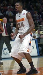
• The super-baggy shorts are ridiculous. I mean, look at Eric Devendorf here — dude looks like he’s playing for the Yeshiva University women’s team. I totally don’t get the tight/baggy dichotomy — seems counterintuitive, counter to Nike’s usual performance-based approach, and predicated on nothing but fashion. Pfeh.
• A confession: Maybe it’s just because I’ve never been a big college hoops guy (I’ve worked out of my home for over a decade, so it’s been a looooong time since I filled out a bracket in an office pool), but I’m actually more intrigued than offended by the possibility of seeing those undershirts, mainly because I think the shirts look kinda cool by themselves.
• Incidentally, if you look at that last Syracuse photo, you’ll see there’s a little logo on the chest. It says, “bSb,” for “Syracuse basketball,” an idea Nike says it borrowed from the first Syracuse basketball logo, created for the team around 1900. The various base layers also supposedly include the notable names from the schools’ past. I appreciate these small nods to history.
• Here’s what I don’t appreciate: On the System of Dress web site, it says the following:
The University of Michigan provided basketball with its most recent change of design direction when a group of freshmen rocketed to the final of the NCAA Tournament with a new look of baggy shorts with black shoes and short socks. Since that debut 15 years ago, basketball’s look has been slow to evolve.
There are so many things wrong with that statement, starting with the implicit assumption that the sport’s look is supposed to change on some sort of schedule. If you look at most sports, you’ll almost never see more than one significant aesthetic change within a 15-year period. The idea that basketball uniforms are somehow running “behind schedule” is a self-serving notion designed to create an air of inevitability around Nike’s new product, and that’s total bullshit. Moreover, the Fab Five developed their look on their own — it was an organic thing, not a bunch of marketing hooey. Comparing something that developed on its own to a huge, calculated promotional campaign is somewhere between disingenuous and offensive.
• Why do the models in all the photos look so unpleasant? Like, couldn’t they smile just occasionally?
Uni Watch News Ticker: Reprinted from yesterday’s comments: Even though the Pats have signed Kyle Brady, QB Tom Brady won’t have to add a “T.” initial to his nameplate. See details near the bottom of this page. … Also reprinted from yesterday: Nomar is doctoring a regular game cap to make it look like a BP cap (here’s the real thing for comparison), an idea he apparently swiped from teammate Jeff Kent. … Still more from yesterday: Smallest nameplate ever? … Underbill update: Looks like Chan Ho Park’s got something written under there. … “During Tuesday night’s CBA basketball game between the Albany Patroons and the Indiana Alley Cats, Albany’s Kwan Johnson had one of his two white sneakers tear,” writes Chuck Miller. “So Kwan switched one shoe, and finished the game with one white shoe and one black.” … Soccer news from Dominic J. Litten: “EPL Talk is reporting that English Premier League team Sheffield United is asking fans to vote on the color/style of their official away kit for next season. And you can vote for the away kit here.” … I recently took part in an e-mail roundtable interview about the distinctions between sports bloggers and “normal” sports journalists — an interesting topic for me, since I sort of operate in both spheres. You can read it here. … David Teigland notes that there was an ad in the Salt Lake Tribune the other day featuring a Harley Davidson hockey uniform. … A few days ago I linked to a photo of the 1978 Colorado Caribous’ fringed jersey. Here’s a closer look, courtesy of Doug Brei. … If you look closely here, you can see that Kenji Johjima is still using that little thingie on the back of his catching helmet (or on the front, depending on how you look at it). … This do-rag thing has really gotten out of hand. … Vlad Guerrero’s helmet pine tar isn’t yet in midseason form. … Good catch by Chris Kurek, who notes that the “J” in Dominic James’s nameplate has a true descender (i.e., the lower part of the letterform dips below the “bottom” the line of type).
Nike has tried this before, sorta. Don’t know how many of you will remember this, but in the late-80s Nike tried out spandex bb unis for a few schools. The uniforms were a one piece singlet-type, similar to wrestlers.
One school I recall was NC State, but the players thought the uniform was a little too “revealing†– if you know what I mean. You could tell if they what they were “packing”. So Nike added shorts for the players to wear over the uni-tard. They wore them once or twice, the players hated them, and they ditched the idea. It was around the time Rodney Monroe and Chris Corchiani were there. I think another school was Seton Hall
“System of Dress.” The getups are indeed nasty, but they’d be tolerable if the name weren’t so damn pompous.
As a Syracuse guy, I like the new uniforms (aside from the too-baggy shorts).
I always disliked how much navy was in their home uniforms (the lettering and numbering was all navy, with traces of orange in the trim), but now I find myself missing the navy. If the numbers and letters were orange with navy outlining, I would love it.
That being said, is it just me, or do the tops look a little too plain? It looks like they need some kind of trim or something.
I’m interested to see how the away jerseys look today (they’re seeded lower than ND, today’s opponent).
I think Marquette basketball has the best name plate font in sports followed closely by Arizona basketball.
The thing with the Fab Five is that it wasn’t some marketing scheme. They were influenced by Michael Jordan and they took his example of baggier shorts to an extreme level (I’m a huge Fab Five fan, and to this day, I don’t feel right if I’m playing basketball and my shorts aren’t close to hitting the calves…so the extra baggy shorts thing doesn’t bother me in the least).
The black socks were the enxt thing they really introduced, that was done during their sophomore year (on their own too…none of the other players on the team initially had the black socks) and I thought that with the black shoes, that looked outstanding.
But the key difference isn’t that they did this as some kind of marketing scheme, they took stuff they liked, stuff they were influenced by, and they made it happen on their own.
I agree with Paul, for Nike to claim it’s following in that spirit in some way is absolutely bullshit.
from the system of dress website:
sorry, forgot to close the tag.
link
but anyways, i thought the NCAA only allowed solid colored undershirts? i know they have all sorts of rules on what can be worn under a jersey, but i just can’t remember.
I imagine the original Syracuse basketball logo looked something similar to link
[quote comment=”59066″]I think Marquette basketball has the best name plate font in sports followed closely by Arizona basketball.[/quote]
Agreed, Marquette’s unifroms are pure class all the way around.
link
hah i finally got it
I think they need to beef up the typeface on HU’s jersey a little to match link
To quote the immortal Nero Wolfe, “Pfui!” I watched most of the game, and didn’t even notice that the ‘Cuse was wearing “new, improved” uniforms! So much for Nike’s attempt to create a “unique” style…
One thing I definately didn’t like about the new unis was the silver/grey uniform numbers. As a basketball radio play-by-play guy, I’m against anything that makes the numbers harder to see and identify. Orange numbers with a blue border would’ve been much better. (I can still remember Keith Jackson waxing poetic when Tennessee added a black stripe around the orange numbers on their white football jerseys… making them much easier to see!)
as far as the black socks go, got a little story for you.
88-89 season, i played jv that year.
it was before the boom of black shoes hit, so everyone on my team had white shoes.
we had an away game, so we had to dress accordingly.
one of my teammates hadnt packed socks to play in, and only had his black dress socks. he was a starter and we decided that it wouldnt look right for him to be the only one with black socks on.
so we all cuffed our black or navy dress socks down to ankle socks and played the game like that.
it became our signature, but it only lasted for the remainder of that season.
oh, and nobody on our team called a timeout when we had none left either…
[quote comment=”59072″]link
hah i finally got it[/quote]
That’s kinda cool.
Sorry to bring up the NFL thing again, but the article only mentions that owners “voted” and “changed” it. That can mean so, so, so many things.
Does it mean we’ll have two BRADYs? Or does it mean that one player can drop his initial? How is that decided? And does it mean the end of full names on the nameplates, in the case of all the Williamses and Johnsons?
[quote comment=”59072″]link
hah i finally got it[/quote]
holy man! if you go to the downloads directory, you’ll find a ton of pics…
link
Ok, the Harley Davidson link is a little much. The whole marketing of Harley Davidson is really on my nerves. I remember when it was badass to drive a Harley. Now I go into Hallmark and they have a whole Harley Davidson section…In Hallmark!!! Now they are marketing to old ladies. Yesterday I stopped in a video store and saw this link. Who the hell thinks this is a good idea? This product blows my mind for many different reasons, one being the fact that it was a very small package and cost $6. Plus it looked like it was made of either road kill or recycled tires.
I apoligize for the non-uni rant but that jersey pushed me over the edge.
Nice link. Unfortunately you can tell who KU’s contract is with.
[quote comment=”59079″]Ok, the Harley Davidson link is a little much. The whole marketing of Harley Davidson is really on my nerves. I remember when it was badass to drive a Harley. Now I go into Hallmark and they have a whole Harley Davidson section…In Hallmark!!! Now they are marketing to old ladies. Yesterday I stopped in a video store and saw this link. Who the hell thinks this is a good idea? This product blows my mind for many different reasons, one being the fact that it was a very small package and cost $6. Plus it looked like it was made of either road kill or recycled tires.
I apoligize for the non-uni rant but that jersey pushed me over the edge.[/quote]
It’s a promotion. Much like the Grand Rapids Griffins’ “Back in Black” AC/DC tribute jerseys, these promo jerseys are meant to appeal to a demographic that may not be interested in hockey, especially since most of these promos come with the caveat “win the jerseys off our backs”. Some go up for auctions to raise money for charity, but most are given away.
I wouldn’t let it get to you, Jill. As I’ve discovered in writing Part 2 of my “You’re Wearing That” piece on my blog, there are more promo jerseys than teams out there.
Marquette appeared to all be wearing new yellow shoes last night in the Big East Tournament.
Here’s Dominic James on Saturday: link
DJ last night in the Big East Tourney: link
Here’s Ousmane Barro in the Yellow shoes: link
[quote comment=”59064″]”System of Dress.” The getups are indeed nasty, but they’d be tolerable if the name weren’t so damn pompous.[/quote]
Slightly off-topic, but a fond memory…
Back in college, the university decided that it could no longer stomach students walking on the grass, but instead of putting signs up that said “Keep off grass” or “Stay on sidewalk,” they decided to put short little signs next to the sidewalk that said “Path of Travel.” The pompous nature of the signs and the fact that overwhelmed, busy (and sometimes stoned) students had to figure out the real meaning (“Wait – if that is the Path of Travel and I am walking on the grass, what does that mean?) made the signs short-lived for the world. They were so ridiculous that they immediately started to adorn dorm rooms and off-campus residences.
I must say how much I enjoy this Watch of Uni. It never ceases to entertain.
Sorry, the one link didn’t work. Let’s try it again.
link
Oh my goodness! My initial reaction to the System of Dress was kind of a yawn with Florida, and then yesterday I watched the ‘Cuse and was slightly impressed. Now that I see those up close pics from todd on here and I am amazed. The names of great players from the past are actually on the bottom of the undershirts! link I don’t care if the pants are too baggy anymore. The name kind of hidden on the shirt, plus i think there are stats on there too, is impressive. Hopefully we will see more of those undershirts in the Big Dance. I hate to say it, but Nike is doing amazing things with these uni’s.
[quote comment=”59082″]Marquette appeared to all be wearing new yellow shoes last night in the Big East Tournament.
Here’s Dominic James on Saturday: link
DJ last night in the Big East Tourney: link
Here’s Ousmane Barro in the Yellow shoes: link[/quote]
Those shoes are part of the link. You’ll notice St. John’s is rocking theirs, also.
The ‘Cuse undershirt that Justin posted is pretty good to show the names. Here is a good one of Florida’s
Names on FL’s unis
And yes… the Florida ones show stats on em.
I think the thing under Chan Ho Park’s hat brim, is sweat, a white salty sweat line (think John Wettland)
Argh! I’m kicking myself! I went to the “Meet the Caps” thing last night and failed to bring my camera! Not having anything for them to autograph, I skipped the lines for the players (although I desperately wanted to ask Brashear about taping the white on this socks), but was fascinated by the locker room tour. I got to see the Ovechkin YELLOW LACES up close and personal (even touch them). AND the yellow lace in his shorts. AND the sticks up close (although no cute drawings on OVI’s).
[quote comment=”59072″]link
hah i finally got it[/quote]
Great catch, and that’s an awesome idea. It gave me a Lawrence Moten high-white socks flashback.
[quote comment=”59080″]Nice link. Unfortunately you can tell who KU’s contract is with.[/quote]
Rocking the KU edition Samoa’s.
link
[quote comment=”59091″][quote comment=”59072″]link
hah i finally got it[/quote]
Great catch, and that’s an awesome idea. It gave me a Lawrence Moten high-white socks flashback.[/quote]
Sorry to quote myself, but I noticed a typo on the shirt. If you zoom in and look all the way to the left of the shirt, about 10 lines up from the waistline it says “44 Danny Shaves”. It’s supposed to be Danny Schayes.
[quote comment=”59086″][quote comment=”59082″]Marquette appeared to all be wearing new yellow shoes last night in the Big East Tournament.
Here’s Dominic James on Saturday: link
DJ last night in the Big East Tourney: link
Here’s Ousmane Barro in the Yellow shoes: link[/quote]
Those shoes are part of the link. You’ll notice St. John’s is rocking theirs, also.[/quote]
although im not a fan of the air force 25, the south florida pe and the pitt pe are some serious heat…
i like how the georgetown one went back to the gray upper,
i loved when they wore the gray and navy terminators in 85-87, and then the air force 2’s in 88
[quote comment=”59087″]The ‘Cuse undershirt that Justin posted is pretty good to show the names. Here is a good one of Florida’s
Names on FL’s unis[/quote]
I think it’s kinda of interesting that they have the names of current players on the undershirts. I know that you can’t buy a jersey with a current player’s name on it (unless you customize it)…so will the sale of those undershirts with current player names on it be permitted??
Also, I like pretty much all of the jerseys (with the exception of a few coloring issues that could easily be resolved) but the shorts are WAY too baggy for the shirts. Yes, they may be comfortable and/or the “in” thing, but with a shirt as tight and form-fitting as that, the uniform package looks ridiculous.
Hell, I actually like the gator print on Florida’s unis.
Did anyone at Nike consider what their “system of dress” will look like when people who aren’t ripped with washboard abs and finely tuned arms start wearing these? Not a pretty picture. But it probably will make the names on the shirts easier to read when they’re stretched out over a nicely sized beer belly. But they don’t make these just so a college team can wear them. It’s all about the retail sales.
[quote comment=”59094″][quote comment=”59086″][quote comment=”59082″]Marquette appeared to all be wearing new yellow shoes last night in the Big East Tournament.
Here’s Dominic James on Saturday: link
DJ last night in the Big East Tourney: link
Here’s Ousmane Barro in the Yellow shoes: link[/quote]
Those shoes are part of the link. You’ll notice St. John’s is rocking theirs, also.[/quote]
although im not a fan of the air force 25, the south florida pe and the pitt pe are some serious heat…
i like how the georgetown one went back to the gray upper,
i loved when they wore the gray and navy terminators in 85-87, and then the air force 2’s in 88[/quote]
I just think its funny that Nike chose to do sneakers in specific school colors for a conference where almost half of the schools wear Adidas (Pitt, ND, Cincy, Louisville, Rutgers, DePaul, Seton Hall).
I also find it interesting that the site shows several jerseys with manufacturer logos on them since they can’t have those logos in games:
link | link | link | link
anyone know anything about gerald wallace wearing what looked like shoulder pads under his jersey against the Suns last night?
Technically, link does not contain a nameplate.
The term “nameplate” only applies when the name letters are attached to a link and then that is the “nameplate” that is attached to the jersey.
I REALLY hated the System of Dress before. But, actually, the Unis are pretty cool. The problem was that all of the pics I had seen had those undershirts. I like the jerseys. The pants are rediculously baggy, but I’ll deal. But, yeah, that name is quite pompous.
Due to its number one status in athletics aesthetics, I don’t think this excellent blog should boycott this new unis debate, wether its author and readers like them or not. After all, it is the biggest story in the biggest event of the moment, having brought a whole culture and society discussion way beyond the limits of sports, as seen in all kind of racist/homophobic comments Uniwatch has been spared so far.
Long-time Phillies coach John Vukovich passed away today and the Phils will wear “Vuk” patches on their uniforms this season.
link
Uni News Dept.:
Longtime Phillies coach/exec link has died at age 59; the team will be wearing a uniform patch this season (scroll halfway down), which I’m assuming has yet to be designed, considering it was only yesterday when they found out he was very sick.
Tie goes to the runner…
The Warriors are wearing their great “The City” throwbacks again. One of the best throwbacks in any sport, I think. The best part (and one I hadn’t noticed before..) is the socks they wear. Check out these pictures!
[quote comment=”59096″]Did anyone at Nike consider what their “system of dress” will look like when people who aren’t ripped with washboard abs and finely tuned arms start wearing these? Not a pretty picture. But it probably will make the names on the shirts easier to read when they’re stretched out over a nicely sized beer belly. But they don’t make these just so a college team can wear them. It’s all about the retail sales.[/quote]
that’s like saying, “Reebok should keep the baggy hockey jerseys so fat people can continue to wear them. who cares about athletic performance, what about the fat people?!”.
I’ll just shake the hand of Billy from Philly. :)
Can we get women’s basketball teams to adopt the tighter fitting jerseys? Then it could be called “System of Soft Porn.”
The Knicks sent an e-mail to season ticket holders today confirming that they will be wearing green unis on Friday, March 16 in honor of St. Patrick’s day.
They will also be selling green beer and green cotton candy at the game.
Paul, it looks like the thing on the back of Kenji Johjima’s helmet may be velcro or something. I’m sure it’s probably used to keep his catcher’s mask in place (and from sliding up or down) when it’s on his head. Any idea if it’s velcro or not?
The world renown Minnesota State High School Hockey Tournament began yesterday, and on day 1, we had our first uniform travesty. If you view the 3rd pic on link page (sorry, it’s a Flash album, I can’t link to the pic directly), you’ll see the goalie for the Hermantown Hawks, Nathan Hardy. Does the gray collar on that jersey remind anybody of link?
I don’t believe I’ll be able to file too much of a report for Day 2… I’ve seen all of the teams playing today and they all have “normal” looking unis.
[quote comment=”59112″]Paul, it looks like the thing on the back of Kenji Johjima’s helmet may be velcro or something. I’m sure it’s probably used to keep his catcher’s mask in place (and from sliding up or down) when it’s on his head.
Any idea if it’s velcro or not?[/quote]
It’s not velcro. It’s a plastic (or maybe rubber) tab that keeps the back of his mask strap in place. Good view from last year link.
[quote comment=”59087″]The ‘Cuse undershirt that Justin posted is pretty good to show the names. Here is a good one of Florida’s
Names on FL’s unis[/quote]
Isn’t it an NCAA violation to sell a product with an players name on it? I notice Joakim Noah, and Al Horford’s names on the undershirt.
That quote from System of Dress that Paul used in the blog…
The University of Michigan provided basketball with its most recent change of design direction when a group of freshmen rocketed to the final of the NCAA Tournament with a new look of baggy shorts with black shoes and short socks. Since that debut 15 years ago, basketball’s look has been slow to evolve.
However, this actually reads like so on the website: “…rocketed to final of the NCAA…” – the “the” is missing. Nike can’t even use correct grammar…
I also share some of Paul’s evolution on the new system of dress. When the first photos came out, all I could focus on were the ridiculously lengthy shorts, which I still think are silly. You don’t need that much freedom of movement for basketball.
The more I look at the shirts, the more I like them. I’m not crazy about the silver strips on the back shoulders, and some of the numbers (like Syracuse’s) almost look reflective, but other than that, it’s pretty ok. As a Buckeye fan, they’re a definite improvement, albeit just a simplification, from the template that everybody seems to be wearing.
Somebody else mentioned it, but I agree that it’s odd that current players are featured on the undershirts. Joakim Noah’s visible on the UF ones, and presumably Oden’s on the Buckeye shirts. I guess they can get away with it because they won’t be at their respective schools for too much longer.
ps – It looks like Florida’s are the only undershirt with stats. My guess is that it’s because they don’t have quite the basketball lineage of the other schools.
[quote comment=”59110″]Can we get women’s basketball teams to adopt the tighter fitting jerseys? Then it could be called “System of Soft Porn.”[/quote]
what? and miss opportunities like this?
link
[quote comment=”59110″]Can we get women’s basketball teams to adopt the tighter fitting jerseys? Then it could be called “System of Soft Porn.”[/quote]
[Trying my best to be polite to the women basketball players] Do you really care to see 95% of the college women players in outfits that tight? They are not exactly built like Anna Kournikova.
todays headline has to be a first…
a 70’s british drama which i remember being shown on pbs…
what’s next? a young ones reference?
VYVYAN!!!!!
Do these new Nike CBB unis remind anyone else of Kentucky’s unis from a few years back that had really small arm and neckholes? Don’t have a pic right now, but I remember them wearing these jerseys, maybe 10 years ago…
Hey, is there any D1 college bball school that doesn’t have logo creep of some sort on their jersey (Nike/adidas/UA/etc. logo)? I know there were a ton in teh 90s, but I can’t think of any right now. Do you know of any?
Not uni-related, but today’s link includes some social commentary about one of Paul’s favourite companies…
Why is the LeBron James logo all over the Ohio State stuff. Wishfull thinking?
ok well i just read the NCAA rules regarding undergarments. Those new nike undershirts are definitely illegal in NCAA play:
Art. 13. An undershirt is considered to be part of the game jersey and must be a color similar to that of the game jersey. In addition, the sleeves and neckline of undershirts shall be unaltered. (e.g., no cut-off sleeves or cut necklines) Both sleeves shall be of the same length and not extend beyond the elbows. No logos, decorations, trim, commemorative patches, lettering or numbering may be used on an undershirt. An illegal undershirt shall not be worn.
also, i know they talked about leggings and such, and I found this:
Art. 14. Undergarments shall not extend below the game pants and shall be similar in color to that of the game pants.
So, basically, any player who actually wore those undershirts in a game would be required to leave the game and not be able to return until they changed/removed it (No techincal fouls, though). This is similar to MLB’s rules on the polka dot undershirts.
[quote comment=”59122″]Do these new Nike CBB unis remind anyone else of Kentucky’s unis from a few years back that had really small arm and neckholes? Don’t have a pic right now, but I remember them wearing these jerseys, maybe 10 years ago…[/quote]
you talking ’bout these?
link
[quote comment=”59124″]Not uni-related, but today’s link includes some social commentary about one of Paul’s favourite companies…[/quote]
“Teal with magnesium trim.”
Hilarious.
[quote comment=”59127″][quote comment=”59122″]Do these new Nike CBB unis remind anyone else of Kentucky’s unis from a few years back that had really small arm and neckholes? Don’t have a pic right now, but I remember them wearing these jerseys, maybe 10 years ago…[/quote]
you talking ’bout these?
link
Yes! It’s been awhile since I’ve seen those. I thought the neckline and armholes were even smaller than that, but I still think that’s the smallest I’ve seen them in a long time, until these new Nikes.
The Las Vegas Wranglers are going with Hawaiian-style sweaters on March 16:
link
[quote comment=”59129″][quote comment=”59127″][quote comment=”59122″]Do these new Nike CBB unis remind anyone else of Kentucky’s unis from a few years back that had really small arm and neckholes? Don’t have a pic right now, but I remember them wearing these jerseys, maybe 10 years ago…[/quote]
you talking ’bout these?
link
Yes! It’s been awhile since I’ve seen those. I thought the neckline and armholes were even smaller than that, but I still think that’s the smallest I’ve seen them in a long time, until these new Nikes.[/quote]
In my opinion, without the undershirts, I kind of like these new Nike unis. I like how Syracuse used the retro stripes they used to have on their unis, I like how Ohio St.’s has the same striping as their football helmets and jerseys, and I like the subtle gator print on Florida’s. In person, these aren’t near as bad as the release a few days ago.
On System of Dress, etc.:
Just thinkin’ out loud: given the evolution to ever-more-expansive pantaloons on BBall players — which I seriously doubt will stop before they’re all wearing full-length Nike-branded skirts — has UniWatch (or one of you intrepid posters) ever probed the depths of where this style really came from: namely, the gangsta-hiphop baggy pants look? Seems to have all kinds of uni-related fallout, e.g., for big-time, macho sports this influence often seems oddly feminine: ballooning pants/shorts, do-rags (or, um, bonnets), the occasional corn-rows. These fashion statements have clearly worked their way into other major sports as well.
I raise this also because the whole trend seems to favor style over function (or certainly will before much longer): won’t those baggy shorts *eventually* slow down players in a sport as lightning-fast as basketball? (I’m waiting for the first time a ball gets lost in those folds.) Won’t baseball players eventually trip over those “pajama pants” rapidly engulfing their shoes? (Maybe one has already — I can hope …)
Not that I’m avocating a return to the “short shorts” days (though obviously I’m with Paul on high baseball socks) — I’m really just curious how long this can go on and whether major sports will continue to take their uni cues from fashion.
Just turned on the Nationals/Astros game, and it looks like Washington is wearing some sort of goofy blue camouflage hats. I’m not sure how to get a screenshot off of MLB.tv, but it’s quite the treat to see.
On the Devendorf picture, it looks like #13 has his number on his shorts. On Devendorf’s shorts he has an orange number, but it isn’t a 2 or 3. Anyone know about this?
Anyone in the DC area happen to be listening to WTOP around 5PM yesterday? I was in my car, so I wasn’t able to transcribe the conversation, but the news jockeys were going over the basketball scores, and when Syracuse’s game was mentioned, an ensuing conversation regarding the new unis unfolded.
Again, I wish I was able to transcribe, but the comments made were definately negative–mainly pointing out that the shorts were just way to baggy.
Back when I played High School basketball, we had shooting shirts with our names on the back. We had a point guard, who’s now playing on a DIII school, with the last name Ho. Made for an interesting time in south Louisiana where we’d play some tiny backwater towns.
We used to make fun of him for his tiny nameplate. Good times.
[quote comment=”59108″][quote comment=”59096″]Did anyone at Nike consider what their “system of dress” will look like when people who aren’t ripped with washboard abs and finely tuned arms start wearing these? Not a pretty picture. But it probably will make the names on the shirts easier to read when they’re stretched out over a nicely sized beer belly. But they don’t make these just so a college team can wear them. It’s all about the retail sales.[/quote]
that’s like saying, “Reebok should keep the baggy hockey jerseys so fat people can continue to wear them. who cares about athletic performance, what about the fat people?!”.[/quote]
Nike isn’t making its $$$ form the schools, the money comes from the fat people whobuy the jerseys. The real issue is that the “performance fabric” is a crock of shit. just like the new baseball hats, they will make the players better, its BS. They want to sell more so they need to change them to try to get the lemmings to buy something they already have just in a slightly different configuration.
[quote comment=”59135″]On the Devendorf picture, it looks like #13 has his number on his shorts. On Devendorf’s shorts he has an orange number, but it isn’t a 2 or 3. Anyone know about this?[/quote]
It’s just the Syracuse block ‘S’. The players’ numbers are on the other leg.
[quote comment=”59135″]On the Devendorf picture, it looks like #13 has his number on his shorts. On Devendorf’s shorts he has an orange number, but it isn’t a 2 or 3. Anyone know about this?[/quote]
the player numbers are on the right “pant” leg, whereas we have a left “pant” leg shot of eric…
[quote comment=”59138″][quote comment=”59108″][quote comment=”59096″]Did anyone at Nike consider what their “system of dress” will look like when people who aren’t ripped with washboard abs and finely tuned arms start wearing these? Not a pretty picture. But it probably will make the names on the shirts easier to read when they’re stretched out over a nicely sized beer belly. But they don’t make these just so a college team can wear them. It’s all about the retail sales.[/quote]
that’s like saying, “Reebok should keep the baggy hockey jerseys so fat people can continue to wear them. who cares about athletic performance, what about the fat people?!”.[/quote]
Nike isn’t making its $$$ form the schools, the money comes from the fat people whobuy the jerseys. The real issue is that the “performance fabric” is a crock of shit. just like the new baseball hats, they will make the players better, its BS. They want to sell more so they need to change them to try to get the lemmings to buy something they already have just in a slightly different configuration.[/quote]
It seems obvious that Nike is just trying to catch a ride on the wave that has brought Under Armor so much success.
A local Dallas sports afternoon talk show, the Hardline, briefly addressed the Diamondbacks’ new colors yesterday. The gruff older host complained that the new red was ugly and not found in nature.
The younger, supposedly hip hosts said that they liked the color, since it fit in with a desert theme. They then remarked that uni talk was stupid anyway, and changed the subject. Grrr.
[quote comment=”59142″]A local Dallas sports afternoon talk show, the Hardline, briefly addressed the Diamondbacks’ new colors yesterday. The gruff older host complained that the new red was ugly and not found in nature.
The younger, supposedly hip hosts said that they liked the color, since it fit in with a desert theme. They then remarked that uni talk was stupid anyway, and changed the subject. Grrr.[/quote]
I listen to The Hardline daily and had it on yesterday when they brought that up about the D-Backs. Luckily the comments were brief and didn’t turn into a whole segment on unis. I love talk radio and The Hardline is a good show, but I know where to go for my uni news, and it’s not the AM dial.
[quote comment=”59114″][quote comment=”59112″]Paul, it looks like the thing on the back of Kenji Johjima’s helmet may be velcro or something. I’m sure it’s probably used to keep his catcher’s mask in place (and from sliding up or down) when it’s on his head.
Any idea if it’s velcro or not?[/quote]
It’s not velcro. It’s a plastic (or maybe rubber) tab that keeps the back of his mask strap in place. Good view from last year link.[/quote]
Interesting pic. I wonder if that’s even his team’s helmet, since I can’t see a logo at all. I’ll be willing to bet my life that Jorge Posada never covers up the NY logo on his helmet!
Michigan State’s Marquise Grey came into the game with an upside-down Nike headband, resulting in an upside-down swoosh.
[quote comment=”59142″]A local Dallas sports afternoon talk show, the Hardline, briefly addressed the Diamondbacks’ new colors yesterday. The gruff older host complained that the new red was ugly and not found in nature.
The younger, supposedly hip hosts said that they liked the color, since it fit in with a desert theme. They then remarked that uni talk was stupid anyway, and changed the subject. Grrr.[/quote]
The gruff guy you speak of has to be Mike Reiner, correct?
And when I first read your post I thought you said a ‘dessert’ theme. I was perplexed – like, they’re dressed up like strawberry shortcakes?
Not really uni related, but I didn’t realize that the spring training grounds crew for the Yankees also did the “YMCA” dance.
link
It looks like “the end of the world as we know it” has been overblown. I think the ‘Cuse uniforms in today’s game look very sharp. And their home uni looked good yesterday.
LET’S GO ORANGE!
[quote comment=”59145″]Michigan State’s Marquise Grey came into the game with an upside-down Nike headband, resulting in an upside-down swoosh.[/quote]
Like your box of Newports?
link
[quote comment=”59129″][quote comment=”59127″][quote comment=”59122″]Do these new Nike CBB unis remind anyone else of Kentucky’s unis from a few years back that had really small arm and neckholes? Don’t have a pic right now, but I remember them wearing these jerseys, maybe 10 years ago…[/quote]
you talking ’bout these?
link
Yes! It’s been awhile since I’ve seen those. I thought the neckline and armholes were even smaller than that, but I still think that’s the smallest I’ve seen them in a long time, until these new Nikes.[/quote]
Yep, the “one-hit wonders” from Kentucky’s first Nike year. I don’t think the players liked the jerseys and they changed to a looser cut jersey the following year (and wore them until they changed to the current style in 2005-2006) – even though they won the NCAA that year and haven’t been back to the Final Four since.
Nothing new under the sun…all “fashions” repeat. Compare…
link vs link
[quote comment=”59133″]Just turned on the Nationals/Astros game, and it looks like Washington is wearing some sort of goofy blue camouflage hats. I’m not sure how to get a screenshot off of MLB.tv, but it’s quite the treat to see.[/quote]
From the Post’s Nats blog:
Panama!
That’s what’s playing on the PA right now. You know, from Van Halen. (Did I mention, too, that it’s Armed Forces Appreciation Day (AFAD) here at HSCS? Well, it is. Wait till you see the pictures or highlights of the Nationals wearing blue camouflage hats. Apparently, if they’re in a lake, they’ll blend right in. They had a helicopter land in center field before the game and three dudes jumped out and one of them threw the first pitch. Col. Steve Kirkpatrick. And when he bounced the pitch in, the PA guy actually said through the speakers so everyone could hear, “It must be helicopter lag.” He’s no Jim Clarke, I tell ya.)
link
is northcarolina getting new uniforms or not
I like the new jerseys across the board, but the shorts really dont match the tighter jersey.
If the players wanted to couldn’t they just wear a smaller size?
[quote comment=”59146″][quote comment=”59142″]A local Dallas sports afternoon talk show, the Hardline, briefly addressed the Diamondbacks’ new colors yesterday. The gruff older host complained that the new red was ugly and not found in nature.
The younger, supposedly hip hosts said that they liked the color, since it fit in with a desert theme. They then remarked that uni talk was stupid anyway, and changed the subject. Grrr.[/quote]
The gruff guy you speak of has to be Mike Reiner, correct?
And when I first read your post I thought you said a ‘dessert’ theme. I was perplexed – like, they’re dressed up like strawberry shortcakes?[/quote]
Yes, Mike Rhyner. I didn’t bother to name him, since everyone from the DFW market would already know to whom I was referring, and no one outside the market would care.
Strawberry shortcakes. That would be funny.
[quote comment=”59154″]is northcarolina getting new uniforms or not[/quote]
god i hope not…
take me back to regular block font letters and numbers too… circa 94
they seriously need to have an alternate set of home and away retro uni’s as well, circa 82 national title and previous.
You can add Arizona to the list of schools wearing the tight-fitting jerseys & uber-bagging shorts. They’re using them vs. Oregon in the Pac 10 tourney.
You fab (fraud) five fans can be as “proud” as you want since:
a) those players got paid while in college
and
b) they never won a single Big10 or ncaa title.
winners indeed.
nor did they invent the baggy shorts look- go back and watch ESPN Classic of the Fighting Illini in 1989. they broke out orange uniforms with baggy shorts, while other teams (indiana) were wearing tighties.
no, those Illini orange shorts weren’t as baggy as today’s model- but they easily began the trend.
(in the big10 at least)
[quote comment=”59074″]To quote the immortal Nero Wolfe, “Pfui!” I watched most of the game, and didn’t even notice that the ‘Cuse was wearing “new, improved” uniforms! So much for Nike’s attempt to create a “unique” style…
One thing I definately didn’t like about the new unis was the silver/grey uniform numbers. As a basketball radio play-by-play guy, I’m against anything that makes the numbers harder to see and identify. Orange numbers with a blue border would’ve been much better. (I can still remember Keith Jackson waxing poetic when Tennessee added a black stripe around the orange numbers on their white football jerseys… making them much easier to see!)[/quote]
Agreed. I also thought the silver accents looked more like strips of duct tape.
Ultimate Logo Creep:
I often read and follow the links to various logo creep spottings. A Bob Huggins pin, a Nike notebook, corporate overload yes, slightly obnoxious, but when I stumbled upon this photo today I simply had to post it. There are a few ways you could look at it I guess, a bad bet perhaps, severe intoxication, slight insanity, anyway you choose to view it, its creepy, super logo creep.
so without further rambling I present what might well be the biggest logo creep of all time:
link
[quote comment=”59150″][quote comment=”59129″][quote comment=”59127″][quote comment=”59122″]Do these new Nike CBB unis remind anyone else of Kentucky’s unis from a few years back that had really small arm and neckholes? Don’t have a pic right now, but I remember them wearing these jerseys, maybe 10 years ago…[/quote]
you talking ’bout these?
link
Yes! It’s been awhile since I’ve seen those. I thought the neckline and armholes were even smaller than that, but I still think that’s the smallest I’ve seen them in a long time, until these new Nikes.[/quote]
Yep, the “one-hit wonders” from Kentucky’s first Nike year. I don’t think the players liked the jerseys and they changed to a looser cut jersey the following year (and wore them until they changed to the current style in 2005-2006) – even though they won the NCAA that year and haven’t been back to the Final Four since.[/quote]
It seems Kentucky, Wake Forest, Purdue among others get new uniforms every season. Is it because of constant tweaks or is it bidding wars between manufacturers that explain all the changes? In the old days (70s) only a few schools such as Marquette were bold enough to change styles on a annual basis.
Post #96 HAS to be Not Safe For Work (since the link is to the BMEzine).
[quote comment=”59133″]Just turned on the Nationals/Astros game, and it looks like Washington is wearing some sort of goofy blue camouflage hats. I’m not sure how to get a screenshot off of MLB.tv, but it’s quite the treat to see.[/quote]
It was “Armed Forces Day” at the park. An Air Force LtCol landed in a copter on the field, went straight to the mound and threw the first pitch.
The hats are an ‘urban-camo’ . They didn’t even get custom sized hats for the day or at least BP expandable general size hats- they all have the velcro straps and opening in the back – can’t find photo of that though
On another note announcers Don Sutton and Bob Carpenter talked about Fick’s stirrups while he was at the plate, Sutton mentioning Fick’s were old school, that they used to call the ones that the Cubs used to wear as “Ankle chokers” because the sanitaries were not even to be showing.
[quote comment=”59162″]It seems Kentucky, Wake Forest, Purdue among others get new uniforms every season.[/quote]
To the best of my knowledge, Purdue has worn the same unis for at least 3 seasons now, and wore their previous design for several years, as well.
Also, in regards to Wake, link was the first image that came to mind for me, for many years, until their recent changes.
probably already covered, but I just noticed that the LA Dodgers have a link for 2007
[quote comment=”59080″]Nice link. Unfortunately you can tell who KU’s contract is with.[/quote]
What socks?
HAHAHAHAHAAAA I love it when people say that!
[quote comment=”59165″][quote comment=”59162″]It seems Kentucky, Wake Forest, Purdue among others get new uniforms every season.[/quote]
To the best of my knowledge, Purdue has worn the same unis for at least 3 seasons now, and wore their previous design for several years, as well.
Also, in regards to Wake, link was the first image that came to mind for me, for many years, until their recent changes.[/quote]
Yes sure, a similar image for Wake over the years – but from Tim Duncan era to the lean years in the late 90s to Josh Howard era to Chris Paul era to today – many subtle changes to font and outlines and trim. I can’t seem to find a site with college uniforms year-by-year.
[quote comment=”59138″][quote comment=”59108″][quote comment=”59096″]Did anyone at Nike consider what their “system of dress” will look like when people who aren’t ripped with washboard abs and finely tuned arms start wearing these? Not a pretty picture. But it probably will make the names on the shirts easier to read when they’re stretched out over a nicely sized beer belly. But they don’t make these just so a college team can wear them. It’s all about the retail sales.[/quote]
that’s like saying, “Reebok should keep the baggy hockey jerseys so fat people can continue to wear them. who cares about athletic performance, what about the fat people?!”.[/quote]
Nike isn’t making its $$$ form the schools, the money comes from the fat people whobuy the jerseys. The real issue is that the “performance fabric” is a crock of shit. just like the new baseball hats, they will make the players better, its BS. They want to sell more so they need to change them to try to get the lemmings to buy something they already have just in a slightly different configuration.[/quote]
So what is it? Is Nike bad for making jerseys too small so that fat people can’t wear them or is Nike bad for making baggy clothes that urban kids and fat people can wear?
Or is Nike bad for not making something that you want to wear?
[quote comment=”59166″]probably already covered, but I just noticed that the LA Dodgers have a link for 2007[/quote]
Looks like they lost the white trim.
[quote comment=”59167″][quote comment=”59080″]Nice link. Unfortunately you can tell who KU’s contract is with.[/quote]
What socks?
HAHAHAHAHAAAA I love it when people say that![/quote]
I like those shoes all day long. Let’s see, what was that old slogan. Die Marke Mit Den Drie Riemen.
[quote comment=”59171″][quote comment=”59166″]probably already covered, but I just noticed that the LA Dodgers have a link for 2007[/quote]
Looks like they lost the white trim.[/quote]
Superb road uniform, LA. No unnecessary outline, good legible font, logo on sleeve.
2 thumbs up to the Dodgers.
Just finished another link. It focusses solely on the Worcester IceCats of the AHL before they became the Worcester Sharks.
Check out the number of different jerseys they wore in their 11 years of existance. There is no word or reason for that kind of lunacy.
Just finished another hockey jersey blog. It focusses solely on the Worcester IceCats of the AHL before they became the Worcester Sharks.
Check out the number of different jerseys they wore in their 11 years of existance. There is no word or reason for that kind of lunacy.
Auctually they moved to Peoria IL. to become the Peoria Rivermen. They were the Springfield(MA.)Indians before moving to Worchester, they are the 4th oldest continually operating hockey franchise behind the Habs, Leafs and Briuns.
[quote]
Or is Nike bad for not making something that you want to wear?[/quote]
nike is bad for many other reasons…
Teebz, the Worcester Fire was a very horrifying tragedy in the city’s history. For years, there has been an outpouring of emotion and donations to help the families of the victims, and for other fire-related charities in the city. Up until a few years ago, the city’s fire headquarters were across the street from the DCU Center.
You also forgot to mention that within days of the tragedy, the team’s jerseys were adorned with the initials “W.F.D.”
Every year the team had a memorial tribute of some sort. I believe the jersey you showed was the only specific one made for that event, aside from a small patch.
Denis Leary was a cousin of one of the fallen firefighters. To this day, he still holds a charity/celebrity hockey game. It was started primarily for the families and charities of the W.F.D., but has since grown to include the Boston and New York Police and Fire Departments.
[quote comment=”59177″]Teebz, the Worcester Fire was a very horrifying tragedy in the city’s history. For years, there has been an outpouring of emotion and donations to help the families of the victims, and for other fire-related charities in the city. Up until a few years ago, the city’s fire headquarters were across the street from the DCU Center.
You also forgot to mention that within days of the tragedy, the team’s jerseys were adorned with the initials “W.F.D.”
Every year the team had a memorial tribute of some sort. I believe the jersey you showed was the only specific one made for that event, aside from a small patch.
Denis Leary was a cousin of one of the fallen firefighters. To this day, he still holds a charity/celebrity hockey game. It was started primarily for the families and charities of the W.F.D., but has since grown to include the Boston and New York Police and Fire Departments.[/quote]
I didn’t know that. There was no mention on any of the websites that I was on. I’ll make an adjustment for that right now.
And Duke? I’ll make changes for your info too.
It’s funny how people leave these glaring details out of the story when talking about “their team”.
Thanks for your help, guys. I live nowhere near Worcester, Mass, and was unaware of the IceCats history. :o) I gave you both a credit on the blog.
[quote comment=”59163″]Post #96 HAS to be Not Safe For Work (since the link is to the BMEzine).[/quote]
Not true, like people always say shouldn’t judge at link by its URL.
Hey guys, check out this uniform from Golden West High School which is also out of Visalia, California. I think Paul would like these socks.
link
I’m watching the Panthers/Flyers game and (don’t know why this didn’t jump out at me earlier) Martin Biron still hasn’t painted his mask since being traded.
No problems, Teebz.
Here’s some more info about the fire:
link
Not sure if this has been posted here before. Lots of great unis in link, which is basically a montage of deadball-era photographs.
[quote comment=”59086″][quote comment=”59082″]Marquette appeared to all be wearing new yellow shoes last night in the Big East Tournament.
Here’s Dominic James on Saturday: link
DJ last night in the Big East Tourney: link
Here’s Ousmane Barro in the Yellow shoes: link[/quote]
Those shoes are part of the link. You’ll notice St. John’s is rocking theirs, also.[/quote]
Can Players from the Adidas sponsored school wear those shoes???
I must admit that I think Nike did a good job with these uniforms…. I thought I read an article that said the under layers weren’t ready yet… but should be on the court just in time for the big dance (It’s a miracle) lol…..
[quote comment=”59166″]probably already covered, but I just noticed that the LA Dodgers have a link for 2007[/quote]
Technically, they also have a new home uni. They lost the white trim on the back numbers there as well.
I have no evidence as to what hat size nomar and jeff kent and the others who are wearing painted regular season hats this spring are but i wear a size 8 cap, and those hats- offered in s,m,l never ever fit me. Which is fine, cuz those are some ugly ass hats.
[quote comment=”59113″]The world renown Minnesota State High School Hockey Tournament began yesterday, and on day 1, we had our first uniform travesty. If you view the 3rd pic on link page (sorry, it’s a Flash album, I can’t link to the pic directly), you’ll see the goalie for the Hermantown Hawks, Nathan Hardy. Does the gray collar on that jersey remind anybody of link?
I don’t believe I’ll be able to file too much of a report for Day 2… I’ve seen all of the teams playing today and they all have “normal” looking unis.[/quote]
Natron, I disagree about today. I did not like the two green teams playing today: Hill-Murray and Edina. Borrowing from your link, link are the pics. The first five pictures are of HM. The pics don’t do justice to how bright the green is on HDTV. Look at how sharp Rochester Century is, then look at HM.
Ok. They don’t have the Edina pics up yet, but you can see a fan in the background link wearing a jersey. Also notice how nice Grand Rapids looks.
I will post pics tomorrow of Edina, but they basically look like HM with white pants instead of black. There is justice, however, as both the green teams lost to unseeded teams.
After all the hoo-ha about the new Nike unis, I was gearing up to really, really hate them. Perhaps, on the flip side, I might have really, really dug them if Nike got creative for once. Instead, I…could not care less.
Teebz, keep up the good work. I am loving the hockey unis knowledge.
Jill, don’t freak because Harley Davidson became more mainstream ages ago. They have stuffed pigs, you know, decked out in Harley gear. It was bound to happen once the baby boomers started experiencing midlife crises and using riding as an escape/relief.
im watching the washington washington state basketball game on FSN, and the cameras just panned to a washington cheerleaders after a made basket with about 3:00 left in the 1st half and i noticed that she was a bit “huskier” (sorry couldn’t resist) than the other cheerleaders, also the big girl had a top that went all the way to her skirt whereas the others had an opening in the midesction where you could see their stomachs, is this common anywhere else? i know i havent seen it outside of high school here in alabama. it would be awesome if someone could find a screenshot of this.
link appears to have the wrong number on his shorts. Also why is his short number orange while the other guy’s is grey?
[quote comment=”59223″]link appears to have the wrong number on his shorts. Also why is his short number orange while the other guy’s is grey?[/quote]
that’s not a number, it’s his orange “S” his number is on the other side
The new Chargers’ uniform leaked on their webpage – link
hey – check out Sir Jock Stirrup’s uni!
link
UNLV is wearing a different home uni tonight. Looks like a throwback from national champs.