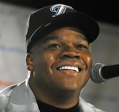
A crummy design is bad enough, but a missed opportunity is even worse. The Blue Jays managed to combine the two yesterday, when they introduced newly signed bopper Frank Thomas to the media and used the occasion to unveil their new alternate cap.
And man, is it a stinker. Like, is that the lamest “T” ever or what? It looks like a seagull swooping down to take a dump, and it doesn’t even match the “T” on the team’s road jersey. More importantly, everyone’s been saying for years that it’d be nice if the Blue Jays actually had some blue in their color scheme again, so this was a great chance to introduce a cerulean chapeau. But no, they had to go with black (which created a particularly blinding contrast with the Big Hurt’s bleached white teeth). What a waste.
Meanwhile, there was some uni watchery from the press corps, as a reporter alertly noted that Thomas’s new jersey featured uni No. 35 (the same number he wore during his stints in Chicago and Oakland), which until yesterday belonged to Lyle Overbay. Turns out Thomas and Overbay had already discussed this: “He said he’s open to changes with the number,” said Thomas. “He started with 11 and he said he might go to 11. I’m going to do something special for him.” Someone should inform Thomas that Overbay actually started with No. 23 during his Dbacks days, although he did indeed wear 11 when he moved to the Brewers. For now, he’s listed with no number on the Toronto roster.
Incidentally, while looking for old photos of Thomas, I came across this shot, from his days at Auburn. Check out the “A” logo on the sleeve!
This Space for Sale: As you can see, we now have display ads, which of course means Johnny Ek and I are now counting our millions while sipping cocktails on the French Riviera. Excellent wireless service out here, I’m happy to report, and my laptop hasn’t fallen in the pool even once. Only problem is, there’s nothing on the TV except soccer. Sigh.
More seriously, I can personally vouch for every one of our initial display advertisers: Helmet Hut, run by gridiron historian Curtis Worrell (one of the most knowledgeable and nicest people I’ve ever encountered on the uni beat), is a longtime Uni Watch favorite, with a dynamite array of football helmet reproductions that are true to the original detailing in every respect; Distant Replays sells a broad range of high-quality uni-related apparel that should appeal to any retro-minded fan; and Superba Graphics is the home of our own Scott M.X. Turner, who designed the Uni Watch logo. I hope you’ll check out all these fine sponsors and consider them for your holiday shopping needs.
Speaking of which: We’ll soon have a slew of new Uni Watch merch available for sale, including travel mugs, trucker’s caps, tote bags, and flip-flops. Okay, maybe not flip-flops. These new products will all be available with a choice of two designs: the primary Uni Watch logo, as seen at the top of this page, and this logo. Our previous merch — T-shirts, coffee mugs, and stamps — will be available with this second logo as well. More details on this soon.
This Space for Free: Distant Replays is going the extra mile by donating a $200 gift card to their site, which they’ve asked me to raffle off. Pretty cool, right? Here’s how we’re gonna do it: Tomorrow I’m going to present a uni-centric quiz, along with an e-mail address where you can submit your answers. The 10 people with the most correct answers will have their names put into a hat (or, actually, a Green Bay Packers reproduction helmet, made by Helmet Hut), and then I’ll select the winner. More on all of that tomorrow.
Uni Watch News Ticker: Good view here of Charles Woodson’s leg warmer look from Monday night. … Nice gallery of Philly-area game-worn hockey jerseys here (with thanks to Chris Ashworth). … The Ben Wallace headband story keeps getting stupider. … On Monday I linked to this New York Times article about the brisk sales of Pat Tillman jerseys. But apparently the Times had run a column suggesting sluggish Tillman sales just a few days earlier. Amusing details here. (With thanks to Uni Watch librarian/publicist Carrie Klein.) … Research question: Who is this? I think it’s John Dunlap, but his uni number isn’t clear enough for me to be sure. I know somebody linked to another photo of this player — presumably including a clear view of his number — a few days ago in the Comments section, but I can’t find it now. Little help..? … Yesterday it was Tom, today it’s Dick. Can Harry be far behind? … Mega-thanks to the many readers who rang the cash register in response to yesterday’s call for temporary tattoo purchases (read: donations). We truly appreciate your support.
Paul, the first hour of work each morning is a real struggle. That is, until your column hits at around 9. Thanks for being there and for being as obsessive as I only thought I could be. I need to get some hints out to loved ones about your merch. Great gift ideas. Thanks.
Paul, is this what you were looking for in regards to your research question?
(Sorry, your link won’t work for me, I think accfootballphotos is down temporarily).
If so, that is definitely John Dunlap.
That T looks like it’s from apackage of cookies or something.
A list of best uniforms that does not include the cardinals bird on the bat and does include the freaking detroit lions? Ugh.
Random comment:
I think that Paul should host a uni-centric Secret Santa here. I don’t know how many people would be interested, but it might be fun.
link
#13: “The fall colors shout “pigskin” while the helmet is a minimalist masterpiece that conveys the team’s name.”
Conveys the team’s name?!? The helmet is orange the team name is the Browns! I’m not dissin’ the uni, but the logic is a little off-base.
RE: The SI best dressed list. I live in Michigan so I’m prejudiced, but to include the Lions (fire Millen) and not the Tigers?!? Other than that, it’s a good list.
Does the new Toronto Blue Jay hat have a T or a J on it? I was unsure looking at it …
A little while back there was much to be made of college teams entering “Nike World” with their new uni designs. Duke was on that list. However, last night, during the (insert sponsor here) ACC/Big Ten Challenge, Duke was wearing their classic unis for days gone by. Does anyone have any screen caps? They were nice to see, and I hope they stay.
FWIW, I love the site, and a few family member will be recieving Uniwatch tshirts and coffee mugs this holiday season…even if they have no idea what it’s all about. Keep up the great work!
The new ads cover up quite a bit of the main page banner logo when I view the site with Firefox (1.58 or 2.0.. same in each) but they sit up above the logo (as they should with IE. Just a coding quirk I suppose and not a big deal but I thought I should mention it. Anyone else seeing this?
I noticed the inclusion of the Lions and the exclusion of the Tigers on the SI list, and it perplexed me, too. I do think the Lions are fairly well-dressed, but I was surprised to see them there without the Tigers. Oh, and I do very much agree with the Wings’ inclusion.
Speaking of which, something caught my eye in the Wings picture. Is the link wearing a red Under Armour hat? It was nice to him to match his UA apparel to his Wings jersey.
[quote comment=”25354″]The new ads cover up quite a bit of the main page banner logo when I view the site with Firefox (1.58 or 2.0.. same in each) but they sit up above the logo (as they should with IE. Just a coding quirk I suppose and not a big deal but I thought I should mention it. Anyone else seeing this?[/quote]
FYI, it looks fine using the latest version of Netscape.
I’ve already commented on the Jays outfits and new cap yesterday. Bufugly!
Take a lesson from the classy Cardinals uniforms (except the navy cap with red undershirts and socks) and do something along those lines w/ a blue-colored bird and voila!
The Toronto “T” looks more like an incomplete “F”.
[quote comment=”25354″]The new ads cover up quite a bit of the main page banner logo when I view the site with Firefox (1.58 or 2.0.. same in each) but they sit up above the logo (as they should with IE. Just a coding quirk I suppose and not a big deal but I thought I should mention it. Anyone else seeing this?[/quote]
I’m using Safari on a Mac and the logos cover most of the banner as well.
And I don’t even know where to begin on the link used to add support for this poor girl.
[quote comment=”25341″]Paul, is link what you were looking for in regards to your research question?
(Sorry, your link won’t work for me, I think accfootballphotos is down temporarily).
If so, that is definitely John Dunlap.[/quote]
Yes, that’s the one I was thinking of. And double-yes, now I can see that it’s Dunlap. Thanks!!
I noticed this while watching the Blues v. Sharks game last night. I have never seen skates like link, worn by Marcel Goc. They have several spaces in the tuuk chassis, rather than the link.
[quote comment=”25361″]I noticed this while watching the Blues v. Sharks game last night. I have never seen skates like link, worn by Marcel Goc. They have several spaces in the tuuk chassis, rather than the link.[/quote]
Sorry, let me fix that second link.
[quote comment=”25356″]The new ads cover up quite a bit of the main page banner logo when I view the site with Firefox (1.58 or 2.0.. same in each) but they sit up above the logo (as they should with IE. Just a coding quirk I suppose and not a big deal but I thought I should mention it. Anyone else seeing this?[/quote]
If the ads don’t look right, refresh your screen — that should take care of it. If not, let me know.
[quote comment=”25354″]The new ads cover up quite a bit of the main page banner logo when I view the site with Firefox (1.58 or 2.0.. same in each) but they sit up above the logo (as they should with IE. Just a coding quirk I suppose and not a big deal but I thought I should mention it. Anyone else seeing this?[/quote]
I have IE 6.0 and the ads overlap most of the UNIWATCH banner.
I’m using FFX 2.0 and the banner ads are up top.
Duke One.
Duke Two.
just hit refresh a couple times and the ads will fix themselves…
[quote comment=”25353″]A little while back there was much to be made of college teams entering “Nike World” with their new uni designs. Duke was on that list. However, last night, during the (insert sponsor here) ACC/Big Ten Challenge, Duke was wearing their classic unis for days gone by. Does anyone have any screen caps? They were nice to see, and I hope they stay.
FWIW, I love the site, and a few family member will be recieving Uniwatch tshirts and coffee mugs this holiday season…even if they have no idea what it’s all about. Keep up the great work![/quote]
The Duke jerseys with the new Nike stripes are alternates, like we discussed when the story first broke. Last night, they wore their link against Indiana.
Those aren’t Tuuk holders, there called T-blades. They’re just a different kind of holder
link
link
i dont know who watched duke/indiana last night
(or who has seen the movie “blue chips” with shaq and penny)
but watching guard errek suhr wear #11 for the hoosiers last night, along with the way he played and moved, looked exactly like what bobby hurley looked like when he played for the hoosiers in the movie.
Is it just me, or does that new Jays cap look a lot like this one, minus the bird’s face?
link
Comparing the T and the J, it appears that someone took the laziest way out of designing a logo and just made the J into a T. Alternate caps require alternate logos… not some half-assed effort in “re-design”.
Even if last night’s Duke jerseys didn’t have the nike world neck accents, they are still hardly jerseys from the bygone era. They made sure to have black trim on all jerseys, including the home jersey. Oh, how I long for the blue-and-white.
Anyone having problems with the way the ads are displayed should refresh a few times and it should be okay.
I ran checks on safari, firefox, opera and IE on OS/X, XP and RedHat and everything was fine. Let me know if that isn’t the case…
Frank wore #79 at Auburn.
[quote comment=”25344″]A list of best uniforms that does not include the cardinals bird on the bat and does include the freaking detroit lions? Ugh.[/quote]
AMEN!!! plus the list could have been at least twice as long
[quote comment=”25347″]link
#13: “The fall colors shout “pigskin” while the helmet is a minimalist masterpiece that conveys the team’s name.”
Conveys the team’s name?!? The helmet is orange the team name is the Browns! I’m not dissin’ the uni, but the logic is a little off-base.[/quote]
HAHAHA!!! That is hilarious…I didn’t even catch that…oh man that’s a riot
That T looks like something I’d imagine would be on the hat for the Tidewater Tides. What the hell does it have to do with Toronto Blue Jays?
I like the list, though I would prefer the Canadiens and Wings in white, and for gosh sakes put the Steelers in black!
From link, confirmation that the Jays have done away with their grey caps and will alternate the new and old black models.
From the Toronto Star:
“The players like the black caps and fans buy the black caps,” president and CEO Paul Godfrey said. “Those are two of our most important stakeholders.”
[quote comment=”25347″]link
#13: “The fall colors shout “pigskin” while the helmet is a minimalist masterpiece that conveys the team’s name.”
Conveys the team’s name?!? The helmet is orange the team name is the Browns! I’m not dissin’ the uni, but the logic is a little off-base.[/quote]
My thoughts EXACTLY. Also, wehn I saw the list and saw that the Lions were included…I knew that the majority of Uni Watch readers would disagree.
And, personally, I just don’t throw the Knicks into the “Best Pro Uniforms” category.
[quote comment=”25362″][quote comment=”25361″]I noticed this while watching the Blues v. Sharks game last night. I have never seen skates like link, worn by Marcel Goc. They have several spaces in the tuuk chassis, rather than the link.[/quote]
Sorry, let me fix that second link.[/quote]
Yes, those are called T-blades. They are big in Europe and while they seemed to be getting more popular here in Canada a couple of years ago, they seem to have slumped a bit as of late. Basically, once the holder has been chaged to a T-blade holder, you can then go to the store and by replacement blades that come in a variety of level of sharpnes and also different pitches depending on your skating style. The metal that they are made of is ultra-hard, so they aren’t resharpened like tradiitonal blades. However, after a while they do need to be replaced, so you can just buy another pair of blades and screw them on.
About the Tillman jersey sales. The problem was the guy went into a store in NYC and not Arizona. I bet any store in AZ has a Tillman jersey hanging somewhere for purchase. I bet I could go into almost any Champs, Finish Line, Olympia or whatever around here and not find a Reggie Bush jersey for sale, or a few of the other best sellers, not sure what the rest of the top ten is.
Online sales also count for a huge chunk of jersey sales in the NFL. I know I got my Tillman jersey from nflshop.com. A portion of online sales for the Tillman jersey were going to link. I’m not sure if that’s still the case but it was right after his death. So a lot of people may have been buying them online to help out that cause as well.
Yesterday it was Tom, today it’s Dick. Can Harry be far behind? … SI.com Best Dressed List.
If you don’t have the Chicago Blackhawks identity near the top of your best dressed list then you have no best dressed list to discuss. Great color, great crest, great secondary logo and equally cool home and road uniforms…what uniforms did Wayne and Garth find cool enough to wear in “Wayne’s World”…
Oxcellent…
SI sucks…
[quote comment=”25382″]That T looks like something I’d imagine would be on the hat for the Tidewater Tides. What the hell does it have to do with Toronto Blue Jays?[/quote]
It does look very similar to the link
[quote comment=”25387″][quote comment=”25362″][quote comment=”25361″]I noticed this while watching the Blues v. Sharks game last night. I have never seen skates like link, worn by Marcel Goc. They have several spaces in the tuuk chassis, rather than the link.[/quote]
Sorry, let me fix that second link.[/quote]
Yes, those are called T-blades. They are big in Europe and while they seemed to be getting more popular here in Canada a couple of years ago, they seem to have slumped a bit as of late. Basically, once the holder has been chaged to a T-blade holder, you can then go to the store and by replacement blades that come in a variety of level of sharpnes and also different pitches depending on your skating style. The metal that they are made of is ultra-hard, so they aren’t resharpened like tradiitonal blades. However, after a while they do need to be replaced, so you can just buy another pair of blades and screw them on.[/quote]
Those are definately link mounted on a pair of Graf skates. I thought they couldv’e been the new link the skates Goc has on are definately link
[quote comment=”25392″][quote comment=”25382″]That T looks like something I’d imagine would be on the hat for the Tidewater Tides. What the hell does it have to do with Toronto Blue Jays?[/quote]
It does look very similar to the link[/quote]
Or is that just one big link for the top stroke of the “T”?
[quote comment=”25386″][quote comment=”25347″]
And, personally, I just don’t throw the Knicks into the “Best Pro Uniforms” category.[/quote]
Agreed, especially the new design with the big diamond shaped thing-a-ma-bob on the shorts. link Knicks uniforms were classic. link could even be considered “best dressed.” but those link just don’t scream “classic” to me anymore. I think it’s the side striping.
[quote comment=”25391″]Yesterday it was Tom, today it’s Dick. Can Harry be far behind? … SI.com Best Dressed List.
If you don’t have the Chicago Blackhawks identity near the top of your best dressed list then you have no best dressed list to discuss. Great color, great crest, great secondary logo and equally cool home and road uniforms…what uniforms did Wayne and Garth find cool enough to wear in “Wayne’s World”…
Oxcellent…
SI sucks…[/quote]
I agree that the Blackhawks are significantly better dressed than some of those teams, and with the fact that the Tigers are better dressed than the Lions. Both of the lists are fairly off, but hey, that’s why opinion columns are what they are, just conjecture. At least Paul gives us the reasons behind his opinions and is fairly consistent across the board.
Paul your co-worker at Page 2 called the Brown’s unis hideous
Not naming names but the article is link
damn screwed up the quote thing.
[quote comment=”25397″][quote comment=”25386″]Agreed, especially the new design with the big diamond shaped thing-a-ma-bob on the shorts. link Knicks uniforms were classic. link could even be considered “best dressed.” but those link just don’t scream “classic” to me anymore. I think it’s the side striping.[/quote]
Totally, the Patrick Ewing Knicks had MUCH better unis that the current versions.
[quote comment=”25401″][quote comment=”25397″][quote comment=”25386″]Agreed, especially the new design with the big diamond shaped thing-a-ma-bob on the shorts. link Knicks uniforms were classic. link could even be considered “best dressed.” but those link just don’t scream “classic” to me anymore. I think it’s the side striping.[/quote]
Totally, the Patrick Ewing Knicks had MUCH better unis that the current versions.[/quote]
Well, except for the time they added the link link link down the side. That was downright awful.
Heads up UniWatchers. Here’s serious tattoo money.
Lot 821.
1970-71 Bobby Orr Game Worn Bruins Road Jersey
Reserve: $25,000
Number of Bids: 17
Final Bid :$134,977.30 (huh?)
Lot 821.
1970-71 Bobby Orr Game Worn Bruins Road Jersey
Reserve: $25,000
Number of Bids: 17
Final Bid: $179,654.79 (whoa?)
link
How pissed is Bobby Orr that the Bruins didn’t have an alternate road uniform back then, even the infamous ugly yellow bear crest jersey???
WOW!!! He shoots, he scores!!!!!
[quote comment=”25393″][quote comment=”25387″][quote comment=”25362″][quote comment=”25361″]I noticed this while watching the Blues v. Sharks game last night. I have never seen skates like link, worn by Marcel Goc. They have several spaces in the tuuk chassis, rather than the link.[/quote]
Sorry, let me fix that second link.[/quote]
Yes, those are called T-blades. They are big in Europe and while they seemed to be getting more popular here in Canada a couple of years ago, they seem to have slumped a bit as of late. Basically, once the holder has been chaged to a T-blade holder, you can then go to the store and by replacement blades that come in a variety of level of sharpnes and also different pitches depending on your skating style. The metal that they are made of is ultra-hard, so they aren’t resharpened like tradiitonal blades. However, after a while they do need to be replaced, so you can just buy another pair of blades and screw them on.[/quote]
Those are definately link mounted on a pair of Graf skates. I thought they couldv’e been the new link the skates Goc has on are definately link[/quote]
wow! and this whole time i thought he was skating on a pair of brass knuckles!
link
On the subject of hockey equipment. Check out Buccigross’ latest installation of his consistantly incredible hockey column. 3/4 of the way down, next to a photo of link is a letter concerning Colin Campbell, NHL VP, and the debate over equipment doing more harm than good in a contact sport. I am interested to see if the league will restrict the use of hard plastics in upper body pads.
If this seems off the topic of UNI’s, I theorize that if you get rid of the huge, bulky pads. You can get the link without tucking the jersey into the pants.
link
By Melrose’s Mullet, It refuses to link!
[quote comment=”25364″][quote comment=”25354″]The new ads cover up quite a bit of the main page banner logo when I view the site with Firefox (1.58 or 2.0.. same in each) but they sit up above the logo (as they should with IE. Just a coding quirk I suppose and not a big deal but I thought I should mention it. Anyone else seeing this?[/quote]
I have IE 6.0 and the ads overlap most of the UNIWATCH banner.[/quote]
The ads look fine for me now (on IE). I’m not sure if you did something, or if it just took multiple refreshes.
Ok… we all hate nike, but you just gotta love link.
Hey Paul,
I posted the link link a few weeks back. Here link are again. Glad you remembered them!
[quote comment=”25411″]Ok… we all hate nike, but you just gotta love link.[/quote]
viral marketing at its best
[quote comment=”25402″]Well, except for the time they added the link link link down the side. That was downright awful.[/quote]
AHHHHHHHH!!!!!! I don’t remember those. Now I’m going to need therapy. Seriously, why do people think that just throwing some black into a team’s color-scheme makes it all better?!
check out this link it explains why Rick Peterson, the Mets pitching coach always wears a jacket. I guess he always wears it because he stores pens, notebooks, clickers and other equipment he uses during a game in it
[quote comment=”25373″]i dont know who watched duke/indiana last night
(or who has seen the movie “blue chips” with shaq and penny)
but watching guard errek suhr wear #11 for the hoosiers last night, along with the way he played and moved, looked exactly like what bobby hurley looked like when he played for the hoosiers in the movie.[/quote]
Errek Suhr is the epitome of what makes college basketball superior to the NBA. Here is a guy who leaves it all on the floor whether he gets 25 minutes or 2 minutes. He plays like he cares and, as an IU fan, I love him for it. (Don’t get me wrong, I like D.J. White, too, but this season is it for Suhr and D.J. has bigger fish to fry.)
Someone noted Duke went with their classic look in the game and, while I agree Duke-IU was an aesthetically pleasing matchup, I don’t remember black trim on old-school Duke jerseys. Nevertheless, I can live with the modest amount of black on that outfit.
And finally, I’ve mentioned this on other comments, but I again invite everyone in Uni-World to give it up for IU’s candy-striped warmup pants. It’s a classic look that no other team (that I’m aware of) wears and it defines IU such that the there’s a whole line of apparel at the gift shop oriented around the “Stripes.”
[quote comment=”25411″]Ok… we all hate nike, but you just gotta love link.[/quote]
please dont say things like “we all…”
a. i dont hate nike (in fact its all i buy and have bought for the last 20 years)
b. purple doesnt bother me
c. i really dig football’s monochromatic pant/jersey combos (color dependent of course)
d. i like the long baseball pants look
Paul, why is the stirrup in the link a vertically mirrored image of the link stirrup?
[quote comment=”25417″][quote comment=”25411″]Ok… we all hate nike, but you just gotta love link.[/quote]
please dont say things like “we all…”
a. i dont hate nike (in fact its all i buy and have bought for the last 20 years)
b. purple doesnt bother me
c. i really dig football’s monochromatic pant/jersey combos (color dependent of course)
d. i like the long baseball pants look[/quote]
Hey krvanch, i agree with you. I like Nike products. They are well made and have lasted for me for a long time. I too like the long pants look in baseball and monochramatic look depends on the jersey color, but purple does bother me when used as a main jersey color, as an accent color it doesn’t bother me (i.e. Clemson, LA Lakers home jersey or alternate, or LSU).
[quote comment=”25416″][quote comment=”25373″]i dont know who watched duke/indiana last night
(or who has seen the movie “blue chips” with shaq and penny)
but watching guard errek suhr wear #11 for the hoosiers last night, along with the way he played and moved, looked exactly like what bobby hurley looked like when he played for the hoosiers in the movie.[/quote]
Errek Suhr is the epitome of what makes college basketball superior to the NBA. Here is a guy who leaves it all on the floor whether he gets 25 minutes or 2 minutes. He plays like he cares and, as an IU fan, I love him for it. (Don’t get me wrong, I like D.J. White, too, but this season is it for Suhr and D.J. has bigger fish to fry.)[/quote]
totally agree terry, just from watching the game last night, and listening to his story of finally getting a scholly, he is the epitome of athletic persistence. he is the guy you want your son/daughter to watch to define basketball effort and getting the most out of the tools you were given (i guarantee he practices the same way he plays)
as a carolina guy, you all can understand of my historic and never ending disgust towards dook. but it was a nice scene though to see krzyzewski hug suhr at the end of the game. it has to be the highest of compliments to your game to have the opposing coach embrace you as though to say, “i would have you on my team any day of the week.”
[quote comment=”25417″][quote comment=”25411″]Ok… we all hate nike, but you just gotta love link.[/quote]
please dont say things like “we all…”
a. i dont hate nike (in fact its all i buy and have bought for the last 20 years)
b. purple doesnt bother me
c. i really dig football’s monochromatic pant/jersey combos (color dependent of course)
d. i like the long baseball pants look[/quote]
Todd,
I think that you took the comment “we all hate nike” a little to personal. I beleive that it is not a fact that we “hate” nike as much as it is that we “hate” how the have turn the uniforms into billboards. Nobody has ever said that their products are no good or that you have to buy exclusivy (sp?) from adidas to be a uni-watch reader. Nike is really the first company that plastered as many logos as they can on to the uniform and that is the problem that most of us have. I think don’t think Vince meant that in any other way.
I think link should be addressed before something like the headband fiasco. At least Wallace’s accessories match his uni, Woodson is wearing blacked out shoes (the Packers wear white) and no white on the socks. That is what is defined as alterting the uniform. He should be fined. Heavily
Yes, those are called T-blades. They are big in Europe and while they seemed to be getting more popular here in Canada a couple of years ago, they seem to have slumped a bit as of late.
Ya, they were a new fad, but a lot of players have foouind it tricky to find replacements, and the actual skates are quite loud when you’re skating. Might be a minor pint, but it’s strange to hear so much noise coming fom a guy’s skates.
Those are definately link mounted on a pair of Graf skates. I thought they couldv’e been the new link the skates Goc has on are definately link[/quote]
Graf has offered the T-blades ontheir high-end skates for about 4 years now. Graf used to use Tuuk holders, but around the same time as the T-blades, they introduced tehir own holders, called “Cobras”. I’m not a huge fan It’e easy to replace blades, but I’ve broken more blades in them than all other skates combined. When you break one, you need to get two, and start rockering from scratch. Grr…
link
[quote comment=”25418″]Paul, why is the stirrup in the link a vertically mirrored image of the link stirrup?[/quote]
Cuz we didn’t have anything to hang it off of, and we thought it would be good to put it right-side up, instead of upside-down. Yeah, it’s kinda “floating,” but I like how it looks.
[quote comment=”25411″]Ok… we all hate nike, but you just gotta love link.[/quote]
Awesome, that’s all I can say…can’t wait to see more
[quote comment=”25421″][quote comment=”25417″][quote comment=”25411″]Ok… we all hate nike, but you just gotta love link.[/quote]
please dont say things like “we all…”
a. i dont hate nike (in fact its all i buy and have bought for the last 20 years)
b. purple doesnt bother me
c. i really dig football’s monochromatic pant/jersey combos (color dependent of course)
d. i like the long baseball pants look[/quote]
Todd,
I think that you took the comment “we all hate nike” a little to personal. I beleive that it is not a fact that we “hate” nike as much as it is that we “hate” how the have turn the uniforms into billboards. Nobody has ever said that their products are no good or that you have to buy exclusivy (sp?) from adidas to be a uni-watch reader.
Nike is really the first company that plastered as many logos as they can on to the uniform and that is the problem that most of us have. I think don’t think Vince meant that in any other way.[/quote]
Ok… I appologize. I didn’t mean to group everyone together. Let’s pretend I said this:
Ok… I hate nike, and I know that many others share my disdain, but love ’em or leave ’em, you gotta love link.
I think my favorite is the jell-o
Riff just noticed this too…
How does Woodson get away with wearing black shoes when the rest of the team wears white shoes?
[quote comment=”25429″]Riff just noticed this too…
How does Woodson get away with wearing black shoes when the rest of the team wears white shoes?[/quote]
It looks like his ankles are spatted and just the toes of the cleats are black…there is some white showing in the picture Riff referenced
[quote comment=”25421″][quote comment=”25417″][quote comment=”25411″]Ok… we all hate nike, but you just gotta love link.[/quote]
please dont say things like “we all…”
a. i dont hate nike (in fact its all i buy and have bought for the last 20 years)
b. purple doesnt bother me
c. i really dig football’s monochromatic pant/jersey combos (color dependent of course)
d. i like the long baseball pants look[/quote]
Todd,
I think that you took the comment “we all hate nike” a little to personal. I beleive that it is not a fact that we “hate” nike as much as it is that we “hate” how the have turn the uniforms into billboards. Nobody has ever said that their products are no good or that you have to buy exclusivy (sp?) from adidas to be a uni-watch reader.
Nike is really the first company that plastered as many logos as they can on to the uniform and that is the problem that most of us have. I think don’t think Vince meant that in any other way.[/quote]
no, not at all. i just disagree with the “we” part. it implies that all readers subscribe to the same philosophy. i have no problem with the way nike brands their products (or any other manufacturer), or nike products at all. i just think that sometimes readers accept paul’s opinions to also mean that of his readership. i dont think thats why he started this blog, to be a pied piper for his opinions. i think (and this is just my opinion) that he wanted to create a place for other people who “get it” TM, recognize sports minutae, or who actually pay attention to this stuff to share opinions. thats all im saying.
i know its tough to discern tone on a blog/message board, but really its not a big deal. my post shouldnt be read with any kind of malice or “holier than though” kind of tone. not at all! i like you guys/girls!
but as far as who was first in visible uniform branding, i would say russell athletic would be the culprit. even in 1983’s “all the right moves” russell branded the uniforms for the ampipe team.
you can make out the russell “r” on the left sleeve of the player on the far left…
link
i think that was one of the first times i remember a manufacturer branding outside of the traditional lower left shirt patch.
I noticed this Sunday, and forgive me if it’s been covered already but I’ve been away from the computer for a couple of days.
Was Adam “Pac-Man” Jones wearing a jersey that said “P. Jones”? Shouldn’t it say “A. Jones”? How does he get away with that? Did he legally change his name or something?
[quote comment=”25431″]
i just think that sometimes readers accept paul’s opinions to also mean that of his readership. i dont think thats why he started this blog, to be a pied piper for his opinions. i think (and this is just my opinion) that he wanted to create a place for other people who “get it” TM, recognize sports minutae, or who actually pay attention to this stuff to share opinions. thats all im saying.
[/quote]
Wait, todd k. Are you saying that Paul is not a god like Thor who will smite with lightning bolts them who dare disagree? You mean I can shout my admiration for all things black (not to mention Troy P.) at the top of my lungs and I won’t have my (black) mouse taken away from me? Yahoo(TM)! What a Google(TM)-eyed expression of Glad(TM)ness you see from Minna(TM)!
Huh. Those (TM)s showed up as trademark symbols in the preview. Ek? Good to see you, by the way, Ek. It’s been too long.
[quote comment=”25359″]
And I don’t even know where to begin on the link used to add support for this poor girl.[/quote]
Joe, that is just sick and wrong. They could have at least used orange fabric so it wouldn’t look like she was wearing a pad on the wrong side of her pants.
From Chris yesterday about the Toronto hats:
That “T†looks like two leeches mid-coitus.
I agree whole-heartedly. I am all for black, but that ‘T’ is so ugly. Dan J., that quote from the uppers just prove they have their heads up their collective asses. People buy the black hats because they are there and promoted. If the Blue Jays came up with a nicer blue hat with a better logo, people would buy that, too.
Paul, when will the new stuff come out? I’m already done with my Christmas shopping, but I have got to get a pair of those flip-flops, er, mug and maybe cap. Flip-flops would be nice, too. How about sheets while you’re at it?
how do you do the superscript TM
More reason for the uni-watchery to be left up to the pros.
From the SI column:
Hard to argue with black and gold, and the classic spoked B is an NHL classic. The alternate bear-head crest likely helps prevent forest fires.
[quote comment=”25439″]how do you do the superscript TM[/quote]
todd, you put the TM in () which (hopefully) make (TM)
Thanks to everyone who pointed me to the t-blades I referenced in post 17. I wonder how many other NHLers use them? Can’t be too many since this is the first I’ve seen, and I watch a lot of hockey.
[quote comment=”25387″][quote comment=”25362″][quote comment=”25361″]I noticed this while watching the Blues v. Sharks game last night. I have never seen skates like link, worn by Marcel Goc. They have several spaces in the tuuk chassis, rather than the link.[/quote]
Sorry, let me fix that second link.[/quote]
Yes, those are called T-blades. They are big in Europe and while they seemed to be getting more popular here in Canada a couple of years ago, they seem to have slumped a bit as of late. Basically, once the holder has been chaged to a T-blade holder, you can then go to the store and by replacement blades that come in a variety of level of sharpnes and also different pitches depending on your skating style. The metal that they are made of is ultra-hard, so they aren’t resharpened like tradiitonal blades. However, after a while they do need to be replaced, so you can just buy another pair of blades and screw them on.[/quote]
The blades are plastic with a thin strip of metal on the bottom. I use them. They feel different, but ultimately I like.
I have to say that the SI entry into Uni-Affairs was fairly good. Not nearly as good as UniWatch, of course.
Especially when compared to the disasterous forays into the UNIverse from fashion critics (whom I wager has as much sporting sense as fashion sense) and FOX (as told by a knoucklehead at AskMen.com.)
I’ll admit that I snickered when I read “alternate logo helps put out forest fires”
[quote comment=”25441″][quote comment=”25439″]how do you do the superscript TM[/quote]
todd, you put the TM in () which (hopefully) make (TM)[/quote]
thanks minna, i think i get it(TM)
[quote comment=”25434″][quote comment=”25431″]
i just think that sometimes readers accept paul’s opinions to also mean that of his readership. i dont think thats why he started this blog, to be a pied piper for his opinions. i think (and this is just my opinion) that he wanted to create a place for other people who “get it” TM, recognize sports minutae, or who actually pay attention to this stuff to share opinions. thats all im saying.
[/quote]
Wait, todd k. Are you saying that Paul is not a god like Thor who will smite with lightning bolts them who dare disagree? You mean I can shout my admiration for all things black (not to mention Troy P.) at the top of my lungs and I won’t have my (black) mouse taken away from me? Yahoo(TM)! What a Google(TM)-eyed expression of Glad(TM)ness you see from Minna(TM)![/quote]
Minna, you should look at becoming some kind of rehab assistant for the Steelers to be able to spend a lot of time with Troy P. with how much he’s been injured this year. You would definitely love that.
guess i dont…
[quote comment=”25355″]I noticed the inclusion of the Lions and the exclusion of the Tigers on the SI list, and it perplexed me, too. I do think the Lions are fairly well-dressed, but I was surprised to see them there without the Tigers. Oh, and I do very much agree with the Wings’ inclusion.
Speaking of which, something caught my eye in the Wings picture. Is the link wearing a red Under Armour hat? It was nice to him to match his UA apparel to his Wings jersey.[/quote]
Mmmmm, gotta disagree with you on the flying wheel, Burrill. It just looks strange to me. So, do you root for all Detroit teams?
Oh, and I must protest the lack of inclusion of the Vikings on this list. What a travesty.
p.s. That is a joke, my friends, before you banish me for monumental lack of taste.
[quote comment=”25448″]guess i dont…[/quote]
You got it, Todd, but it doesn’t always work, for some reason. See my post to you above as evidence.
[quote comment=”25438″]Paul, when will the new stuff come out?[/quote]
Not sure — Ek’s setting it up, and Zazzle can be slow. But the wheels are turning.
[quote comment=”25439″]how do you do the superscript TM[/quote]
I do option-2â„¢
[quote comment=”25416″]
And finally, I’ve mentioned this on other comments, but I again invite everyone in Uni-World to give it up for IU’s candy-striped warmup pants. It’s a classic look that no other team (that I’m aware of) wears and it defines IU such that the there’s a whole line of apparel at the gift shop oriented around the “Stripes.”[/quote]
Although it really hurts me to say anything good about the Hoosiers, IU does have the best warmups around. I also like the lack of name plates on their jerseys.
Now, to make myself feel link
[quote comment=”25447″]
Minna, you should look at becoming some kind of rehab assistant for the Steelers to be able to spend a lot of time with Troy P. with how much he’s been injured this year. You would definitely love that.[/quote]
dchis, what a fantastic idea. I would definitely love to rehab(TM) Troy P….Can someone from the Pittsburgh area hook a sister up?
I’m wondering if you have to have a space around the (TM) instead of putting it dorectly after a word. Otherwise it seems like it shows up as(TM). At least, that’s what it looks like to me. Now watch my own post prove me wrong…
[quote comment=”25451″][quote comment=”25438″]Paul, when will the new stuff come out?[/quote]
Not sure — Ek’s setting it up, and Zazzle can be slow. But the wheels are turning.
[quote comment=”25439″]how do you do the superscript TM[/quote]
I do option-2â„¢[/quote]
Thanks, Paul. I will sit tight. As for the superscript, option-2? We’re not playing football. Could you be a little more specific since my way works only half the time?
(TM)(TM)(TM)
[quote comment=”25454″]I’m wondering if you have to have a space around the (TM) instead of putting it dorectly after a word. Otherwise it seems like it shows up as(TM). At least, that’s what it looks like to me. Now watch my own post prove me wrong…[/quote]
Hm. I always put it directly, but let’s try. Troy P. is babelicious (TM)
Troy P. is babelicious(TM)
[quote comment=”25454″]I’m wondering if you have to have a space around the (TM) instead of putting it dorectly after a word. Otherwise it seems like it shows up as(TM). At least, that’s what it looks like to me. Now watch my own post prove me wrong…[/quote]
Burrill, you are a genius, even if you like the flying wheel (TM)!
[quote comment=”25456″][quote comment=”25454″]I’m wondering if you have to have a space around the (TM) instead of putting it dorectly after a word. Otherwise it seems like it shows up as(TM). At least, that’s what it looks like to me. Now watch my own post prove me wrong…[/quote]
Hm. I always put it directly, but let’s try. Troy P. is babelicious (TM)[/quote]
So it works (TM)
[quote comment=”25455″][quote comment=”25451″][quote comment=”25438″]Paul, when will the new stuff come out?[/quote]
Not sure — Ek’s setting it up, and Zazzle can be slow. But the wheels are turning.
[quote comment=”25439″]how do you do the superscript TM[/quote]
I do option-2â„¢[/quote]
Thanks, Paul. I will sit tight. As for the superscript, option-2? We’re not playing football. Could you be a little more specific since my way works only half the time?
(TM)(TM)(TM)[/quote]
The Option button is on Apple computers, almost the equivilant of Alt.. but Alt-2 won’t work on Windows.
Mac users, try pressing Option-Shift-K for an Apple.
lets see if i get it (TM) this time
[quote comment=”25449″]Mmmmm, gotta disagree with you on the flying wheel, Burrill. It just looks strange to me. So, do you root for all Detroit teams?
Oh, and I must protest the lack of inclusion of the Vikings on this list. What a travesty.
p.s. That is a joke, my friends, before you banish me for monumental lack of taste.[/quote]
I can’t really explain the appeal of the Wings logo for me, Minna; I just like the look of the whole Wings uni. I think having seen it for so long, and knowing that it has a long history, it’s just comfortable for me. If a team introduced it as a brand new logo, I’m not sure if it would really be a success. (I don’t think I could predict how I would feel about it.)
Actually, I’m going to a Wings game this Saturday.
And yes, having lived in Michigan my whole life, I do tend to be a local guy, so it’s Detroit teams for me. But my favorite sport is football, and I prefer the college level in that sport, and … well, you know where I stand there, I think. Otherwise, I enjoy hockey, and I have some fun with basketball and baseball because I love sports.
And let me just state the obvious: the Pistons’ teal jerseys were a huge mistake. They had a great thing going, and then they embarked on that horror show. Fortunately, they came to their senses and returned to their color scheme.
Due to popular demand, we’re changing the name of this site to Superscript.comâ„¢, and all content will now focus on typographic tricks and keyboard shortcuts. Watch for news about our new line of superscript temporary tattoos.
[quote comment=”25460″]
The Option button is on Apple computers, almost the equivilant of Alt.. but Alt-2 won’t work on Windows.
Mac users, try pressing Option-Shift-K for an Apple.[/quote]
Thanks, LunchBox. I thought it might be an Apple thing, but I never pictured Paul as an Apple kind of guy.
Ummmmm….I’m surprised the Blue Jays found a hat big enough to fit Thomas’s head. There. That’s semi-uni related.
[quote comment=”25458″][quote comment=”25454″]I’m wondering if you have to have a space around the (TM) instead of putting it dorectly after a word. Otherwise it seems like it shows up as(TM). At least, that’s what it looks like to me. Now watch my own post prove me wrong…[/quote]
Burrill, you are a genius, even if you like the flying wheel (TM)![/quote]
The link is one of the better logos in the NHL (C) link link a link of link link and link link link ones. But the NHL probably has the best logos overall in any sport.
[quote comment=”25463″]Due to popular demand, we’re changing the name of this site to Superscript.comâ„¢, and all content will now focus on typographic tricks and keyboard shortcuts. Watch for news about our new line of superscript temporary tattoos.[/quote]
You’re funny. Hey, I’d buy that! It’s sort of uni-related…and my last post had actual content (TM). Sort of.
[quote comment=”25465″][quote comment=”25458″][quote comment=”25454″]I’m wondering if you have to have a space around the (TM) instead of putting it dorectly after a word. Otherwise it seems like it shows up as(TM). At least, that’s what it looks like to me. Now watch my own post prove me wrong…[/quote]
Burrill, you are a genius, even if you like the flying wheel (TM)![/quote]
The link is one of the better logos in the NHL (C) link link a link of link link and link link link ones. But the NHL probably has the best logos overall in any sport.[/quote]
Dang it!! That C was supposed to be for NHL(C)
[quote comment=”25467″][quote comment=”25465″][quote comment=”25458″][quote comment=”25454″]I’m wondering if you have to have a space around the (TM) instead of putting it dorectly after a word. Otherwise it seems like it shows up as(TM). At least, that’s what it looks like to me. Now watch my own post prove me wrong…[/quote]
Burrill, you are a genius, even if you like the flying wheel (TM)![/quote]
The link is one of the better logos in the NHL (C) link link a link of link link and link link link ones. But the NHL probably has the best logos overall in any sport.[/quote]
Dang it!! That C was supposed to be for NHL(C)[/quote]
Shoot!! It comes up in the preview as a copyright logo©. Oh well.
[quote comment=”25425″][quote comment=”25418″]Paul, why is the stirrup in the link a vertically mirrored image of the link stirrup?[/quote]
Cuz we didn’t have anything to hang it off of, and we thought it would be good to put it right-side up, instead of upside-down. Yeah, it’s kinda “floating,” but I like how it looks.[/quote]
Ahh thanks for the answer. I wasn’t ripping on the new logo…a change of pace is always nice, and I like the new one. And the old one.
Just for kicks and giggles (TM)
[quote comment=”25465″][quote comment=”25458]
Burrill, you are a genius, even if you like the flying wheel (TM)![/quote]
The link is one of the better logos in the NHL (C) link link a link of link link and link link link ones. But the NHL probably has the best logos overall in any sport.[/quote]
dchis, I was going to protest the inclusion of the Wild! (TM) logo in the ugly category, but it is. I don’t like the wings on the flying wheel (TM) because they are too realistic.
link had a nice logo. Sigh….
[quote comment=”25462″]
I can’t really explain the appeal of the Wings logo for me, Minna; I just like the look of the whole Wings uni. I think having seen it for so long, and knowing that it has a long history, it’s just comfortable for me. If a team introduced it as a brand new logo, I’m not sure if it would really be a success. (I don’t think I could predict how I would feel about it.)
Actually, I’m going to a Wings game this Saturday.
And yes, having lived in Michigan my whole life, I do tend to be a local guy, so it’s Detroit teams for me. But my favorite sport is football, and I prefer the college level in that sport, and … well, you know where I stand there, I think. Otherwise, I enjoy hockey, and I have some fun with basketball and baseball because I love sports.
And let me just state the obvious: the Pistons’ teal jerseys were a huge mistake. They had a great thing going, and then they embarked on that horror show. Fortunately, they came to their senses and returned to their color scheme.[/quote]
Burrill, I hear you. As a lifelong MN native (I was named after the state), I rooted for the home teams even when I lived in the Bay Area (TM). I like the Twins’ unis, and I like the black Wolves’ unis. I liked the old Vikings’ uni, and I even like the Wild!’s Christmas unis. The U of M’s maroon and gold? Eh, it’s ok, but I didn’t go there so I don’t have any real ties.
p.s. There is no room for teal in sports.
(TM) (C) (R) and so on.
Great shout out to Errek Suhr from IU, who proves the “size of the dog in the fight, size of fight in the dog” cliche perfectly. The kid has suck great hustle and he moves so quickly and just annoys the heck out of the opposing team.
Also, he looks great in the stripes!
[quote comment=”25470″][quote comment=”25465″][quote comment=”25458]
Burrill, you are a genius, even if you like the flying wheel (TM)![/quote]
The link is one of the better logos in the NHL (C) link link a link of link link and link link link ones. But the NHL probably has the best logos overall in any sport.[/quote]
dchis, I was going to protest the inclusion of the Wild! (TM) logo in the ugly category, but it is. I don’t like the wings on the flying wheel (TM) because they are too realistic.
link had a nice logo. Sigh….[/quote]
I do like the Eye (TM) on the logo but the sun/moon thing© and the trees just really kill it for me. And yes the North Stars (TM) is an awsome logo. I still say the Stars (TM) should change their name and the Wild (TM) should become the Noth Stars (TM) .
booo, my superscripts didn’t work the first timeâ„¢
ok so random work/uni question
so i work for the public defenders office (no im not talking about correction’s officers’ unis, but something one of the prisoners was wearing) and i was watching bond hearing this morning and one of the prisoners was wearing a BROWNS baseball jersey. basically the same color scheme as the cleveland browns football team. the situation was too inappropriate to ask the prisoner (and often times if they are arrested without a shirt one is given to them by a goodwill box) so i didnt find out if it was his or whatnot,
but i was wondering if this jersey was a throwback of a real team (it had “1944 BROWNS” on the right sleeve), possibly a negro league team, or just a marketing ploy by the cleveland team
just something interesting i saw today and have been curious about
[quote comment=”25475″]ok so random work/uni question
so i work for the public defenders office (no im not talking about correction’s officers’ unis, but something one of the prisoners was wearing) and i was watching bond hearing this morning and one of the prisoners was wearing a BROWNS baseball jersey. basically the same color scheme as the cleveland browns football team. the situation was too inappropriate to ask the prisoner (and often times if they are arrested without a shirt one is given to them by a goodwill box) so i didnt find out if it was his or whatnot,
but i was wondering if this jersey was a throwback of a real team (it had “1944 BROWNS” on the right sleeve), possibly a negro league team, or just a marketing ploy by the cleveland team
just something interesting i saw today and have been curious about[/quote]
It could be this link (TM) link.
[quote comment=”25475″]ok so random work/uni question
so i work for the public defenders office (no im not talking about correction’s officers’ unis, but something one of the prisoners was wearing) and i was watching bond hearing this morning and one of the prisoners was wearing a BROWNS baseball jersey. basically the same color scheme as the cleveland browns football team. the situation was too inappropriate to ask the prisoner (and often times if they are arrested without a shirt one is given to them by a goodwill box) so i didnt find out if it was his or whatnot,
but i was wondering if this jersey was a throwback of a real team (it had “1944 BROWNS” on the right sleeve), possibly a negro league team, or just a marketing ploy by the cleveland team
just something interesting i saw today and have been curious about[/quote]
Jswerdy,
link
‘Coz I’m quick like that….
anyone else notice that SI labeled them as the New York Giants on the right side description in slide 16?
[quote comment=”25473″][quote comment=”25470″]
link had a nice logo. Sigh….[/quote]
I do like the Eye (TM) on the logo but the sun/moon thing© and the trees just really kill it for me. And yes the North Stars (TM) is an awsome logo. I still say the Stars (TM) should change their name and the Wild (TM) should become the Noth Stars (TM) .[/quote]
dchis, the problem with the Wild! logo is that it’s trying to be everything to everybody at once, and so, it is nothing. The North Stars logo, on the other hand, is simple and to the point. Man, them were the days….
For those of us in Michigan,it’s not a flying wheel, but a winged wheel.
[quote comment=”25478″]anyone else notice that SI labeled them as the New York Giants on the right side description in slide 16?[/quote]
Nice catch, Chris. That is very funny.
[quote comment=”25463″]Due to popular demand, we’re changing the name of this site to Superscript.comâ„¢, and all content will now focus on typographic tricks and keyboard shortcuts. Watch for news about our new line of superscript temporary tattoos.[/quote]
Dude, I’m holding out for Superscript Eye-black.(tm)
[quote comment=”25480″][quote comment=”25473″][quote comment=”25470″]
link had a nice logo. Sigh….[/quote]
I do like the Eye (TM) on the logo but the sun/moon thing© and the trees just really kill it for me. And yes the North Stars (TM) is an awsome logo. I still say the Stars (TM) should change their name and the Wild (TM) should become the Noth Stars (TM) .[/quote]
dchis, the problem with the Wild! logo is that it’s trying to be everything to everybody at once, and so, it is nothing. The North Stars logo, on the other hand, is simple and to the point. Man, them were the days….[/quote]
Excuse the ignorance once again (remember I’m the one form the South) but how is the logo trying to be everything to everyone exactly? Oh and by the way I beat you to the link (TM). HAHA!! J/K
[quote comment=”25477″][quote comment=”25475″]ok so random work/uni question
so i work for the public defenders office (no im not talking about correction’s officers’ unis, but something one of the prisoners was wearing) and i was watching bond hearing this morning and one of the prisoners was wearing a BROWNS baseball jersey. basically the same color scheme as the cleveland browns football team. the situation was too inappropriate to ask the prisoner (and often times if they are arrested without a shirt one is given to them by a goodwill box) so i didnt find out if it was his or whatnot,
but i was wondering if this jersey was a throwback of a real team (it had “1944 BROWNS” on the right sleeve), possibly a negro league team, or just a marketing ploy by the cleveland team
just something interesting i saw today and have been curious about[/quote]
Jswerdy,
link
‘Coz I’m quick like that….[/quote]
That is just as good as a third “first” post. I kid because I love Minna.
[quote comment=”25477″][quote comment=”25475″]ok so random work/uni question
so i work for the public defenders office (no im not talking about correction’s officers’ unis, but something one of the prisoners was wearing) and i was watching bond hearing this morning and one of the prisoners was wearing a BROWNS baseball jersey. basically the same color scheme as the cleveland browns football team. the situation was too inappropriate to ask the prisoner (and often times if they are arrested without a shirt one is given to them by a goodwill box) so i didnt find out if it was his or whatnot,
but i was wondering if this jersey was a throwback of a real team (it had “1944 BROWNS” on the right sleeve), possibly a negro league team, or just a marketing ploy by the cleveland team
just something interesting i saw today and have been curious about[/quote]
Jswerdy,
link
‘Coz I’m quick like that….[/quote]
damn Minna…
props to dchis on that too, thanks guys
[quote comment=”25484″][quote comment=”25480″]
dchis, the problem with the Wild! logo is that it’s trying to be everything to everybody at once, and so, it is nothing. The North Stars logo, on the other hand, is simple and to the point. Man, them were the days….[/quote]
Excuse the ignorance once again (remember I’m the one form the South) but how is the logo trying to be everything to everyone exactly? Oh and by the way I beat you to the link (TM). HAHA!! J/K[/quote]
You are quicker on the trigger than am I, dchis. I bow to your superior speed.
What I should have said is that the Wild! is such a stupid name, they tried to validate it by adding all those random elements of ‘the wild’ which makes the logo waaaaay too busy—and, ultimately, ugly. There should never be an entire scene within an animal’s head. It’s just not right.
interesting note on one of the cards dipicted for link (i havent checked anyone else yet, im too lazy)
notice the zipper up uni (and its a drawing too)
the guys today was buttoned, no zipper
[quote comment=”25486″][quote comment=”25477″][quote comment=”25475″]ok so random work/uni question
so i work for the public defenders office (no im not talking about correction’s officers’ unis, but something one of the prisoners was wearing) and i was watching bond hearing this morning and one of the prisoners was wearing a BROWNS baseball jersey. basically the same color scheme as the cleveland browns football team. the situation was too inappropriate to ask the prisoner (and often times if they are arrested without a shirt one is given to them by a goodwill box) so i didnt find out if it was his or whatnot,
but i was wondering if this jersey was a throwback of a real team (it had “1944 BROWNS” on the right sleeve), possibly a negro league team, or just a marketing ploy by the cleveland team
just something interesting i saw today and have been curious about[/quote]
Jswerdy,
link
‘Coz I’m quick like that….[/quote]
damn Minna…
props to dchis on that too, thanks guys[/quote]
Anytime. Was that team then? I found this photo of their link, but from 1939. Well this is link.
[quote comment=”25487″][quote comment=”25484″][quote comment=”25480″]
dchis, the problem with the Wild! logo is that it’s trying to be everything to everybody at once, and so, it is nothing. The North Stars logo, on the other hand, is simple and to the point. Man, them were the days….[/quote]
Excuse the ignorance once again (remember I’m the one form the South) but how is the logo trying to be everything to everyone exactly? Oh and by the way I beat you to the link (TM). HAHA!! J/K[/quote]
You are quicker on the trigger than am I, dchis. I bow to your superior speed.
What I should have said is that the Wild! is such a stupid name, they tried to validate it by adding all those random elements of ‘the wild’ which makes the logo waaaaay too busy—and, ultimately, ugly. There should never be an entire scene within an animal’s head. It’s just not right.[/quote]
Probably not that I’m quicker but just more bored at work. I feel like I never do anything all day, and more than likely because in all actuality I really don’t. It’s a sad way to live.
[quote comment=”25485″][quote comment=”25477″]
link
‘Coz I’m quick like that….[/quote]
That is just as good as a third “first” post. I kid because I love Minna.[/quote]
MetsFanAZ, I know! I was crushed to see dchis beat me too it. Serves me right for being a bit too cocky for my own good.
Besides, I am never first to point, so I gotta crow (even falsely) whenever I can.
[quote comment=”25484″][quote comment=”25480″][quote comment=”25473″][quote comment=”25470″]
link had a nice logo. Sigh….[/quote]
I do like the Eye (TM) on the logo but the sun/moon thing© and the trees just really kill it for me. And yes the North Stars (TM) is an awsome logo. I still say the Stars (TM) should change their name and the Wild (TM) should become the Noth Stars (TM) .[/quote]
dchis, the problem with the Wild! logo is that it’s trying to be everything to everybody at once, and so, it is nothing. The North Stars logo, on the other hand, is simple and to the point. Man, them were the days….[/quote]
Excuse the ignorance once again (remember I’m the one form the South) but how is the logo trying to be everything to everyone exactly? Oh and by the way I beat you to the link (TM). HAHA!! J/K[/quote]
I believe Minna H is saying that The Wild’s logo is too busy and lacks any real symbolism whatsoever.
As far as link are concerned…
On a completely different topic, I like this punishment, especially as it was decreed by his teammates:
link
Browns logo Fun Fact
The link the Browns used is an illustration of this monument in Forest Park. It was a popular symbol of the city until the Gateway Arch was built.
In case you can’t tell from all my posts today, I’m a St. Louisan.
I don’t think there’s any doubt the Wild! logo is slightly busy (in the same sense that the Wings’ home jerseys are slightly red). But I have to say that I really like the muted color scheme of their jerseys. For some reason it’s very appealing to me. A nice change from the typical LOOK AT ME shades on many jerseys.
I’m glad to read Todd’s post…Now I know I’m not the only Nike(tm) fan on this board.
Althought I can’t stand adidas(tm) and what they have done to the NBA warmups and practice gear.
[quote comment=”25495″]I don’t think there’s any doubt the Wild! logo is slightly busy (in the same sense that the Wings’ home jerseys are slightly red). But I have to say that I really like the muted color scheme of their jerseys. For some reason it’s very appealing to me. A nice change from the typical LOOK AT ME shades on many jerseys.[/quote]
Yeah, see, Burrill, I really like the jerseys (including the red-and-green), but I can’t stand the logo. I guess it’s a push.
Why the hell did the ™ show up in superscrpit on the preview but not on the actual post ™ ?
[quote comment=”25492″]
I believe Minna H is saying that The Wild’s logo is too busy and lacks any real symbolism whatsoever.
As far as link are concerned…[/quote]
I like the Wild’s logo for a couple of reasons. It makes them unique in terms of identity, and removes them from Tom Hicks’ regime. Changing the name back to the North Stars would be nice, but I doubt that Hicks would give up that control.
The second reason is that it combines the great things that Minnesota is known for: the eye is the North Star, the mouth is a river, the trees/forest almost look like vertical stripes on the animal’s face, the ear is the moon, and the horizontal green in front of the moon represent clouds. Unlike the animal on the link logo, the Wild’s logo is actually alot like the link logo in that it is a picture within a picture.
As for winged logos, don’t forget about link.
[quote comment=”25489″][quote comment=”25486″][quote comment=”25477″][quote comment=”25475″]ok so random work/uni question
so i work for the public defenders office (no im not talking about correction’s officers’ unis, but something one of the prisoners was wearing) and i was watching bond hearing this morning and one of the prisoners was wearing a BROWNS baseball jersey. basically the same color scheme as the cleveland browns football team. the situation was too inappropriate to ask the prisoner (and often times if they are arrested without a shirt one is given to them by a goodwill box) so i didnt find out if it was his or whatnot,
but i was wondering if this jersey was a throwback of a real team (it had “1944 BROWNS” on the right sleeve), possibly a negro league team, or just a marketing ploy by the cleveland team
just something interesting i saw today and have been curious about[/quote]
Jswerdy,
link
‘Coz I’m quick like that….[/quote]
damn Minna…
props to dchis on that too, thanks guys[/quote]
Anytime. Was that team then? I found this photo of their link, but from 1939. Well this is link.[/quote]
Why would they break St. Louis after the ‘L’? Makes sense, I suppose, from a balance standpoint, but now it looks like ‘St. L’ (which is fine and could stand alone kind of like the Cards current STL logo) and then ‘ouis’ which makes no sense whatsoever. Making it even worse is the dark brown and orange trim down the buttons which really breaks up the word.
[quote comment=”25367″][quote comment=”25353″]A little while back there was much to be made of college teams entering “Nike World” with their new uni designs. Duke was on that list. However, last night, during the (insert sponsor here) ACC/Big Ten Challenge, Duke was wearing their classic unis for days gone by. Does anyone have any screen caps? They were nice to see, and I hope they stay.
FWIW, I love the site, and a few family member will be recieving Uniwatch tshirts and coffee mugs this holiday season…even if they have no idea what it’s all about. Keep up the great work![/quote]
The Duke jerseys with the new Nike stripes are alternates, like we discussed when the story first broke. Last night, they wore their link against Indiana.[/quote]
Is UNC’s Nike stripes their alternate too? I hope so!
[quote comment=”25499″][quote comment=”25492″]
I believe Minna H is saying that The Wild’s logo is too busy and lacks any real symbolism whatsoever.
As far as link are concerned…[/quote]
I like the Wild’s logo for a couple of reasons. It makes them unique in terms of identity, and removes them from Tom Hicks’ regime. Changing the name back to the North Stars would be nice, but I doubt that Hicks would give up that control.
The second reason is that it combines the great things that Minnesota is known for: the eye is the North Star, the mouth is a river, the trees/forest almost look like vertical stripes on the animal’s face, the ear is the moon, and the horizontal green in front of the moon represent clouds. Unlike the animal on the link logo, the Wild’s logo is actually alot like the link logo in that it is a picture within a picture.
As for winged logos, don’t forget about link.[/quote]
Teebz! Good to see ya, man. The reasons you listed for liking the Wild! logo are pretty much the reasons I don’t. To me, the sum is less than the parts, and there should at least be one damn lake if they are trying to highlight the best of MN (and, perhaps the Megamall (TM)). The logo is just too much for me.
Then again, I am still mourning the intimely demise of the North Stars, so I might be a wee bit biased.
Untimely. The intimely demise of the North Stars. Hey, Paul. Maybe you could give lessons in proofing, too.
I may have been prejudiced against the link because they have a nonsensical name. But I still think it is too busy to be put on the front of a jersey. The old North Stars(TM) is better suited for that.
[quote comment=”25431″][quote comment=”25421″][quote comment=”25417″][quote comment=”25411″]Ok… we all hate nike, but you just gotta love link.[/quote]
please dont say things like “we all…”
a. i dont hate nike (in fact its all i buy and have bought for the last 20 years)
b. purple doesnt bother me
c. i really dig football’s monochromatic pant/jersey combos (color dependent of course)
d. i like the long baseball pants look[/quote]
Todd,
I think that you took the comment “we all hate nike” a little to personal. I beleive that it is not a fact that we “hate” nike as much as it is that we “hate” how the have turn the uniforms into billboards. Nobody has ever said that their products are no good or that you have to buy exclusivy (sp?) from adidas to be a uni-watch reader.
Nike is really the first company that plastered as many logos as they can on to the uniform and that is the problem that most of us have. I think don’t think Vince meant that in any other way.[/quote]
no, not at all. i just disagree with the “we” part. it implies that all readers subscribe to the same philosophy. i have no problem with the way nike brands their products (or any other manufacturer), or nike products at all. i just think that sometimes readers accept paul’s opinions to also mean that of his readership. i dont think thats why he started this blog, to be a pied piper for his opinions. i think (and this is just my opinion) that he wanted to create a place for other people who “get it” TM, recognize sports minutae, or who actually pay attention to this stuff to share opinions. thats all im saying.
i know its tough to discern tone on a blog/message board, but really its not a big deal. my post shouldnt be read with any kind of malice or “holier than though” kind of tone. not at all! i like you guys/girls!
but as far as who was first in visible uniform branding, i would say russell athletic would be the culprit. even in 1983’s “all the right moves” russell branded the uniforms for the ampipe team.
you can make out the russell “r” on the left sleeve of the player on the far left…
link
i think that was one of the first times i remember a manufacturer branding outside of the traditional lower left shirt patch.[/quote]
I’m not trying to say that “because everybody does it it’s ok”, but is there *one* major college basketball program that doesn’t have a logo splattered somewhere on their jersey, be it Nike, adidas, Under Armour, etc.? Nike may have started it in the modern era, but they aren’t the first to do it. I remember Converse having their logo on teh 1984 men’s Olympic basketball jerseys.
[quote comment=”25494″]Browns logo Fun Fact
The link the Browns used is an illustration of this monument in Forest Park. It was a popular symbol of the city until the Gateway Arch was built.
In case you can’t tell from all my posts today, I’m a St. Louisan.[/quote]
M Flick, thanks for the backup on the Wild! logo, and I thought this was pretty neat. Nice to see more Midwesterns in our crew.
[quote comment=”25480″][quote comment=”25473″][quote comment=”25470″]
link had a nice logo. Sigh….[/quote]
I do like the Eye (TM) on the logo but the sun/moon thing© and the trees just really kill it for me. And yes the North Stars (TM) is an awsome logo. I still say the Stars (TM) should change their name and the Wild (TM) should become the Noth Stars (TM) .[/quote]
dchis, the problem with the Wild! logo is that it’s trying to be everything to everybody at once, and so, it is nothing. The North Stars logo, on the other hand, is simple and to the point. Man, them were the days….[/quote]
Hey all – I’m back from vacation – did you miss me? Anyway…that Minnesota North Stars logo is great because of the simplicity of the design along with the AWESOME color scheme – the green and yellow and white is just beautiful.
[quote comment=”25503″]To me, the sum is less than the parts, and there should at least be one damn lake if they are trying to highlight the best of MN (and, perhaps the Megamall (TM)). The logo is just too much for me.
[/quote]
Since you’re the land of 10,000 lakes, which do you select? That would be open to a huge debate whereas the rivers that feed those lakes are just as abundant. I actually prefer the logos that contain multiple images… such as link or link.
And are you really proud of the mall? The Minnesota Shoppers sponsored by Mall of America playing at the Xcel Energy Centre? Too many sponsors… must kill someone. ;o)
[quote comment=”25508″]
Hey all – I’m back from vacation – did you miss me? Anyway…that Minnesota North Stars logo is great because of the simplicity of the design along with the AWESOME color scheme – the green and yellow and white is just beautiful.[/quote]
Banker B! One half of our original comedy duo. Welcome back. Where did you go?
A moment of silence, please, for my dearly departed link.
Banker B, I think I might have to follow your advice and incorporate the North Star N into my next tat.
Stupid remote. link.
[quote comment=”25463″]Due to popular demand, we’re changing the name of this site to Superscript.comâ„¢, and all content will now focus on typographic tricks and keyboard shortcuts. Watch for news about our new line of superscript temporary tattoos.[/quote]
I’d laugh if tomorrow’s post was about the relationship of superscript text to uniforms in the present day. Or maybe just put a subtle â„¢ on the Uni Watch logo.
[quote comment=”25511″][quote comment=”25508″]
Hey all – I’m back from vacation – did you miss me? Anyway…that Minnesota North Stars logo is great because of the simplicity of the design along with the AWESOME color scheme – the green and yellow and white is just beautiful.[/quote]
Banker B! One half of our original comedy duo. Welcome back. Where did you go?
A moment of silence, please, for my dearly departed link.
Banker B, I think I might have to follow your advice and incorporate the North Star N into my next tat.[/quote]
My wife actually asked me what jersey I wanted for Xmas – I told her a Minnesota North Stars green away jersey – she said “Who are they?”
The tear fell down my cheek like the old commercial with the Native American who can’t believe that people litter.
To her defense, she’s a hockey fan in training.
Go with the North Stars “N” in your tattoo – small of the back – MINNA with the pointed N’s.
I forgot to mention that I DO appreciate the symbolism in the Wild logo. At least they tried. link bad link sad. I hate, hate, hate arbitrary hockey stick breaking. link
I really didn’t go anywhere – just stayed home and spent all day with my little girl (she’ll be 3 in February – and she already knows the Rangers!)
[quote comment=”25510″]
Since you’re the land of 10,000 lakes, which do you select? That would be open to a huge debate whereas the rivers that feed those lakes are just as abundant. I actually prefer the logos that contain multiple images… such as link or link.
And are you really proud of the mall? The Minnesota Shoppers sponsored by Mall of America playing at the Xcel Energy Centre? Too many sponsors… must kill someone. ;o)[/quote]
It could be a generic lake, or they could go with one of the more famous ones like Calhoun or Harriet. Or a fictitious one like Wobegone. Or not-so famous ones like Detroit or Leech. Famous here, but not outside of here, I bet. Any lake as long as a lake is included.
I am not proud of the Mall (TM) at all, but it is pretty damn famous. In fact, it is the spot from MN in the new Monopoly. Bad, bad choice.
I like the other two logos you linked; I just think the Wild! go too far with the busyness.
Oh, and I liked your Minnesota Shoppers…line even though it’s not nearly that far away.
Every Sunday me and a half dozen or so other friends get together and play some good time hockey. There’s always old school hockey jerseys there, Nordiques, Canucks, Blues and Flames (sometimes away and home colors)
Follow through for some videos of us link
I think part my problem with the Wild! logo might be that to me, because of the name it seems to be complexity without context. The name doesn’t provide anything concrete; it’s almost like naming a team the Happy, or the Ferocious, or the Intimidating, or the Good-Looking. Wild is sort of a vague state of being; you could put frizzy hair on the jersey, and I guess you could call that wild, too.
Isn’t there something a bit more uniquely Minnesotan that could be used as a team name, rather than Wild!?
[quote comment=”25515″][quote comment=”25511″][quote comment=”25508″]
Hey all – I’m back from vacation – did you miss me? Anyway…that Minnesota North Stars logo is great because of the simplicity of the design along with the AWESOME color scheme – the green and yellow and white is just beautiful.[/quote]
Banker B! One half of our original comedy duo. Welcome back. Where did you go?
A moment of silence, please, for my dearly departed link.
Banker B, I think I might have to follow your advice and incorporate the North Star N into my next tat.[/quote]
My wife actually asked me what jersey I wanted for Xmas – I told her a Minnesota North Stars green away jersey – she said “Who are they?”
The tear fell down my cheek like the old commercial with the Native American who can’t believe that people litter.
To her defense, she’s a hockey fan in training.
Go with the North Stars “N” in your tattoo – small of the back – MINNA with the pointed N’s.[/quote]
Man. I don’t know what to say. I am stunned. Wow. Hopefully, you educated her—gently. So you think I should get a tramp stamp, huh? I was thinking right breast—then I’d have one tattoo per breast. Tramp stamp is not a bad idea, though, except I would never get to see it.
[quote comment=”25520″]I think part my problem with the Wild! logo might be that to me, because of the name it seems to be complexity without context. The name doesn’t provide anything concrete; it’s almost like naming a team the Happy, or the Ferocious, or the Intimidating, or the Good-Looking. Wild is sort of a vague state of being; you could put frizzy hair on the jersey, and I guess you could call that wild, too.
Isn’t there something a bit more uniquely Minnesotan that could be used as a team name, rather than Wild!?[/quote]
Yes. The North Stars.
Barring that, the Lakers. Barring that, the Snowflakes. That doesn’t sound too fierce, though.
How about…The Stone Arch Bridges? That’s my favorite landmark.
comment=”25506″][quote comment=”25431″][quote comment=”25421″][quote comment=”25417″][quote comment=”25411″]Ok… we all hate nike, but you just gotta love link.[/quote]
please dont say things like “we all…”
a. i dont hate nike (in fact its all i buy and have bought for the last 20 years)
b. purple doesnt bother me
c. i really dig football’s monochromatic pant/jersey combos (color dependent of course)
d. i like the long baseball pants look[/quote]
Todd,
I think that you took the comment “we all hate nike” a little to personal. I beleive that it is not a fact that we “hate” nike as much as it is that we “hate” how the have turn the uniforms into billboards. Nobody has ever said that their products are no good or that you have to buy exclusivy (sp?) from adidas to be a uni-watch reader.
Nike is really the first company that plastered as many logos as they can on to the uniform and that is the problem that most of us have. I think don’t think Vince meant that in any other way.[/quote]
no, not at all. i just disagree with the “we” part. it implies that all readers subscribe to the same philosophy. i have no problem with the way nike brands their products (or any other manufacturer), or nike products at all. i just think that sometimes readers accept paul’s opinions to also mean that of his readership. i dont think thats why he started this blog, to be a pied piper for his opinions. i think (and this is just my opinion) that he wanted to create a place for other people who “get it” TM, recognize sports minutae, or who actually pay attention to this stuff to share opinions. thats all im saying.
i know its tough to discern tone on a blog/message board, but really its not a big deal. my post shouldnt be read with any kind of malice or “holier than though” kind of tone. not at all! i like you guys/girls!
but as far as who was first in visible uniform branding, i would say russell athletic would be the culprit. even in 1983’s “all the right moves” russell branded the uniforms for the ampipe team.
you can make out the russell “r” on the left sleeve of the player on the far left…
link
i think that was one of the first times i remember a manufacturer branding outside of the traditional lower left shirt patch.[/quote]
I’m not trying to say that “because everybody does it it’s ok”, but is there *one* major college basketball program that doesn’t have a logo splattered somewhere on their jersey, be it Nike, adidas, Under Armour, etc.? Nike may have started it in the modern era, but they aren’t the first to do it. I remember Converse having their logo on teh 1984 men’s Olympic basketball jerseys.[/quote]
youre right taylor!
link
[quote comment=”25521″][quote comment=”25515″][quote comment=”25511″][quote comment=”25508″]
Hey all – I’m back from vacation – did you miss me? Anyway…that Minnesota North Stars logo is great because of the simplicity of the design along with the AWESOME color scheme – the green and yellow and white is just beautiful.[/quote]
Banker B! One half of our original comedy duo. Welcome back. Where did you go?
A moment of silence, please, for my dearly departed link.
Banker B, I think I might have to follow your advice and incorporate the North Star N into my next tat.[/quote]
My wife actually asked me what jersey I wanted for Xmas – I told her a Minnesota North Stars green away jersey – she said “Who are they?”
The tear fell down my cheek like the old commercial with the Native American who can’t believe that people litter.
To her defense, she’s a hockey fan in training.
Go with the North Stars “N” in your tattoo – small of the back – MINNA with the pointed N’s.[/quote]
Man. I don’t know what to say. I am stunned. Wow. Hopefully, you educated her—gently. So you think I should get a tramp stamp, huh? I was thinking right breast—then I’d have one tattoo per breast. Tramp stamp is not a bad idea, though, except I would never get to see it.[/quote]
C’mon, let’s be realisitic here… you know we’re all saving our Tramp Stamp area for the Uni Watch tattoo’s.
[quote comment=”25518″]
It could be a generic lake, or they could go with one of the more famous ones like Calhoun or Harriet. Or a fictitious one like Wobegone. Or not-so famous ones like Detroit or Leech. Famous here, but not outside of here, I bet. Any lake as long as a lake is included.[/quote]
Wouldn’t they be the Lakers then, not the Wild? And since the LA Lakers own that licensing, it would be a hard sell, much like them using the North Stars and Tom Hicks’ control over that name.
As for the Mall of America, can you imagine the Minnesota Shoppers sponsored by the Mall of America versus the Edmonton Mallwalkers sponsored by the West Edmonton Mall playing at Rexall Centre on Hockey Night in Canada sponsoned by Molson Canadian? Urge to kill rising….
[quote comment=”25463″]Due to popular demand, we’re changing the name of this site to Superscript.comâ„¢, and all content will now focus on typographic tricks and keyboard shortcuts. Watch for news about our new line of superscript temporary tattoos.[/quote]
If that fails, we can go to a combination of Body Art Comparison/Troy P Fixation Society.
[quote comment=”25524″][quote comment=”25521″]
Man. I don’t know what to say. I am stunned. Wow. Hopefully, you educated her—gently. So you think I should get a tramp stamp, huh? I was thinking right breast—then I’d have one tattoo per breast. Tramp stamp is not a bad idea, though, except I would never get to see it.[/quote]
C’mon, let’s be realisitic here… you know we’re all saving our Tramp Stamp area for the Uni Watch tattoo’s.[/quote]
Yes, but LB, do guys have a Tramp Stamp (TM) area, or is that strictly reserved for women? Somehow, I don’t see a guy putting a tattoo there, and I don’t see it as being sexy on a guy.
By the way, I am assuming you are male. My apologies if I am assuming improperly.
p.s. Very funny, either way.
[quote comment=”25524″]
C’mon, let’s be realisitic here… you know we’re all saving our Tramp Stamp area for the Uni Watch tattoo’s.[/quote]
Speaking of Tramp Stamps and Uni Watch tats, guess what I just got in the mail? That’s right! My very own Uni Watch tats (TM). Yahoo (TM)!
Minna H said:
[quote comment=”25513″]Stupid remote. link.[/quote]
Dino Ciccarelli appears to be sporting Bauer Supremes, with black TUUK chassis.
[quote comment=”25494″]Browns logo Fun Fact
The link the Browns used is an illustration of this monument in Forest Park. It was a popular symbol of the city until the Gateway Arch was built.
In case you can’t tell from all my posts today, I’m a St. Louisan.[/quote]
Props for posting that Blues’ logo. Love that sweater, especially the Garry Unger, PLager Brothers version circa 1975. Awesome sweater.
[quote comment=”25525″][quote comment=”25518″]
It could be a generic lake, or they could go with one of the more famous ones like Calhoun or Harriet. Or a fictitious one like Wobegone. Or not-so famous ones like Detroit or Leech. Famous here, but not outside of here, I bet. Any lake as long as a lake is included.[/quote]
Wouldn’t they be the Lakers then, not the Wild? And since the LA Lakers own that licensing, it would be a hard sell, much like them using the North Stars and Tom Hicks’ control over that name.
As for the Mall of America, can you imagine the Minnesota Shoppers sponsored by the Mall of America versus the Edmonton Mallwalkers sponsored by the West Edmonton Mall playing at Rexall Centre on Hockey Night in Canada sponsoned by Molson Canadian? Urge to kill rising….[/quote]
Sigh. Thanks, Teebz. Now I’m mourning twice over. I think if they used a generic lake instead of the animal head, that wouldn’t be too much of an infringement. Besides, the multitude of lakes is the thing MN is known for. It’s folly that none of our sports teams takes advantage of that fact.
I did indeed educate her – showed her the old jerseys on nhluniforms.com – she likes them.
I always kind of hoped that when Minnesota got an NHL team again – they would honor the WHA and go with the Saints. The only WHA team that still uses it’s WHA name in the NHL now is the Oilers. The Jets moved, so did the Whalers, and my other favorite jersey, the beloved Nordiques. I really would have liked to see the Minnesota Saints – and if they could have used the pointed N is saints, that would have been SWEET!
[quote comment=”25528″][quote comment=”25524″][quote comment=”25521″]
Man. I don’t know what to say. I am stunned. Wow. Hopefully, you educated her—gently. So you think I should get a tramp stamp, huh? I was thinking right breast—then I’d have one tattoo per breast. Tramp stamp is not a bad idea, though, except I would never get to see it.[/quote]
C’mon, let’s be realisitic here… you know we’re all saving our Tramp Stamp area for the Uni Watch tattoo’s.[/quote]
Yes, but LB, do guys have a Tramp Stamp (TM) area, or is that strictly reserved for women? Somehow, I don’t see a guy putting a tattoo there, and I don’t see it as being sexy on a guy.
By the way, I am assuming you are male. My apologies if I am assuming improperly.
p.s. Very funny, either way.[/quote]
so the tattoo at the small of a girls back has a name? i’ve always just referred to those as “targets”
[quote comment=”25531″]Minna H said:
[quote comment=”25513″]Stupid remote. link.[/quote]
Dino Ciccarelli appears to be sporting Bauer Supremes, with black TUUK chassis.[/quote]
This action snapshot of dino is rare on many fronts:
1. this appeears to be a rookie year picture &
2. he is not pissing someone off
3. he is not sitting in the penalty box.
rare photo, indeed.
[quote comment=”25535″][quote comment=”25528″][quote comment=”25524″][quote comment=”25521″]
Man. I don’t know what to say. I am stunned. Wow. Hopefully, you educated her—gently. So you think I should get a tramp stamp, huh? I was thinking right breast—then I’d have one tattoo per breast. Tramp stamp is not a bad idea, though, except I would never get to see it.[/quote]
C’mon, let’s be realisitic here… you know we’re all saving our Tramp Stamp area for the Uni Watch tattoo’s.[/quote]
Yes, but LB, do guys have a Tramp Stamp (TM) area, or is that strictly reserved for women? Somehow, I don’t see a guy putting a tattoo there, and I don’t see it as being sexy on a guy.
By the way, I am assuming you are male. My apologies if I am assuming improperly.
p.s. Very funny, either way.[/quote]
so the tattoo at the small of a girls back has a name? i’ve always just referred to those as “targets”[/quote]
Todd, you have never heard of the Tramp Stamp? We’ll have to give you a few other definitions too. Here’s my favorite – when a girl wears low cut jeans and has some excess hangover over the top of the jeans on the sides, those are “muffin tops”.
[quote comment=”25535″]
so the tattoo at the small of a girls back has a name? i’ve always just referred to those as “targets”[/quote]
Excuse the pun, but…
Bulls-eye, Todd. :o)
[quote comment=”25534″]I did indeed educate her – showed her the old jerseys on nhluniforms.com – she likes them.
I always kind of hoped that when Minnesota got an NHL team again – they would honor the WHA and go with the Saints. The only WHA team that still uses it’s WHA name in the NHL now is the Oilers. The Jets moved, so did the Whalers, and my other favorite jersey, the beloved Nordiques. I really would have liked to see the Minnesota Saints – and if they could have used the pointed N is saints, that would have been SWEET![/quote]
Loved the NStars’ logo and color combination, but
the fightn’Saints also had a great logo, do you remember the cute winged angel attired in hockey gear? cool sweater.
Bring back the NStars, Nords & Jets.
i love regional slang…
[quote comment=”25533″]
Sigh. Thanks, Teebz. Now I’m mourning twice over. I think if they used a generic lake instead of the animal head, that wouldn’t be too much of an infringement. Besides, the multitude of lakes is the thing MN is known for. It’s folly that none of our sports teams takes advantage of that fact.[/quote]
Believe me, it hurts to hear Jets highlights knowing they are talking about the NFL and not the NHL. I share your pain more than you know.
[quote comment=”25535″]
so the tattoo at the small of a girls back has a name? i’ve always just referred to those as “targets”[/quote]
That’s what I heard on this site a few weeks ago. I believe it was Banker Bill, but don’t quote me on that. Target will do as well.
[quote comment=”25534″]I did indeed educate her – showed her the old jerseys on nhluniforms.com – she likes them.
I always kind of hoped that when Minnesota got an NHL team again – they would honor the WHA and go with the Saints. The only WHA team that still uses it’s WHA name in the NHL now is the Oilers. The Jets moved, so did the Whalers, and my other favorite jersey, the beloved Nordiques. I really would have liked to see the Minnesota Saints – and if they could have used the pointed N is saints, that would have been SWEET![/quote]
The thing is, we already have a Saints team—the St. Paul Saints. It’s a baseball team, but still…The Minnesota Stone Arch Bridges. We would be the only team (correct me if I’m wrong, and I’m sure someone will) named after an architectural structure. Cool.
how bout a** logo creep? you know, to keep it uni related…
[quote comment=”25489″][quote comment=”25486″][quote comment=”25477″][quote comment=”25475″]ok so random work/uni question
so i work for the public defenders office (no im not talking about correction’s officers’ unis, but something one of the prisoners was wearing) and i was watching bond hearing this morning and one of the prisoners was wearing a BROWNS baseball jersey. basically the same color scheme as the cleveland browns football team. the situation was too inappropriate to ask the prisoner (and often times if they are arrested without a shirt one is given to them by a goodwill box) so i didnt find out if it was his or whatnot,
but i was wondering if this jersey was a throwback of a real team (it had “1944 BROWNS” on the right sleeve), possibly a negro league team, or just a marketing ploy by the cleveland team
just something interesting i saw today and have been curious about[/quote]
Jswerdy,
link
‘Coz I’m quick like that….[/quote]
damn Minna…
props to dchis on that too, thanks guys[/quote]
Anytime. Was that team then? I found this photo of their link, but from 1939. Well this is link.[/quote]
yea it was the one that said “Browns”, and being as there was a 1944 BROWNS insignia on the sleeve im guessing it was a throwback.
my question now is, was it the prisoners own shirt? and why would he have that jersey, or was it something out of the goodwill bin, in which case i would have been tempted to barter for it
[quote comment=”25536″][quote comment=”25531″]Minna H said:
[quote comment=”25513″]Stupid remote. link.[/quote]
Dino Ciccarelli appears to be sporting Bauer Supremes, with black TUUK chassis.[/quote]
This action snapshot of dino is rare on many fronts:
1. this appeears to be a rookie year picture &
2. he is not pissing someone off
3. he is not sitting in the penalty box.
rare photo, indeed.[/quote]
al, you a personal friend of dino’s? You seem to know him so well….He was a feisty one, wasn’t he?
p.s. I think I am in the lonely club of one on this site for the Troy P. Appreciation (Obsession) Club. Sigh.
Todd, at least tell me you know what I mean when I say a girl is a “pitching wedge”…
[quote comment=”25547″]Todd, at least tell me you know what I mean when I say a girl is a “pitching wedge”…[/quote]
Ummm, I have *no* idea what this means, and I knew the muffin top one. t must be regional one since todd k. (I presume) and I are both in the Midwest.
I’m not sure I want to know what it means, but lay it on me.
al said:
Props for posting that Blues’ logo. Love that sweater, especially the Garry Unger, PLager Brothers version circa 1975. Awesome sweater.
I was looking for a pic of Bob Plager hipchecking the ever-loving-snot out of someone in said classic jersey when I came across this link. I can’t understand why this has become labeled as “The Dive” because
1) Plager (in front of goal) clearly upended him by shoving this stick in Orr’s skate (probably Bauer Supremes, but that’s not important.) prompting me to rename this image, “The Retaliatory Trip” or “Enjoy the Stanley Cup, Ass”
2) “Diving” was not invented until Paul Kariya did so in 1994.
[quote comment=”25548″][quote comment=”25547″]Todd, at least tell me you know what I mean when I say a girl is a “pitching wedge”…[/quote]
Ummm, I have *no* idea what this means, and I knew the muffin top one. t must be regional one since todd k. (I presume) and I are both in the Midwest.
I’m not sure I want to know what it means, but lay it on me.[/quote]
It means “She looked good from about 85 yards” – closer for me since my short game is terrible.
I also use “Summer Teeth” (Some are there – some aren’t!)
[quote comment=”25528″]
Yes, but LB, do guys have a Tramp Stamp (TM) area, or is that strictly reserved for women? Somehow, I don’t see a guy putting a tattoo there, and I don’t see it as being sexy on a guy.
[/quote]
You assume correctly, I am a guy. A guy who is “bringing sexy back”â„¢ with Uni Watchâ„¢ Tramp Stamp Tattoosâ„¢!
(Sorry, no more â„¢’s from me after today, I promise)
My mistake, that was Noel Picard, not Plager. link
[quote comment=”25547″]Todd, at least tell me you know what I mean when I say a girl is a “pitching wedge”…[/quote]
Banker Bill! I looked it up, and that is harsh. Man, guys (in general) have some pretty nasty ways of defining women.
link
Double sigh.
Odd that I didn’t think of it before, but I saw that pic of the Florida Panther logo with the broken stick – I have NEVER seen the stick in the logo before – just the pouncing Panther. I like the broken stick on the Sharks logo though – I just wish Winnipeg was still in the NHL – Winnipeg vs. San Jose – THE WEST SIDE STORY SERIES (Jets vs. Sharks!)
Let’s support Paul. Buy some tattoos.
link
Everybody likes stripes.
[quote comment=”25555″]Odd that I didn’t think of it before, but I saw that pic of the Florida Panther logo with the broken stick – I have NEVER seen the stick in the logo before – just the pouncing Panther. I like the broken stick on the Sharks logo though – I just wish Winnipeg was still in the NHL – Winnipeg vs. San Jose – THE WEST SIDE STORY SERIES (Jets vs. Sharks!)[/quote]
You’re not the only one, Bill. It’s too bad Winnipeg isn’t an NHL city.
We can still have a west side story series… for ugliest player ever.
link or link
minna, actually im in eastern pa, catasauqua actually which is in the lehigh valley-allentown-bethlehem area
nope, didnt know pitching wedge,
we would say
good from far
but
far from good
any of you hear of “1776”?
a FUPA?
we also once talked about what we would say, “she is a cleveland brown”
to mean, nice uni, bad helmet
[quote comment=”25550″]
I was looking for a pic of Bob Plager hipchecking the ever-loving-snot out of someone in said classic jersey when I came across this link. I can’t understand why this has become labeled as “The Dive” because… [/quote]
It was entitled “The Dive” because Bobby Orr dives into the corner head-first after scoring.
[quote comment=”25555″]Odd that I didn’t think of it before, but I saw that pic of the Florida Panther logo with the broken stick – I have NEVER seen the stick in the logo before – just the pouncing Panther. I like the broken stick on the Sharks logo though – I just wish Winnipeg was still in the NHL – Winnipeg vs. San Jose – THE WEST SIDE STORY SERIES (Jets vs. Sharks!)[/quote]
That Panthers Logo (TM) is the alternate logo for their link as opposed to the stickless (TM) panther (can I laugh now?) on the home blues and road whites.
[quote comment=”25559″]minna, actually im in eastern pa, catasauqua actually which is in the lehigh valley-allentown-bethlehem area
nope, didnt know pitching wedge,
we would say
good from far
but
far from good
any of you hear of “1776”?
a FUPA?
we also once talked about what we would say, “she is a cleveland brown”
to mean, nice uni, bad helmet[/quote]
Ah. I think I knew that, but I was mislead by your love for the Cardinals. How close are you to Pittsburgh?
That FUPA is just nasty. I couldn’t find 1776, but you guys are depressing me. As if I weren’t depressed enough by the loss of the Lakers and the North Stars.
There’s been total outrage in this new “T” (or J or whatever the hell it is, leaches?) hat that the Blue Jays have unveiled, I can see why, it sucks. Just thought I’d mention, let’s try this(tm), I think it actually worked.
It worked below, (TM)
There, ahhh, now I’ll sleep tonight, one more(TM)
Teebz, watch the stick of #4-Blues on #4-Bruins onlink
whatever..
[quote comment=”25546″]I think I am in the lonely club of one on this site for the Troy P. Appreciation (Obsession) Club. Sigh.[/quote]
well, i think im the only member of the “bird watchers society”. sue that is…
[quote comment=”25569″][quote comment=”25546″]I think I am in the lonely club of one on this site for the Troy P. Appreciation (Obsession) Club. Sigh.[/quote]
well, i think im the only member of the “bird watchers society”. sue that is…[/quote]
Nope. I think she’s attractive, too.
1776 as used in a sentence
“man, from behind, that girl looked like she was 17, but from the front she looks like shes 76!”
[quote comment=”25567″]Teebz, watch the stick of #4-Blues on #4-Bruins onlink[/quote]
I have seen this clip over and over. He does not trip Orr… Orr jumps after he scores. Picard starts to trip him, but Orr clearly jumps. No player trips an opponent with his stick at the opponent’s waist.
[quote comment=”25568″]whatever..[/quote]
Broker 75, as Burill pointed out, you need a space between the word and the (TM), whereas it will do it just find on its own.
Don’t worry—Paul will have a tutorial tomorrow.
Vince, that Nike golf ball video is one of the best things I’ve seen on the internet in months. My favorite is either the Lava Lamp because of how it explodes outwards or the cantaloupe because it gets absolutely shredded.
No mousepads Paul? No matter, I’ll get a mug. This Friday is payday for our office so I’ll be sure to splurge.
I think some of the best logos in sports history belong to the Original Six NHL teams. I’ve always loved the Blackhawks logos. This is where that SI uniform ranking fell short (aside from including the Lions): not much analysis and they didn’t include the Blackhawks.
And just so I don’t feel left out: (TM).
[quote comment=”25353″]A little while back there was much to be made of college teams entering “Nike World” with their new uni designs. Duke was on that list. However, last night, during the (insert sponsor here) ACC/Big Ten Challenge, Duke was wearing their classic unis for days gone by. Does anyone have any screen caps? They were nice to see, and I hope they stay.
FWIW, I love the site, and a few family member will be recieving Uniwatch tshirts and coffee mugs this holiday season…even if they have no idea what it’s all about. Keep up the great work![/quote]
Those are by no means classic. Quite different from the 80s and 90s home unis.
I have in my hand a copy of the ESPN MAG with Phillip Rivers on the cover, the 12/4/06 issue. In the pictures in the front few pages (on page 29), there is Ben Wallace, with no headband. So why is he making such a big deal about it now? Watch this slideshow for more pics from that game. He obviously either complied with the rule before or hasn’t always worn a headband.
link
link
[quote comment=”25559″]minna, actually im in eastern pa, catasauqua actually which is in the lehigh valley-allentown-bethlehem area
nope, didnt know pitching wedge,
we would say
good from far
but
far from good
any of you hear of “1776”?
a FUPA?
we also once talked about what we would say, “she is a cleveland brown”
to mean, nice uni, bad helmet[/quote]
Hmmm…..down here (Louisiana) we have always referred to those girls as “Butter Face”
As in “everything looked good, butter face.”
[quote comment=”25471″][quote comment=”25462″]
I can’t really explain the appeal of the Wings logo for me, Minna; I just like the look of the whole Wings uni. I think having seen it for so long, and knowing that it has a long history, it’s just comfortable for me. If a team introduced it as a brand new logo, I’m not sure if it would really be a success. (I don’t think I could predict how I would feel about it.)
Actually, I’m going to a Wings game this Saturday.
And yes, having lived in Michigan my whole life, I do tend to be a local guy, so it’s Detroit teams for me. But my favorite sport is football, and I prefer the college level in that sport, and … well, you know where I stand there, I think. Otherwise, I enjoy hockey, and I have some fun with basketball and baseball because I love sports.
And let me just state the obvious: the Pistons’ teal jerseys were a huge mistake. They had a great thing going, and then they embarked on that horror show. Fortunately, they came to their senses and returned to their color scheme.[/quote]
Burrill, I hear you. As a lifelong MN native (I was named after the state), I rooted for the home teams even when I lived in the Bay Area (TM). I like the Twins’ unis, and I like the black Wolves’ unis. I liked the old Vikings’ uni, and I even like the Wild!’s Christmas unis. The U of M’s maroon and gold? Eh, it’s ok, but I didn’t go there so I don’t have any real ties.
p.s. There is no room for teal in sports.[/quote]
Are you nuts? Sure there is.
The Sharks will always be teal.
The Hornets will always be teal
The Jaguars will always be teal.
The Marlins will always be teal.
The Pistons should not go back to teal since it’s not an original color.
That’s one team per sport that can easily be identified with the color. Note that all teams entered their respective leagues after 1987. I think all those teams are respectable franchises and should not change color schemes just to be trendy.
[quote comment=”25572″]1776 as used in a sentence
“man, from behind, that girl looked like she was 17, but from the front she looks like shes 76!”[/quote]
I think this originally came up back in July or so when a woman jumped onto the field from her seats in Yankee stadium to give something to a Yankees player…while the game was going on. Can’t remember if it was Jeter, Giambi, or ARod who was the object of her affection/attention.
Anyway, someone posted a picture of the woman being led off the field by police/security. The picture was only from behind and it wasn’t bad at all. I recall there being several remarks about how she appeared to look good, but people wanted confirmation by seeing a frontal shot. Later in the day someone posted some more pictures of her in the comment section it was quickly decided that she was not very attractive.
And that’s when someone (can’t remember who) referred to her as a Penn State: good uniform, ugly helmet. Mean, but very very funny.
Who gets paid in the NBA to come up with these continually lame season themes/slogans.
link
Rockets. LIVE IT.
LIVE what?
Overprized tickets?
An 82-game regular season sleepwalk?
Overpaid overpampered athletes who can’t hit a 12- ft. jumper?
Crappy unis like the Rockets barber shop poles silhouette and R icon…yech? And you thought the Rockets previous identity was bad…
How friggin stupid does this make the NBA look?
LIVE IT? LOSE IT.
I think the slogan for every NBA team should be “Wake me up when the regular season is OVER.”
[quote comment=”25432″]I noticed this Sunday, and forgive me if it’s been covered already but I’ve been away from the computer for a couple of days.
Was Adam “Pac-Man” Jones wearing a jersey that said “P. Jones”? Shouldn’t it say “A. Jones”? How does he get away with that? Did he legally change his name or something?[/quote]
It’s nearly XFLesque.
[quote comment=”25587″]Who gets paid in the NBA to come up with these continually lame season themes/slogans.
link
Rockets. LIVE IT.
LIVE what?
Overprized tickets?
An 82-game regular season sleepwalk?
Overpaid overpampered athletes who can’t hit a 12- ft. jumper?
Crappy unis like the Rockets barber shop poles silhouette and R icon…yech? And you thought the Rockets previous identity was bad…
How friggin stupid does this make the NBA look?
LIVE IT? LOSE IT.
I think the slogan for every NBA team should be “Wake me up when the regular season is OVER.”[/quote]
Rockets unis are fine, sir. The logo is a bit dorky but I have no problem with the uniform.
With all due respect I don’t think Yao Ming is sleepwalking. The guy is having the year of his life. Most fans would switch places with you in a second.
As for slogans – yeah find me one that doesn’t suck a little. They’re the exception not rule
[quote comment=”25587″]Who gets paid in the NBA to come up with these continually lame season themes/slogans.
link
Rockets. LIVE IT.
LIVE what?
Overprized tickets?
An 82-game regular season sleepwalk?
Overpaid overpampered athletes who can’t hit a 12- ft. jumper?
Crappy unis like the Rockets barber shop poles silhouette and R icon…yech? And you thought the Rockets previous identity was bad…
How friggin stupid does this make the NBA look?
LIVE IT? LOSE IT.
I think the slogan for every NBA team should be “Wake me up when the regular season is OVER.”[/quote]
As a Rockets fan, I have to defend their uniforms. The uniforms today are fantastic compared to this: link which we had to deal with for several years following the Rockets two titles in ’94 and ’95.
Nothing in our history though will ever match up these: link
Simple, but cool. Especially the away reds: link
Would love to see the Rockets use uniforms from their days in San Diego these as an alternate: link
Ok, the first link didn’t work, but I think everyone knows I was referring to these purplish-bluish abominations: link
Whatever happened to the Bauer Supreme color hockey skates from the early ’70’s and why wouldn’t these be reintroduced today? Wicked cool.
The St. Louis Blues.
link
link
The Pittsburgh Penguins.
Syl Apps Jr. skates (scroll down)
link
Dean Prentices’ skates
link
The California Golden Seals?
Check Ted Hampson image…
link
Check this site out for retro yech hockey jerseys:
link
And of course the invaluable:
link
[quote comment=”25585″]
Are you nuts? Sure there is.
The Sharks will always be teal.
The Hornets will always be teal
The Jaguars will always be teal.
The Marlins will always be teal.
The Pistons should not go back to teal since it’s not an original color.
That’s one team per sport that can easily be identified with the color. Note that all teams entered their respective leagues after 1987. I think all those teams are respectable franchises and should not change color schemes just to be trendy.[/quote]
ACC, um, I thought we established that I’m nuts fairly early in the game. That said, I stand by my statement. The fact that all these teams are fairly new lend credence to the reasoning that teal is a trendy color. I don’t like pastels, therefore, I don’t think there should be teal in sports.
p.s. Just because you disagree with someone, that does not make the other person nuts, crazy or anything other than differing in opinion.
[quote comment=”25595″][quote comment=”25585″]
Are you nuts? Sure there is.
The Sharks will always be teal.
The Hornets will always be teal
The Jaguars will always be teal.
The Marlins will always be teal.
The Pistons should not go back to teal since it’s not an original color.
That’s one team per sport that can easily be identified with the color. Note that all teams entered their respective leagues after 1987. I think all those teams are respectable franchises and should not change color schemes just to be trendy.[/quote]
ACC, um, I thought we established that I’m nuts fairly early in the game. That said, I stand by my statement. The fact that all these teams are fairly new lend credence to the reasoning that teal is a trendy color. I don’t like pastels, therefore, I don’t think there should be teal in sports.
p.s. Just because you disagree with someone, that does not make the other person nuts, crazy or anything other than differing in opinion.[/quote]
I don’t even know anything about what a pastel is but I do know one thing: it is preposterous to suggest the SJ Sharks replace teal with some bland color like navy blue or old gold just because it is no longer trendy. Sorry to imply you’re nuts but I take offense – I support the Sharks and always will.
#65 by Riff on 11.29.06 12:07 pm
I think this should be addressed before something like the headband fiasco. At least Wallace’s accessories match his uni, Woodson is wearing blacked out shoes (the Packers wear white) and no white on the socks. That is what is defined as alterting the uniform. He should be fined. Heavily
If I’m not mistaken Woodson’s (partially) white spikes are spatted with black tape. Those leg warmer things look bush league. Why would a guy wanna do that anyway in permafrost…better if he wore a pair of tights under his pants, then put on the “undersocks” or whatever those things are called and then a pair of sanitary socks for more warmth.
People are getting tooooo bent out of shape over Big Ben’s headband, i.e. Bulls fans who side with Skiles, it’s just a piece of material. Maybe Skiles doesn’t like them because he would look like a dork with one on, LOL?!
Anyone know what the record for most posts for one day is… are we going to break 250?
#76 by Minna H on 11.29.06 12:53 pm
Joe Hilseberg said:
And I don’t even know where to begin on the extra fabric used to add support for this poor girl.
Joe, that is just sick and wrong. They could have at least used orange fabric so it wouldn’t look like she was wearing a pad on the wrong side of her pants.
That doesn’t bother me as much as the “Russian Cowboy with disco era bell bottom fashion design that my alma mater has decided to use to cover up coed legs on a clearly nice day. = ) YIKES!
[quote comment=”25596″]
I don’t even know anything about what a pastel is but I do know one thing: it is preposterous to suggest the SJ Sharks replace teal with some bland color like navy blue or old gold just because it is no longer trendy. Sorry to imply you’re nuts but I take offense – I support the Sharks and always will.[/quote]
A pastel is a light shade of a color. More to the point, why take offense when someone has a differing opinion? It’s not good for your heart. Be passionate, be supportive, but realize, at the end of the day, the fact that I don’t like teal and think it should be abolished from sports is no reason to get upset—especially since I have no power to change anything. I am one of the few people on this site who wholeheartedly (and I mean wholeheartedly) supports the liberal use of black for uniforms, but I don’t let it bother me that many more people would rather black be banished than used at all.
What I’m trying to say in my longwinded way, ACC, is that you have good input, but try to remember that this is all in good fun and not make it (or take it) personal(ly).
[quote comment=”25598″]Anyone know what the record for most posts for one day is… are we going to break 250?[/quote]
Kyle O., 250 is the record. The way I’m posting, we’ll break 300.
Here’s a better angle of one of the greatest photo images in sports history… The Dan Kelly call on CBS Sports is an all-time classic…
link
link
Oh, what the hell happened to hockey? From the greatest best kept secret sport to the who cares sport… Sad. Nice job Bettmann.
IS it just me or can the T pass for a J with a smaller hook.
[quote comment=”25587″]Who gets paid in the NBA to come up with these continually lame season themes/slogans.
link
Rockets. LIVE IT.
LIVE what?
Overprized tickets?
An 82-game regular season sleepwalk?
Overpaid overpampered athletes who can’t hit a 12- ft. jumper?
Crappy unis like the Rockets barber shop poles silhouette and R icon…yech? And you thought the Rockets previous identity was bad…
How friggin stupid does this make the NBA look?
LIVE IT? LOSE IT.
I think the slogan for every NBA team should be “Wake me up when the regular season is OVER.”[/quote]
Dallas Mavericks: Catch It, Spread It
We Win!
I’m waiting for Nike to buy up advertising space here.
Speaking of Houston, how about these link?
Personally, I’m a fan of these link. Mainly because they include stirrups. Although I’m wondering why the link “bear” is available as a puppy. And why doesn’t the link bear come in a set of two?
Oh, and I wouldn’t mind seeing these link, as long as the link go back to the link (TM), which is always a Wednesday (TM). Despite link efforts to make the new shirts look good, it’s just not working.
Dallas Mavericks: Catch It, Spread It
Is that a slogan for the bird flu pandemic?
N-No
B-Breakthrough
A-Advertising
In Sports Illustrated today, there was a letter to the editor responding to a comment made by Ande’ Davis about he and Andra Davis being the first two to have their full names on the back of their jerseys. The reader pointed out that Jim and Jack Younblood played for the Rams together in the ’70s and ’80s. SI provided a shot of the two rushing the passer and showing their names but I couldn’t find it online (scanner anyone?), but I did find this photo of link (Jim’s had the same name locations).
Also in SI was a giant picture of DeAngelo Williams in the front of their fantasy football section. In the link you can clearly see the Memphis M and tiger on his pacifier-style mouthpiece. Here’s a link that worked better online.
On the subject of banner ads AND the UNIverse, in which I noticed the NBAstore is using the old 8-seam ball for its logo rather than the new composite ball. Elsewhere on the page, they use the new ball. Wonder if they’ll update.
link
Just to put all the TM and whatnot to rest, the message board is set up so that HTML can be used in the text box, for anyone that still cares the HTML codes for copyright and trademark is:
&traDe = &trade — (lowercase d though), and
&coPy = © — (lowercase p though).
Now maybe we can stop with all this.
well maybe not then, but those are still the codes for anyone that wants to do it right
[quote comment=”25614″]well maybe not then, but those are still the codes for anyone that wants to do it right[/quote]
your codes are correct, they just need a semicolon after them (html standard).
[quote comment=”25609″]In Sports Illustrated today, there was a letter to the editor responding to a comment made by Ande’ Davis about he and Andra Davis being the first two to have their full names on the back of their jerseys. The reader pointed out that Jim and Jack Younblood played for the Rams together in the ’70s and ’80s. SI provided a shot of the two rushing the passer and showing their names but I couldn’t find it online (scanner anyone?), but I did find this photo of link (Jim’s had the same name locations).[/quote]
the pistons also did this. it was in the early to mid 80s. isiah definitely had his first and last name on the back. vinnie may have as well.
i know this practice started when their home unis were gray
We have not talked about this subject in a while, but at some point championship team uniforms were discussed. Someone made the example of 1920’s or 30’s Ottawa Senators uniform that had a globe and world champions printed on it.
My reason for discussion, checkout the Hershey Bears uniforms for their ring ceremony:
link
It is classic. I cannot remember any other team altering their uniform because of a championship.
The Reebok logo on the back of Jim Pavelski’s Sharks jersey is upside down tonight against Minnesota. It looks like one of the cover-up style ones that we saw on some teams last year.
Hey Paul, with all these posts in the comments section, maybe you should start a forum on the site with different categories to make it easier for people who like to read the comments
It seems to have been popular in the early 20th century. The Redbirds did so after their first championship, 1926.
link
As for the Jays’ new cap – I really don’t get the criticism of the scripted T based on the fact that the T on the cap doesn’t match the jersey.
I mean, come on Paul! Is this not the same blog that celebrated for nearly a full week the distinctions between the Tigers’ jersey D and cap D, not to mention the half dozen variations on the Yankees logo?
Taking a quick look, I notice that the link, link, and I’m sure there are others…
I’m a Jays fan, and I steadfastly refuse to ever buy a black Jays cap…but slap that T on a blue cap, or a special Canada Day red or St. Patty’s green, and I’m there.
[quote comment=”25622″]Hey Paul, with all these posts in the comments section, maybe you should start a forum on the site with different categories to make it easier for people who like to read the comments[/quote]
Anyone know why Kenny Rogers’ hat has a different color underbrim from the rest of his teammates?
: -)
(I can’t help myself)
Picture of Pavelski’s upside-downness:
didn’t work
link
Look at the linkof this guy Igawa that the Yankees won the bidding on. We talked a few weeks ago when the D-Backs jerseys came out about teams trying to keep both sides of the front of a button down jersey even so it doesn’t look off center. It looks like its just “Ti” and then “gers” on the other side. Any one seen a more frontal view of this uniform?
Sweet Jesus what’s up with the UNC cheerleaders’ outfits? They’re predominantly black! Black sleeves, shoulders, and bottoms. Even the NC logo is done in black. Not a stitch of white to be found. This is wrong wrong wrong.
(TM) Text
(TM)Text
The TM inside () can’t be touching anything.
But I have a mac, so I can just option-2 it…
New Dodgers Jersey’s: Besides putting names on the back for the 2007 season the Dodgers changed their road jersey. Can’t tell if the shoulder patch changed for the home jersey or not from this picture.
It’s more of a throwback to the original, but I don’t get why there is an LA logo on a jersey that says Los Angeles?
Here is the Link to Yahoo Photos
Here is the link, sorry, had http:// in twice.
Watching the Ohio State-North Carolina game. It looks like Ohio States has some writing on the bib on the back of the jersey, (i.e Arizona Football). At 10:11 p.m. E.T. ESPN showed a highlight of Ron Lewis making a layup and it looks like they may have Buckeyes writen there. Can anyone get a screen grab? Thanks
Is there going to be a time deadline for the test? Being in high school, its tough to read the blog until…nowish. (BTW, am i the youngest one here?)
[quote comment=”25624″]As for the Jays’ new cap – I really don’t get the criticism of the scripted T based on the fact that the T on the cap doesn’t match the jersey.
I mean, come on Paul! Is this not the same blog that celebrated for nearly a full week the distinctions between the Tigers’ jersey D and cap D, not to mention the half dozen variations on the Yankees logo?
Taking a quick look, I notice that the link, link, and I’m sure there are others…
I’m a Jays fan, and I steadfastly refuse to ever buy a black Jays cap…but slap that T on a blue cap, or a special Canada Day red or St. Patty’s green, and I’m there.[/quote]
I don’t think it’s as much of a big deal that it doesn’t match rather than that it’s just an ugly lookin T.
I DO like it in one respect though – it’s not as dense as their regular cap logo. Compare the Jays hat logo to the others link In my opinion, the Jays current cap logo is just too wide, and the J doesn’t really stand out. It just seems awkward to me.
It looks like possibly red stars on the back of OSU’s jerseys.
[quote comment=”25546″][quote comment=”25536″][quote comment=”25531″]Minna H said:
[quote comment=”25513″]Stupid remote. link.[/quote]
Dino Ciccarelli appears to be sporting Bauer Supremes, with black TUUK chassis.[/quote]
This action snapshot of dino is rare on many fronts:
1. this appeears to be a rookie year picture &
2. he is not pissing someone off
3. he is not sitting in the penalty box.
rare photo, indeed.[/quote]
al, you a personal friend of dino’s? You seem to know him so well….He was a feisty one, wasn’t he?
p.s. I think I am in the lonely club of one on this site for the Troy P. Appreciation (Obsession) Club. Sigh.[/quote]
No Minna, (laffing)
I’m no friend of our feisty hero… but as a Rangers’ fan of a certain age I can tell you he tormented me quite a bit. Banker Billy could corroborate this, but Dino might only be outranked by Dale Hunter as Public Enemy #1 at the Garden.
[quote comment=”25553″]My mistake, that was Noel Picard, not Plager. link[/quote]
Thanks for finding that clip… gotta love early 70’s sports films, did you catch that porno-esque theme music? Classic stuff.
I’ll see your Noel Picard with another lovely mid-70’s St. Louis Blues goon: Phil Roberto
[quote comment=”25556″]Let’s support Paul. Buy some tattoos.
link
Everybody likes stripes.[/quote]
Before I opened your link, I thought I was gonna see another picture of Ocho cinco! This was mucho better.
[quote comment=”25635″]Is there going to be a time deadline for the test? Being in high school, its tough to read the blog until…nowish. (BTW, am i the youngest one here?)[/quote]
Since you have time issues, you’re probably a junior. I’m a HS senior, and I think I’ve heard of some younger.
[quote comment=”25631″]New Dodgers Jersey’s: Besides putting names on the back for the 2007 season the Dodgers changed their road jersey. Can’t tell if the shoulder patch changed for the home jersey or not from this picture.
It’s more of a throwback to the original, but I don’t get why there is an LA logo on a jersey that says Los Angeles?
link
Here is the Link to Yahoo Photos[/quote]
Yes that is odd. Previously they had “Dodgers” on the sleeve of the link jerseys and “LA” on the sleeve of the link jersey. Now it looks like the “LA” is on both.
[quote comment=”25642″][quote comment=”25635″]Is there going to be a time deadline for the test? Being in high school, its tough to read the blog until…nowish. (BTW, am i the youngest one here?)[/quote]
Since you have time issues, you’re probably a junior. I’m a HS senior, and I think I’ve heard of some younger.[/quote]
Freshman, haha
Believe me or not, but my school has 4600 people. Its sooo packed with work its not even funny.
[quote comment=”25607″]Speaking of Houston, how about these link?
Personally, I’m a fan of these link. Mainly because they include stirrups. Although I’m wondering why the link “bear” is available as a puppy. And why doesn’t the link bear come in a set of two?
Oh, and I wouldn’t mind seeing these link, as long as the link go back to the link (TM), which is always a Wednesday (TM). Despite link efforts to make the new shirts look good, it’s just not working.[/quote]
I still think those Astros uniforms are awesome and underappreciated. I would love to see them to adopt those as Sunday alternate uniforms like the Brewers did last season. I’m quickly getting sick of their red jerseys which they wear on the road from June to the end of the season and also on Sundays at home.
[quote comment=”25629″]Sweet Jesus what’s up with the UNC cheerleaders’ outfits? They’re predominantly black! Black sleeves, shoulders, and bottoms. Even the NC logo is done in black. Not a stitch of white to be found. This is wrong wrong wrong.[/quote]I missed the game, but are you sure you weren’t looking at the dance team?
I missed the game, but I’d be surprised if the cheerleaders (who usually dress like link) were wearing a predominantly black uniform, but the dance team usually wears link.
[quote comment=”25624″]As for the Jays’ new cap – I really don’t get the criticism of the scripted T based on the fact that the T on the cap doesn’t match the jersey.
I mean, come on Paul! Is this not the same blog that celebrated for nearly a full week the distinctions between the Tigers’ jersey D and cap D, not to mention the half dozen variations on the Yankees logo?
Taking a quick look, I notice that the link, link, and I’m sure there are others…
I’m a Jays fan, and I steadfastly refuse to ever buy a black Jays cap…but slap that T on a blue cap, or a special Canada Day red or St. Patty’s green, and I’m there.[/quote]
I don’t think Detroit’s Ds were celebrated, just pointed out.
I also like the idea of categorized comments sections, but I can imagine that it might be a logistical nightmare.
“The world of sports has not been the most welcome place for the gay fitness community, but the Denver Nuggets tried to break the ice. With a red, orange, yellow, green, blue and purple stripe across the midsection, the Nuggets jersey bore a striking resemblance to the rainbow flag over a 20-year period. Although their look has since evolved, throwback Nuggets jerseys can still frequently be seen at gay and lesbian pride events”
Yeah, thats professional….
Thanks for doing things right, Paul.
The white Dodger Jersey now has a blue LA, the previous was blue outlined by gray and white.
This is the inspiration for the Dodgers road jersey.
link
My apologies, I’m having some problems with the link that I didn’t have earlier this evening. I’ll repost tomorrow morning, if I figure it out.
link
Never mind it works. Sorry.
As a die-hard Dodger fan, I think making the outline of the LA on the white jersey same as the front Dodgers script is an improvement.
I also agree with removing the white outline underneath Los Angeles on the gray jersey, but as I said earlier I do not agree with a Los Angeles Jersey with a LA patch.
The Giants have a Giants jersey with a Giants patch and a San Francisco jersey with a SF patch. This also bothers me, even though I hate the Giants. I don’t like the repetition.
I would rather have the arm blank than with an LA. However, Frank McCourt has been branding the LA logo around Dodger Stadium, placing it on the field behind homeplate and on the gaps of the outfield wall and I presume that played into his decision.
However, I’m still holding out for a blue jersey even though I know, I’ll never get it. I figure a team nicknamed the Blue Crew and whose slogan is Think Blue needs a blue jersey. They wore them once during Think Blue Week, I think it was 6 years ago, and never wore them again.
Well, I’m sure I’ve had my two cents and then some on the Dodgers Jersey. At least they didn’t add black, lol.
Not too happy to see names on the Dodgers’ jerseys, but supposedly Vin Scully said he likes them, and I’m willing to compromise for a great announcer like Vin. Maybe the Dodgers could go the route that a lot of traditional teams (Cubs, Giants, Red Sox) have been going, with the names only on the road?
The Dodgers also took out that completely-meaningless white layer underneath the blue numbers on the home jerseys. I never knew why they bothered putting that there… does anyone know?
I missed the game, but are you sure you weren’t looking at the dance team?
Six of one, half dozen of the other. But yes, it probably was the dance team.
That SI.com list of the best uni is ridiculous. They have the KS Chief? But they dont have the St. Louis Cards or the New York Rangers. What gives?
[quote comment=”25585″]The Sharks will always be teal.
The Hornets will always be teal
The Jaguars will always be teal.
The Marlins will always be teal.
The Pistons should not go back to teal since it’s not an original color.
That’s one team per sport that can easily be identified with the color. Note that all teams entered their respective leagues after 1987. I think all those teams are respectable franchises and should not change color schemes just to be trendy.[/quote]
Personally, I think the Hornets need to ditch the teal for GREEN since they’ve added the YELLOW to the color scheme in an obvious attempt to relate closer to the old link logo and New Orleans’s link heritage.
OK, let’s try that again….the link.
[quote comment=”25678″]That SI.com list of the best uni is ridiculous. They have the KS Chief? But they dont have the St. Louis Cards or the New York Rangers. What gives?[/quote]
I think the list is fairly lame.
It’s almost all unis that haven’t changed in decades. Most of them are nice but the list should be renamed to suggest longevity or stability.